| Image |
Comment |
| 10/11/2004 12:49:54 PM |
|
 Photographer found comment helpful. Photographer found comment helpful. |
| 10/11/2004 12:48:53 PM |
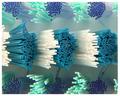
Toothbrush fibersby anirenoComment: Meets the challenge. Looking at the photo makes me dizzy - if this was the effect you were going for, you did it!! Quite well done. Would I put it on my wall? No, but some other folks I know would, so, it may do well. G'luck. |
| Photographer found comment helpful. |
| 10/10/2004 11:20:46 PM |
Snapping in the Windby dswebbComment: Definitely meets the challenge - in my opinion. The color contrast in the blue is a little dull. Also, the edge of the blue is blurry which is distracting. Isn't the flag backwards (Blue on the right...). |
| Photographer found comment helpful. |
| 10/10/2004 11:17:47 PM |
Llama Llipsby Faye PekasComment: He (she??) is cute. Did you try cropping closer to the nose/lips? It seems that it might accentuate the lips, but will you lose the ability to tell what it is? I like it. |
| Photographer found comment helpful. |
| 10/10/2004 11:15:28 PM |
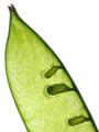
part of a podby slonkoComment: Nice, simple, good detail. Not sure that I like the white background - it seems sterile, but I'm also not sure what would have worked better. |
| Photographer found comment helpful. |
| 10/10/2004 02:05:11 PM |
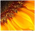
Sunflower detailsby sgauriaComment: love the croping of this image; good closeup detail. the only area for improvement that I see is the most foremost petal being out of focus - I don't think that it takes away from it too badly. |
| 10/09/2004 09:30:24 AM |
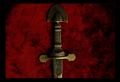
Espada de Toledoby VangelisComment: Perhaps the significance of the sword is lost on me. This is technialy a fine photo, nice background color, good focus, etc., but it just doesn't hold much interest to me. |
| 10/09/2004 09:28:43 AM |
Intensityby PtmanComment: Nice color and I like the background - very warm. The out of focus (stamens? pistils?) is a little hard to look at. I do like the crop. |
| 10/09/2004 09:26:32 AM |
Monarchby smartypantsComment: Phew, that's a closeup. Not sure what would make it have more WOW, but it's missing something for me. It may just be the colors - which I know is a matter of taste. I like the dof. I like the crop (3 dots, etc) - too bad the 4th white area couldn't be avoided - it's a little distracting. Good luck. |
| Photographer found comment helpful. |
| 10/09/2004 09:23:56 AM |
the missing partby supermaxComment: Good idea. Not sure I like the crop. Did you consider cropping just below the eyes - for more of a part-missing-a-part idea? I think it fits the challenge. Good luck. |
Home -
Challenges -
Community -
League -
Photos -
Cameras -
Lenses -
Learn -
Help -
Terms of Use -
Privacy -
Top ^
DPChallenge, and website content and design, Copyright © 2001-2025 Challenging Technologies, LLC.
All digital photo copyrights belong to the photographers and may not be used without permission.
Current Server Time: 08/01/2025 09:12:25 AM EDT.