| Image |
Comment |
| 07/20/2004 10:43:23 PM |
Greenby KonadorComment: Interesting craft skills you have there. :) I like the foreground focus and the blurred out color in the background. Maybe just a bit more green area at the top to suit my taste, but overall very nice. |
 Photographer found comment helpful. Photographer found comment helpful. |
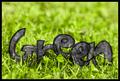
| 07/20/2004 10:40:58 PM |
Change Is Goodby psychxpsilxcybinComment: I'm not sure I understand the relationship of the graffitti and the background. If they are unrelated--which based on focus, I am guessing they must be-- then I don't really understand the value of not getting more of the sign and less of the background. |
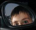
| 07/20/2004 10:38:18 PM |
The Sacred Wordsby foxycoxy2auComment: Seems to have DOF issues....focus is on again-off-again. I like the way you composed it with flowers, pearls and rings. Small thread and a few specs either on the page or on the lense take away a bit. |
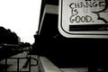
| 07/20/2004 10:32:38 PM |
... Closer Than They Appearby GeneralEComment: Good idea. The lighting doesn't help, though. Your lettering is hard to see in that angle, and the photo is pretty dark overall. Perhaps a lighter image reflected behind the letters would have let them show through more. Also, the partial brand name and the door frame are somewhat distracting. |
| Photographer found comment helpful. |
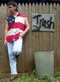
| 07/20/2004 10:28:24 PM |
Buisness in the front, party in the backby DefyTimeComment: I like the two possible meanings of the word: Could be referring to Mr. Mullett there, wearing the flag, or it could be innocently referring to the trash receptacle. FWIW, I would prefer it without the arrow on the sign. IMO, that sort of takes away from the ambiguity, which has the potential to add to the strength of the photo. |
| Photographer found comment helpful. |
| 07/08/2004 10:33:04 PM |
|
| Photographer found comment helpful. |
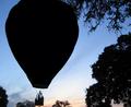
| 07/08/2004 10:23:34 PM |
Sunrise Wine Country Balloon Toursby dharmesonComment: The angles could've been more helpful on this. Looks like you wanted the sunrise and the top of the balloon, and you touched near both of them. The trees are somewhat distracting. Good concept with strong potential. |
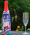
| 07/07/2004 09:22:01 PM |
Welch'sby bobgaitherComment: Interesting colors reflected in the glass. I like the product placement, but I don't understand the composition in terms of the 4th of July packaging, the somewhat formal style of glass, and the floral backdrop. I guess the 4th theme on the bottle is what throws it off for me. |
| Photographer found comment helpful. |
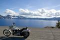
| 07/07/2004 08:28:30 PM |
Harley Davidsonby rkfooteComment: Too bad the kick stand leans the bike so far to the left. Great shot of the setting. I'd like this better if the logo on the tank was readable. |
| 07/07/2004 08:25:37 PM |
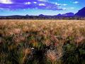
Chapada dos Veadeiros - Brasilby DoMoreiraComment: Looks like a nice photo, but the size is really a lot smaller than the other photos. Makes it seem like a lesser photo as the detail is harder to appreciate. I'd like it bigger. |
Home -
Challenges -
Community -
League -
Photos -
Cameras -
Lenses -
Learn -
Help -
Terms of Use -
Privacy -
Top ^
DPChallenge, and website content and design, Copyright © 2001-2025 Challenging Technologies, LLC.
All digital photo copyrights belong to the photographers and may not be used without permission.
Current Server Time: 08/17/2025 02:26:20 PM EDT.