| Image |
Comment |
| 09/27/2003 08:23:45 PM |
Lullabyby tcherringComment: Good concept, like the light. Don't care for the floor covering. Need to compress less, there are JPEG compression artifacts that are noticeable. Your file size is only 28k, you should try for nearer to the 150k size limit. |
 Photographer found comment helpful. Photographer found comment helpful. |
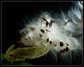
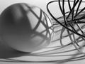
| 09/26/2003 12:44:49 PM |
Breaking Freeby dsidwellComment: Excellent choice of lighting; the dark background and the highlights on the silk give wonderful texture to the shot. Very seasonal as well. Winter's a-coming! BTW, really like the comp as well. |
| Photographer found comment helpful. |
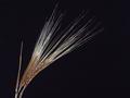
| 09/26/2003 12:24:48 PM |
A closer look at whole grainby LouisonComment: Beautiful, simple, well done. NIce smooth noise-free background. 640x480 doesn't do this image justice at all, since the fibers are just barely a pixel wide after reduction, and so they seem to partly disappear at some points. Can't help that though. |
| Photographer found comment helpful. |
| 09/26/2003 11:56:15 AM |
Yale & Towne Padlockby TarbiniComment: The textures & shapes here are wonderful. The touch of green on the brass, I really like to overall effect.
There is something going on that is detracting, esp. at upper right. Seems the edge is doubled, but camera shake is prolly not responsible, the resto of the image is sharp. Possibly an effect of the optics used? |
| Photographer found comment helpful. |
| 09/26/2003 11:33:02 AM |
Seeing Eye to Eyeby kaysrivComment: This is a tough to get shot, I know from experience! Good composition. I have a few suggestions... you need to watch your compression, your file size is only 39k and so there are very visible compression artifacts in the image. This will affect your score dramatically. Also, I would suggest some color correction to reduce the strong blue cast, and increase contrast slightly. |
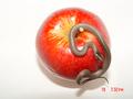
| 09/26/2003 11:29:40 AM |
Temptation Anyone????? SSSSSSssssssssby marmikComment: Awww, (s)he's a cutie. Nice idea! A more diffuse light source would have given a more pleasing result here, I think. The snake's head is also a little out of focus. His head should be tack sharp for maximum effect. Also, turn your date stamping off; it does detract. Good Luck! |
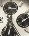
| 09/26/2003 11:24:27 AM |
Watchby jimmyn4Comment: I like your choice of composition, and the B/W treatment. The large amounts of dust on the watch do detract, though. The image is also somewhat noisy, and seems possibly a bit oversharpened. |
| Photographer found comment helpful. |
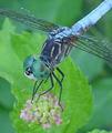
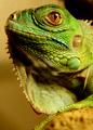
| 09/26/2003 11:20:58 AM |
Iguanaby jenaromComment: The subject is nearly perfect; I soulod have done something different withthe background, perhaps gone with all dark as in the top right. |
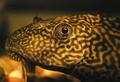
| 09/26/2003 11:09:11 AM |
Lazy Eyeby inspzilComment: Cool plecostomus. Good lighting. Maybe reducing the yellow cast slightly would be beneficial. |
| Photographer found comment helpful. |
| 09/26/2003 10:54:37 AM |
Nemesisby ursulaComment: heh heh, love the title. Also like the B+W tratment. Nice tones. Good comp & DoF. |
| Photographer found comment helpful. |
Home -
Challenges -
Community -
League -
Photos -
Cameras -
Lenses -
Learn -
Help -
Terms of Use -
Privacy -
Top ^
DPChallenge, and website content and design, Copyright © 2001-2025 Challenging Technologies, LLC.
All digital photo copyrights belong to the photographers and may not be used without permission.
Current Server Time: 08/25/2025 01:04:57 AM EDT.