| Image |
Comment |
| 12/13/2003 11:04:42 PM |
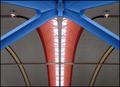
Terminal 1by JasperComment: A beautiful architectural abstract, one of my favorite images for this challenge. It could stand just a bit more saturation & contrast; try bringing in the white and black points just a bit in levels, and adjusting midtone pointer to right to increase contrast slightly. The resulting slightly darker, more saturated image seems to my eye a slight improvement on an already exceptional image. |
 Photographer found comment helpful. Photographer found comment helpful. |
| 12/13/2003 10:56:01 PM |
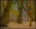
Evening Snowby dsidwellComment: As simple as it gets! lovely job capturing the sparkle of the newfallen snow. |
| Photographer found comment helpful. |
| 12/13/2003 10:52:32 PM |
|
| Photographer found comment helpful. |
| 12/13/2003 10:29:55 PM |
interrogationby jadecComment: A fun and unique take on the challenge, and well executed. Might have even stronger suggestion of "interrogation" with the "interrogatee" placed directly under the lamp. |
| 12/13/2003 10:27:28 PM |
Voigtlanderby bubonoceleComment: Awesome results on post-processsing; love the negative and the cyan tone; beautiful color choice. I wish the camera were not pointed down (resting on the lens), but like the perspective. Maybe prop the camera up and shoot from higher to retain the perspective? |
| Photographer found comment helpful. |
| 12/13/2003 10:23:30 PM |
Simply Discardedby connieComment: Absolutely gorgeous tones, would not chage a thing with exposure, focus, or processing.
I like the comp, but wonder how it would look sith the leaf rotated slightly CCW, and include all of the stem if possible. |
| Photographer found comment helpful. |
| 12/13/2003 04:43:03 PM |
|
| Photographer found comment helpful. |
| 12/01/2003 11:39:10 AM |
Waiting for the Elves by dsidwellComment: You nailed the soft focus, but lost some color & contrast in the process.
If you adjust the white point & gamma this photo really scores.
Great mood, appropriate for the soft focus. |
| Photographer found comment helpful. |
| 10/22/2003 08:53:55 PM |
.....But At Peaceby BLEEComment: Positively love the composition. Woderful contrast between the vivid flowers and the drab, desaturated sky. Title works beautifully.
I might have adjusted hue & saturation slightly to give the flowers a bit less "lemon", more yellow tone, and maybe gone just a hair sharper. |
| Photographer found comment helpful. |
| 10/08/2003 12:05:41 AM |
|
Home -
Challenges -
Community -
League -
Photos -
Cameras -
Lenses -
Learn -
Help -
Terms of Use -
Privacy -
Top ^
DPChallenge, and website content and design, Copyright © 2001-2025 Challenging Technologies, LLC.
All digital photo copyrights belong to the photographers and may not be used without permission.
Current Server Time: 08/25/2025 08:47:46 AM EDT.