| Image |
Comment |
| 07/09/2004 03:22:48 AM |
My Dream Collectionby timganierComment: I like the composition and the stark light. The bright foreground and soft background really push the subjects forward. I wonder if a wide depth of field would work better to give focus to all the cars. |
 Photographer found comment helpful. Photographer found comment helpful. |
| 07/09/2004 03:20:15 AM |
Live Musicby CamComment: I like the starkness of this image. The composition works well. |
| Photographer found comment helpful. |
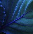
| 07/09/2004 03:19:05 AM |
Very Veinby greenfuseComment: I love the composition and the mood that this image creates. The focus seems a bit soft. Is this intentional? I wonder if sharper focus would really push out the texture. |
| Photographer found comment helpful. |
| 07/09/2004 03:15:34 AM |
Purple Gazeby melismaticaComment: I really like this. The composition works really well. The focus does seem to be a bit out. Great shot though. |
| Photographer found comment helpful. |
| 07/09/2004 03:14:09 AM |
Saltwater Solitudeby muur88Comment: Lovely concept. The colours are very subtle. I feel that the light takes too much of my attention. I think this image would even work with the lights cropped out. You could crop to just outside the mans back and crop most of the top off to the height of the fence at the right of the image This would make the light on the man's back the brightest part of the image. Just a suggestion. |
| Photographer found comment helpful. |
| 07/09/2004 03:09:39 AM |
|
| Photographer found comment helpful. |
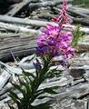
| 07/09/2004 03:07:48 AM |
fireweed and driftwoodby camelotnorthComment: Love the colour contrast between the flower and the background. The composition is also powerful. It adds a bit of dynamics to the image. The depth of field works really well here too. |
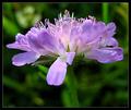
| 07/09/2004 03:06:08 AM |
The Summer is here for You.by MonaComment: I think the purple and green work really well together. I do find the central postion and the scale of the flower a bit "loud." Perhaps the flower could have been positioned a bit to one side and maybe been a bit smaller. Just a suggestion. |
| Photographer found comment helpful. |
| 07/09/2004 03:03:44 AM |
Whoops...by browntComment: I really like the composition of this image. The lighting is also well done. Just enough to get the tonal gradations in the paint looking right. |
| Photographer found comment helpful. |
| 07/08/2004 08:13:51 AM |
Purple is soooooo smooooooooothby PioneerComment: I think the composition really pushes the purple. I think having it a bit more squared up would enhance the image. Especially if the horizontal lines of the box were parallel to the bottom of the photo. Perhaps also a little bit more space at the top of the image and a border would help to enhance the subject. |
Home -
Challenges -
Community -
League -
Photos -
Cameras -
Lenses -
Learn -
Help -
Terms of Use -
Privacy -
Top ^
DPChallenge, and website content and design, Copyright © 2001-2025 Challenging Technologies, LLC.
All digital photo copyrights belong to the photographers and may not be used without permission.
Current Server Time: 08/20/2025 08:15:16 PM EDT.