| Image |
Comment |
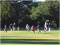
| 09/17/2004 03:58:22 AM |
Frisbeeby GeneralEComment: I think the composition really works well as it gives a real sense of the action as well as a sense of the environment that the game is being played in. I can almost feel the grass under my feet. :) The light people work well against the shadows of the trees. The shadows in the foreground add interest and depth to the scene as does the light on the upper sections of the leaves. The more I look at it the more dynamic it looks. I think the motion blur is good as it adds to the energy. The only thing I could pick on is a bit of over exposure on the really bright elements in the shot. This image could also work really well if it was cropped fairly close to the top and bottom of the people. Good Luck. |
 Photographer found comment helpful. Photographer found comment helpful. |
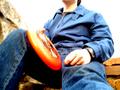
| 09/17/2004 03:50:32 AM |
A Frisbee Time Outby gpiersonComment: I really like the composition and this shot has a candid feel that is quite involving. I think the white sky works well however I feel the overexposure on the hands detracts from the casual vibe of the image. I feel a sharper focus would enhance this photo especially if it brought out the texture in the jeans. I think this would also work well in Black and White as it would enhance the impactt of the white sky. Good Luck. |
| 08/26/2004 06:32:39 AM |
Closed Inby FotowereldComment: The lighting and composition are excellent and have been implemented artistically. I like the contrast between the light bottom right and the dark top left. |
| Photographer found comment helpful. |
| 08/26/2004 06:29:15 AM |
Black Mistby NatatorComment: The lighting is excellent. I like the contrast between the lightness of her skin and the darkness of the material. The highlights on the material create interest also. |
| Photographer found comment helpful. |
| 08/26/2004 06:16:25 AM |
mother natureby SeanachaiComment: The composition and depth of field work really well. I really like the shadows on her chest as a compliment to the leaves in her hand. Its an unusual image in that the desaturation makes her look a bit deathly which seems to contradict the title. She would have passed for a statue except for the pink in some parts of her skin. Technically its a very well executed image. I'm not sure what the purpose of the desaturation is. I would be curious to see it in its original colours or entirely black and white. Good Luck. |
| Photographer found comment helpful. |
| 08/26/2004 06:03:47 AM |
Out of the Darkby smokeditorComment: The lighting is excellent. The composition is unusual and interesting. I really like the way the model fades off into the shadows in some parts of the image. |
| Photographer found comment helpful. |
| 08/26/2004 05:59:15 AM |
Serenity by grigrigirlComment: Superb lighting and composition. I like the way that the shadows extend up from the foreground into her left arm and leg. |
| Photographer found comment helpful. |
| 08/26/2004 04:29:37 AM |
Scarred Beautyby lagavulinComment: This is an interesting shot. At first glance it doesn't greatly appeal to me. When I look at it a bit longer though I notice the curve of her pose on the left of the image and the expression on her face. The lighting is a little harsh down her right side. It is good how it highlights the curves though. I'm wondering if this could have been enhanced by using a dark backdrop and some sort of diffusion for the light. The image has a subtle beauty about it which is the most difficult aspect to capture or produce. |
| Photographer found comment helpful. |
| 08/26/2004 04:22:33 AM |
Mind, Body and Spirit by nico_blueComment: This image makes quite an impact. The contrasty lighting really defines the form. Its perhaps just a touch too strong for my liking. The highlight on his left forearm is a little distracting and is shown up more by the contrasting shadows on his right arm.(by the way I'm nit-picking here because I really like the image.) I think the crumpled fabric adds a nice touch of softness on the left of the image. Its a well executed shot and there's just a couple of finishing touches that would have finished it off. |
| Photographer found comment helpful. |
| 08/26/2004 04:16:07 AM |
|
| Photographer found comment helpful. |
Home -
Challenges -
Community -
League -
Photos -
Cameras -
Lenses -
Learn -
Help -
Terms of Use -
Privacy -
Top ^
DPChallenge, and website content and design, Copyright © 2001-2025 Challenging Technologies, LLC.
All digital photo copyrights belong to the photographers and may not be used without permission.
Current Server Time: 08/21/2025 11:17:13 AM EDT.