| Image |
Comment |
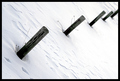
| 01/04/2007 11:12:50 PM |
Snow Postsby drewsephComment: I really like this, but feel the tilt is too extreme for me personally. |
 Photographer found comment helpful. Photographer found comment helpful. |
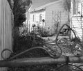
| 01/04/2007 11:11:59 PM |
Multiple fencesby threekiddadComment: Your foreground fence is blurry; your rearground fence lacks punch. I understand your concept, but this seems poorly executed. |
| Photographer found comment helpful. |
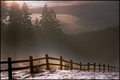
| 01/04/2007 11:11:04 PM |
Morning Rays by aberrationComment: This is lovely, and I think will do very well. I give it a nine. In my personal opinion, the shadows on the trees seem a bit light. |
| Photographer found comment helpful. |
| 04/13/2005 07:02:33 PM |
|
| Photographer found comment helpful. |
| 04/13/2005 06:57:05 PM |
Forest Ambushby SchuffComment: A strange purple and green combination. You may have been better off choosing black and white on this one ;) |
| Photographer found comment helpful. |
| 04/13/2005 06:54:10 PM |
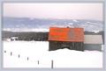
Baie-St. Paul, Québecby SimonkasprzakComment: I like this picture - that red roof really sticks in my mind. I like the posts sticking up from the snow. I don't like the border... a bit too distracting. Something plainer would have framed your picture better, I think, and I don't like how the border overlaps the posts and the corner of the smaller building. Let it breathe! :) Straightening the horizon would improve the image, too. |
| Photographer found comment helpful. |
| 04/13/2005 06:39:21 PM |
I Love Eric Gonzalezby TuckersmomComment: I know it's frowned upon to let a title influence a score, but I really like the fact that you went with something different. Plus the lighting is so good in this picture! 8 |
| Photographer found comment helpful. |
| 04/13/2005 06:37:46 PM |
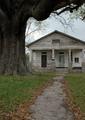
The Path Homeby photogJamesComment: How I would like to see the series you took while trying to get this picture! Since you went with color, I wonder what would happen if you bumped the saturation up by 10? What if you showed us a bit more of this old tree? Although, like me, you may have been faced with a boring sky that day or some nearby buildings you were trying to avoid. |
| Photographer found comment helpful. |
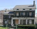
| 04/13/2005 06:35:30 PM |
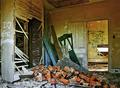
The Apple Tree House circa mid 1700by graphicfunkComment: Aargh! Power lines! The bane of every architectural photographer! I think you have a great subject here. What I really like about this picture is the blue shutters. Would love to see this with the saturation kicked up a bit, no power lines, and perhaps somehow avoid the fence, if possible? |
| Photographer found comment helpful. |
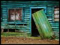
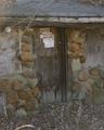
| 04/13/2005 06:31:52 PM |
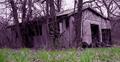
Door that's closed for everby tiki28Comment: I like this picture, but I find the twigs in the foreground distracting. Your contrast seems a bit off - the picture is murky. I don't like the perfect glass globe amidst all the decay. The thing I find most interesting in this picture is the ironwork on the door. Perhaps a different composition would help that stand out more. |
| Photographer found comment helpful. |
Home -
Challenges -
Community -
League -
Photos -
Cameras -
Lenses -
Learn -
Prints! -
Help -
Terms of Use -
Privacy -
Top ^
DPChallenge, and website content and design, Copyright © 2001-2024 Challenging Technologies, LLC.
All digital photo copyrights belong to the photographers and may not be used without permission.
Current Server Time: 04/30/2024 04:53:57 AM EDT.