| Image |
Comment |
| 05/01/2005 10:48:20 AM |
We take trade-ins....by ralphComment: I like the long shadows in this shot...helps with the mood. Also, I like how the reflection and shadow inside the ring looks like a dividing cell, also a fitting relationship to the shot. |
 Photographer found comment helpful. Photographer found comment helpful. |
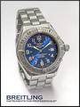
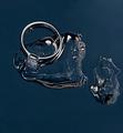
| 05/01/2005 10:46:49 AM |
Who says girls have all the fun? by snackwellsComment: Great control over reflections and light. You even took the shot at 10:10...seems to be the most accepted time to photograph a watch. Also, thanks for using a short exposure time to keep the second hand from blurring. |
| Photographer found comment helpful. |
| 05/01/2005 10:44:48 AM |
Suggestiveby mrmorrisComment: I like your slogan...quite clever, but I think the jewelry could have been a bit brighter, or maybe have a different exposure. In my eyes, it's hard to get a good impression of what the jewelry is. |
| Photographer found comment helpful. |
| 05/01/2005 10:41:50 AM |
Jewelry with a purposeby DogAngelComment: I like the overall feel of your shot, but I do have to comment on the placement of your model's hand...at first glance I thought she was picking her nose. Granted, it could just be me...it probably is just me. |
| Photographer found comment helpful. |
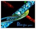
| 05/01/2005 10:39:56 AM |
Blue for youby JohannesFrankComment: The saturation and contrast in this shot are interesting and bold, but they do make it a bit difficult to tell the true color of the jewelry. I am sure it is blue, but how blue? |
| 05/01/2005 10:38:53 AM |
Natural Jewelryby RissaComment: I like the set-up but am slightly turned off by the flash. Parts of the lizard look at bit over exposed, but all in all, I think this is a good entry. |
| Photographer found comment helpful. |
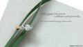
| 05/01/2005 10:37:45 AM |
Writing a Love Poemby admart01Comment: Nice set-up and composition. I don't think the company name is necessary, but I do like the text and font in the main message. The green ribbon is a nice choice as it stands out well, but is not too overpowering. |
| Photographer found comment helpful. |
| 05/01/2005 10:36:03 AM |
OUTBACKby DrJOnesComment: One of the more inventive uses of text in this challenge and a wonderfully professional shot, at that. It looks ripped from the pages of some overly glossy magazine. Good luck and nice hair. |
| Photographer found comment helpful. |
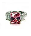
| 04/29/2005 01:40:45 PM |
Pinkby rebelgirlComment: Great color on the stone and a good job managing reflections. It's a beautiful shot, but it's missing something in my opinion...I can't put my finger on it, though. Good luck. |
| Photographer found comment helpful. |
| 04/29/2005 01:35:27 PM |
Forever Iceby MatthewComment: The shapes here are incredibly interesting, but I'm not sure what I'm seeing. Also, the shot appears slightly pixelated...you know, those jaggy things. Maybe it's a shot in front of a computer screen...people here like those. I like this shot but there is something I can't quite put my finger on...good luck all the same. |
| Photographer found comment helpful. |
Home -
Challenges -
Community -
League -
Photos -
Cameras -
Lenses -
Learn -
Help -
Terms of Use -
Privacy -
Top ^
DPChallenge, and website content and design, Copyright © 2001-2025 Challenging Technologies, LLC.
All digital photo copyrights belong to the photographers and may not be used without permission.
Current Server Time: 08/05/2025 08:34:44 AM EDT.