| Image |
Comment |
| 06/11/2006 01:07:22 AM |
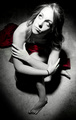
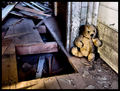
Jasmineby PhotoTessComment: Ok keeping it real here. I really like the process done to the model. But front leg seems out of touch and place. Seems painfully out of shape with the remaining subject and dark compared, even though the other foot is light. The spotlight effect works real well but the crop IMO is to tight to justify an empty rooms theme. I'm not saying it does not meat the challenge but what I am saying is you didn't show me enough to get the feel of an empty room. If you could of taken the picture with a wider angle of the room and the spotlight effect on your subject as you have done I feel it would of reduced the front leg issue and opened up the photograph to give me the feel of an empty room. I also wish the title would of said something more about the picture than just the models name. I feel she has something on her mind as she stares upward. A different title may have given a better picture to viewer relation emotionally.
Overall a good shot that could of been better without the tight crop showing more of an empty room. The processing is great on the model but the venting is a little strong. Good Job and wish you well in the challenge. 6 |
 Photographer found comment helpful. Photographer found comment helpful. |
| 06/11/2006 01:02:43 AM |
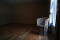
Seating for Oneby ElaineComment: OK I have scored your photograph the other day but wanted to come back to it. First let me say the lighting is great along with the focus and DOF. I love the texture in the floor and the different tones in the floor. But I am having a problem with the placement of the wicker chair. It seems to me to be crowding the window. I think it would have been better if the chair was place a ways from the window maybe 2' out and 2' back. I know the lighting would of still been good on the chair because I can see the wall socket in the back corner of the room.
With that said I had your picture scored as a 6 but I'm going to have to bump to a 7 because of the great detail in the overall picture. |
| Photographer found comment helpful. |
| 06/11/2006 12:55:18 AM |
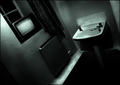
Nobody Homeby KonadorComment: Nice shot. It doesn't wow me but it has a nice tone with good contrast and textures. Good Job 6 |
| Photographer found comment helpful. |
| 06/11/2006 12:53:47 AM |
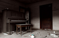
Dusty Pianoby rob_franklinComment: I do feel you meet the challenge and your photograph is over all good. I believe it would of been better if all the trash on the floor were taken out of the shot and the picture brightened up a little around the piano and the door. Good Job 6 |
| Photographer found comment helpful. |
| 06/11/2006 12:50:59 AM |
Left Behindby xXxscarletxXxComment: A nice photograph but a little on the busy side for me. I feel you meet the challenge but the whole in the floor distracts me from the item you placed in the room. 6 |
| Photographer found comment helpful. |
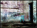
| 06/10/2006 02:25:08 AM |
Blue Chairby sherComment: Nice photograph with wonderful colors. You photo does give me a sense of emptiness. The only thing I may have done differently is bring the chair out a little. Make it stand out more. With all the colors around it, it kind of blends. Good Job! 7 |
| Photographer found comment helpful. |
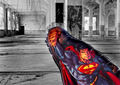
| 06/10/2006 02:24:57 AM |
This is a job for... Indestructable-Mylar-Baloonby justamistereComment: Great job all around the photo captures my attention and retains it. Which usually would be a good thing except that "Superman blowup". :P Really I wish you would of used a prop that along with the theme of the photo and the processing. I'm not going to knock you for having a bad prop (at least it shows you put something in the room) But I would love to see this photo retaken with the same editing with a corresponding prop. I believe it would be great. 7 |
| Photographer found comment helpful. |
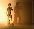
| 06/10/2006 01:23:26 AM |
The invincibleby SimpaComment: From the Critique Club
Hi- OK I'm going to keep it real here and straight to the point. I think you had a good Idea even though statues don't seem to go over well here. If your subject would of been in proper focus and minimal noise along with better border placement you would of pulled it off.
When taking this kind of shot the focus is going to have to be spot on and your going to have to eliminate most or all noise making a clean shot. I like the lighting and the warmth. I believe a border was need on this photograph but yours is off set (not even) and I think its placement would of been better around the edges of your photograph.
Overall a good shot that could of been benefited with a lower ISO and more post processing. Keep up the good work and wish you well in future challenges.
I hope you find this critique helpful and if you have any questions feel free to contact me.
regards,
SDW |
| Photographer found comment helpful. |
| 06/10/2006 01:05:17 AM |
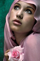
Make All My Dreams Come Trueby librodoComment: From the Critique Club
First off congratulations on your top 5 finish. A great shot!
What can I say that has not already been said. This is a great portrait. A very photogenic model and almost perfect processing. The DOF is great along with your focus. If I had to pick on one or two things it would be the background. It's texture almost overwhelms the texture of her garment. And the rose IMO is to sharp and it almost is a distraction from the models face. However the model won out :).
Overall a great photograph properly set up from the pose to the lighting. I think you almost nailed it with just those two slight distractions. Keep up the good work and I hope you find this critique helpful. If you have any questions about this critique feel free to contact me.
regards,
SDW
|
| Photographer found comment helpful. |
| 06/10/2006 12:46:44 AM |
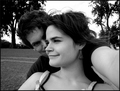
"I'm Looking Through You"by veoconComment: From the Critique Club
Hi- A pretty good portrait but there are a few things that should of been removed and a few thing that should of been added to make your shot work better IMO.
For example the first thing I noticed when I opened up your image was that you are hand holding the camera not using a tripod. That's ok but should not jump out at the viewer. If you would of cropped the right side I believe that would of help this issue but a tripod would of been the best giving you more range in your setup.
In a portrait photograph where the face is shown I believe the eyes are the key to success. Both people in your photograph have there eyes very dark not giving us a connection with them like it would of been if we were able to see the eyes. I would have suggested the eyes being brighter so we could see what direction they were looking.
The female has a very pleasant smile and very photogenic so more detail and contrast would of been great. I also believe a tighter crop may have helped.
You did a good job converting to B&W and the Dof is good.
Overall I think this shot would of been worth taking again with a tripod. Using the same B&W conversion but with a little more contrast. Do away with anything that does not enhance the shot and draw our attention to the elements that make the shot. Good photograph and I hope you find this critique helpful. If you have any questions concerning this critique feel free to contact me.
regards,
SDW
|
| Photographer found comment helpful. |
Home -
Challenges -
Community -
League -
Photos -
Cameras -
Lenses -
Learn -
Help -
Terms of Use -
Privacy -
Top ^
DPChallenge, and website content and design, Copyright © 2001-2025 Challenging Technologies, LLC.
All digital photo copyrights belong to the photographers and may not be used without permission.
Current Server Time: 08/16/2025 10:35:14 AM EDT.