| Image |
Comment |
| 07/16/2004 10:51:35 AM |
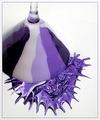
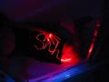
Deep Purple Somethingby mffnqueenComment: Aloha from the Critique Club!
This is a great example of how to create a photograph, rather than trying to find one. You put thought and effort into your composition, and it shows. I like the subtle use of thirds in the placement of the glass, and the shot angle give the image a sense of abstractness.
The focus is mostly very good, but think your depth of field needs to be a little deeper, it would bring the martini glass into full focus, and help sharpen the lines.
Obviously this picture meets the challenge, and as far as the composition of the subject, my only suggestions might be to use one color of purple, and dump the paint from higher up, so the splatter pattern would look more natural. Right now it is more contrived looking.
I like the solid background, though pure white might be better than the textured white. The lightings is unobtrusive and flattering to the subject. I don't care for the frame you chose, it might look better with a solid black bar or no frame at all.
Good job with this entry, keep at it! |
 Photographer found comment helpful. Photographer found comment helpful. |
| 07/14/2004 10:12:31 PM |
- Miracle! -by ImagineerComment: A little grainy, but a very neat image. Can't wait to see your explanation :) |
| Photographer found comment helpful. |
| 07/14/2004 10:07:25 PM |
Here's Your Signby freakyreefComment: Love to know how you got this shot (assuming it was within the rules of engagement). Excellent entry. |
| Photographer found comment helpful. |
| 07/14/2004 10:06:13 PM |
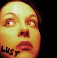
Pulpby Herblacklist12Comment: Nice image, but she doesn't look lustful, she looks aprehansive. I had used the word lust for one of my possible shots, but I decided the photo was too risque. Nice entry. |
| Photographer found comment helpful. |
| 07/14/2004 10:04:11 PM |
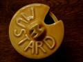
Mustardby paynekjComment: Not very interesting, this is just a picture of a jar. |
| 07/14/2004 10:02:27 PM |
Thin Skinnedby bmatt17Comment: This seems like a last minute idea, but qualifies for the challenge. A simple improvement could have made this a contender: Print the words in a cursive or archaic font from your computer instead of writing in marker. |
| Photographer found comment helpful. |
| 07/14/2004 10:00:04 PM |
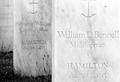
The Hamiltonby jessieComment: Nice image, if not very interesting to look at. The front stone is a bit too bright, it gets washed out along the right edge. Maybe make this a bit darker and up the contrast. Leaving it in color might work to your advantage, sine the white stone would stand out nicely from the green grass. |
| Photographer found comment helpful. |
| 07/14/2004 09:57:58 PM |
Diet Deliciousby Jamie2772Comment: Your focus is off, and this is not a creative image. The horizon is also crooked and the bottom right corner is too bright. Remember the challenge: "Take a photograph where complete words -- not just individual letters -- play a creative role in your composition." There is no creative role here, just a picture of the art already used on the can. |
| Photographer found comment helpful. |
| 07/14/2004 08:40:45 PM |
shhby vivarinComment: Intriguing, hard to get past the blurry, grainy impression, but it has a dark appeal. Nice effect with the bathtub. |
| 07/14/2004 08:39:20 PM |
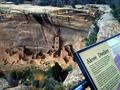
Alcove Dwellersby sharveyComment: "Take a photograph where complete words -- not just individual letters -- play a creative role in your composition." This picture could have been taken by anyone, it's an exhibit. How do the words play a creative role in the composition? Try to focus on creating your shot, rather than finding it. |
Home -
Challenges -
Community -
League -
Photos -
Cameras -
Lenses -
Learn -
Help -
Terms of Use -
Privacy -
Top ^
DPChallenge, and website content and design, Copyright © 2001-2025 Challenging Technologies, LLC.
All digital photo copyrights belong to the photographers and may not be used without permission.
Current Server Time: 08/08/2025 12:16:11 AM EDT.