| Image |
Comment |
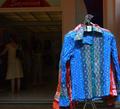
| 08/03/2004 01:02:45 PM |
what to wear to the blue moon ball . . .by tomzinhoComment: Heh, funny picture. Only, it feels like any snapshot, no big wow factor. It might be improved by eliminating the left half of the picture, or taking it from another angle so the shirt takes up more of the frame. |
| 08/03/2004 01:00:24 PM |
The Edge of Night by jefalkComment: Cool picture. The placement of the moon between the outcroppings is great. Too bad the moon is so overexposed, it would be interesting to see some texture on it, but I know how difficult (impossible) it is to get both the moon and the subjects properly exposed at night. I like the border. It's tasteful and adds to the picture. |
 Photographer found comment helpful. Photographer found comment helpful. |
| 08/02/2004 11:53:28 PM |
Marble on Centre Stageby FalcComment: Cool image. It's a little grainy (especially the bacjground) and almost too dark to tell that it's a marble. I love how the light comes through the marble though! I can see the light beams on the near side of it. Very nice. Just too bad the graininess and lack of detail hurt the image so badly. This could otherwise be a definite ribbon winner. |
| Photographer found comment helpful. |
| 08/02/2004 03:22:56 PM |
Everyday Blue Flameby pottersclay75Comment: Oooh, this is nice. I like the hot color tones reflected in the metal rim. The DOF is fabulous. This piccy is awesome! Only, I see some spots and specks about a third of the way up from the bottom of the picture. Since the advanced editing rules are in effect for this challenge, I would defeinitely have cloned out those defects, because the rest of the image is so smooth and perfect. Probably I would also have used less JPEG compression, this is only ~50KB, you have ~150KB, make use of it. One point off for slight JPEG artifacts, one point off for spots. 8. |
| Photographer found comment helpful. |
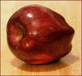
| 08/02/2004 03:18:20 PM |
one everydayby coolharComment: Technically, well done. But uninteresting. It doesn't catch my eye. Maybe if it wasn't so centered. Try getting lower, right down on the table, and put the apple on one of the thirds points. (Read about the rule of thirds if you haven't heard of it.) |
| Photographer found comment helpful. |
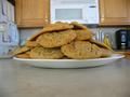
| 08/02/2004 03:12:05 PM |
Otis Spunkmeyer Cookiesby aliciapunchesComment: Dude, you make me hungry. I thought I was safe now that the chocolate challenge was over! ;-) Low and interesting viewpoint, nicely organized cookies, sharp focus. A good picture. |
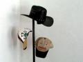
| 08/02/2004 03:10:37 PM |
Hat Rackby chyladyComment: I like the idea and composition, but the blurriness and grainyness combined really don't do it for me. I think that soft focus alone, or some fine grain applied could be good but this just looks like it came from a camera phone or something. |
| 08/02/2004 03:03:49 PM |
Foreplayby CamComment: LOL! This is very creative. What's the word? Anthropomorphic, giving human traits to inanimate objects. Well done, nice focus, DOF, interesting lighting and camera angle. |
| Photographer found comment helpful. |
| 08/02/2004 02:54:25 PM |
Old Schoolby starlight autumnComment: I like the idea, but this picture is a bit low in contrast and yellowy. Perhaps adjusting the white balance and playing with curves in Photoshop would help. |
| 08/02/2004 05:54:13 AM |
Glassesby Hye5Comment: Very very nice. A difficult composition to get right, done perfectly. It must have taken forever to get the glasses just exactly lined up and symmetrical. Good contrast and use of B&W. Hmm, too bad there's a couple of smudges/dust on the glasses. |
| Photographer found comment helpful. |
Home -
Challenges -
Community -
League -
Photos -
Cameras -
Lenses -
Learn -
Help -
Terms of Use -
Privacy -
Top ^
DPChallenge, and website content and design, Copyright © 2001-2025 Challenging Technologies, LLC.
All digital photo copyrights belong to the photographers and may not be used without permission.
Current Server Time: 08/21/2025 01:15:04 AM EDT.