| Image |
Comment |
| 07/13/2004 02:01:41 PM |
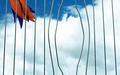
A Daring Escape by scalvertComment: The lighting and colors make the picture look very classy and sophisticated. It almost makes me want to get myself a nice tall glass of whiskey on the rocks despite the fact that I don't drink. Unfortunately the mood of the story that the picture tells is a more light and humorous one, which creates some overall incongruity. Aside from that, it's still an excellently taken picture and I'm rooting for it to do very well in this challenge. |
 Photographer found comment helpful. Photographer found comment helpful. |
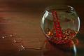
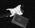
| 07/13/2004 01:51:57 PM |
Then One Afternoonby FirstyComment: I love how the picture has just enough to tell the story. No distractions. Just right. |
| Photographer found comment helpful. |
| 07/13/2004 01:47:39 PM |
|
| Photographer found comment helpful. |
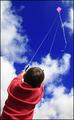
| 07/13/2004 01:40:10 PM |
Freedom Flight by marboComment: Even without looking at any other photos, I already want to give this one a 10. Everything about the picture is good. Great focus. Crisp contrast with the deep blue sky and the striking kite strings that lead the viewer up to the free and boundless heights. I feel like I'm starting to write a poem so I'd better stop myself and just give you the 10 right now. Congrats on the perfect pic for the challenge. |
| Photographer found comment helpful. |
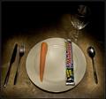
| 06/17/2004 01:39:09 PM |
Paper or Plasticby DefyTimeComment: Nice depth and arrangement. Two points that I think could be improved are that the colors look a bit dull and the shine/shadow contrast of the pressed print on the card is distracting. I like the strategically placed bill over the last four digits of your card.
On another note,
That's a lot of Benjamins you've got there in your photo... Can I be your friend :) |
| Photographer found comment helpful. |
| 06/17/2004 01:29:56 PM |
Color duJourby robertagrizovicComment: Great photo and great idea. I only wish it had been bigger to see the crispness of the markers against the background. |
| 06/16/2004 11:42:18 AM |
Import vs Domesticby fpilatoComment: I love the colors, the focusing, and the arrangement. I can't help but to wonder if it'd look better with the right third of the picture cropped out. Regardless, it's a great looking pic. |
| 06/16/2004 11:38:02 AM |
Regular or Dietby pinkladyComment: I like the idea but, I personally think the spiderman is a little distracting, as well as the gap between the cans. |
| 06/16/2004 11:32:14 AM |
|
| Photographer found comment helpful. |
| 06/16/2004 11:27:17 AM |
|
Home -
Challenges -
Community -
League -
Photos -
Cameras -
Lenses -
Learn -
Help -
Terms of Use -
Privacy -
Top ^
DPChallenge, and website content and design, Copyright © 2001-2025 Challenging Technologies, LLC.
All digital photo copyrights belong to the photographers and may not be used without permission.
Current Server Time: 08/01/2025 09:24:58 PM EDT.