| Image |
Comment |
| 11/17/2006 08:51:48 PM |
|
 Photographer found comment helpful. Photographer found comment helpful. |
| 11/16/2006 09:15:59 PM |
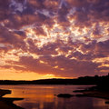
Fairfax Fallsby cryanComment: The waterfall and the struture are interesting but the dang branch in the foregroung must go. If you were able to get closer and shoot in lanscape orientation, the most interesting elements of the composition would have been featured. |
| Photographer found comment helpful. |
| 11/16/2006 09:12:15 PM |
Painted-Roseby cryanComment: Wow....great shot. I like all of it with the exception of the stuff going on in the top right corner. The whole image is so fluid yet that imperfection in the petal takes it down a notch. Good work otherwise. |
| Photographer found comment helpful. |
| 11/16/2006 01:32:54 PM |
|
| Photographer found comment helpful. |
| 11/16/2006 01:31:05 PM |
DSC_2845.jpgby TimComment: Nivce image. I like the square crop but I would have cropped out more of the water as it does very little to enhance the image. The sky is where the primary focus should be in this shot. |
| Photographer found comment helpful. |
| 11/16/2006 01:28:25 PM |
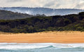
DSC_2925.jpgby TimComment: Colors are really cool but you are featuring the foreground as the main element of the shot and focusing on the dark distant shoreline. BTW, you've also got sensor dust. |
| Photographer found comment helpful. |
| 11/16/2006 01:21:34 PM |
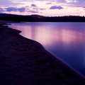
Silent Tideby JRalstonComment: Hi Jennifer. This is a nice effort but you had subjected yourself to some of the most difficult lighting out there. Do you focus on the rocks....then the water gets washed out. Do you focus on the water....then the rocks are too dark. You see what I mean? A good ND filter can help with this or use of the Gradient tool in Photoshop. It would have enabled you to darken the water and avoid darkening the shoreline. Hope that helps. |
| Photographer found comment helpful. |
| 11/16/2006 01:05:16 PM |
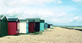
Beach Hutsby kanoComment: Interesting perspective and good use of leading lines. There is a concentration of color in the structures and then it fizzles into bland sand and sky. A tighter crop may have lessened the imapct of the blah surrouding and focused more on the building instead. |
| Photographer found comment helpful. |
| 11/16/2006 02:48:52 AM |
|
| Photographer found comment helpful. |
| 11/16/2006 02:43:36 AM |
jessicaweb.jpgby trnqltyComment: Yeah...I'm not really a portrait guy as people generally bother me but I'll give it whirl. All the technicals are good thought the light is not really flattering. The model seems to be somewhat obligated to pose as opposed to being engaged. Though she has a knockout figure, it renders it useless without some "ambition?"in her expression. |
| Photographer found comment helpful. |
Home -
Challenges -
Community -
League -
Photos -
Cameras -
Lenses -
Learn -
Help -
Terms of Use -
Privacy -
Top ^
DPChallenge, and website content and design, Copyright © 2001-2025 Challenging Technologies, LLC.
All digital photo copyrights belong to the photographers and may not be used without permission.
Current Server Time: 08/18/2025 03:10:36 PM EDT.