| Image |
Comment |
| 08/08/2004 01:31:00 AM |
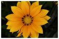
Flowerby NgporterComment by Neil: Beautiful color and sharpness. I think it would have been good to 1) avoid the orange in the upper right (or clone it out). Also, while in one way I think the crop is nice on the flower, I think it would have been a bit better whole. |
| 08/06/2004 03:54:15 PM |
Flowerby NgporterComment by MrAkamai: The composition is very good but it's hampered by slightly flat contrast. The upper left and right corners are quite distracting. |
| 08/04/2004 11:43:58 PM |
|
| 08/04/2004 08:19:52 PM |
Flowerby NgporterComment by annasense: what an interesting looking flower. i love the texture of the petals. i've noticed a lot of people on this site don't think much of flowers, but i really like them. nice shot. |
| 08/04/2004 07:24:45 PM |
Flowerby NgporterComment by Dr.Confuser: Neat flower. I like the pattern of dark patches around the center. Much more interesting than a lot of plain old flowers we've seen the last few days. I'd like to see a bit more of the background but blurred by DOF. As it, there is just enough to be distracting, but not enough to be satisfying. |
| 08/02/2004 06:07:18 PM |
|
| 07/11/2004 10:41:12 PM |
|
| 07/08/2004 08:09:36 PM |
|
| 07/05/2004 01:22:02 PM |
Lighter Shades of Purpleby NgporterComment by Kylie: The focus is good. I think what hurts this a little for me is tht the flower itself is not well formed, so it hurts your composition some. I would also like to see the foreground surface more uniform with the background maybe. |
 Photographer found comment helpful. Photographer found comment helpful. |
| 06/21/2004 06:43:02 AM |
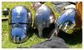
Which One would You choose???by NgporterComment by Curious: I like the contrast between the steel and the grass. It's quite dramatic. I think the reflection in the helmet on the right is a little distracting though. The blue tones in the steel really pop out against the grass. I think the composition gives the image a really solid appearance. The more I look at it the more solid it becomes. |
| Photographer found comment helpful. |
Home -
Challenges -
Community -
League -
Photos -
Cameras -
Lenses -
Learn -
Prints! -
Help -
Terms of Use -
Privacy -
Top ^
DPChallenge, and website content and design, Copyright © 2001-2024 Challenging Technologies, LLC.
All digital photo copyrights belong to the photographers and may not be used without permission.
Current Server Time: 05/29/2024 11:49:03 PM EDT.