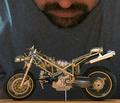
| Image |
Comment |
| 08/05/2004 10:02:52 PM |
Super Carby BigSmilesComment: A little too bright, as the tires are just a tad washed out. Fairly good detail on the car. I don't think negative space in this image works - it actually distracts the eyes. |
 Photographer found comment helpful. Photographer found comment helpful. |
| 08/05/2004 10:01:52 PM |
Earth (not actual size)by bgmorrisComment: In some ways, I really like this image. Excellent focus on the planet. Colors in background create a nice effect. I think there could have been ways to make the image better, though. For instance, having different lighting so that there is no shadow from the model. |
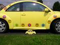
| 08/05/2004 10:00:08 PM |
When I Grow Up....by TuckersmomComment: I like how the miniature car has stickers on it just like the big one. Unfortunate that the flash/sun is in the window of the big car. Some pixellation in the image. |
| Photographer found comment helpful. |
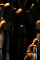
| 08/05/2004 09:58:51 PM |
I See a Little Silhouetto of a Man-o!by JesuispeureComment: I like the concept of this image. However, I think the blurry silhouettes compromise the quality of the image; too much blurriness for the majority of the picture. I find my eyes moving toward the bright lighting in the upper left hand corner. |
| Photographer found comment helpful. |
| 08/05/2004 09:56:34 PM |
Miniature Barbie'sby DianaComment: I like the use of spotlighting the Barbie in the center. I wish the focus was better, though. The centered Barbie has a soft focus to it, while the rest of the Barbies just look washed out, taking away from the picture. A bit noisy. |
| Photographer found comment helpful. |
| 08/05/2004 09:55:12 PM |
Miniature Guard Dogby laserComment: It appears that you were using the sign to show humor, with the dog looking small (hence, the "miniature" theme). I think it's a stretch for the challenge, but I do think it is really funny. Lighting, focus, and details are all good. This is an average photo to me in this particular challenge. |
| Photographer found comment helpful. |
| 08/05/2004 09:50:25 PM |
Glassby Sigur7Comment: Is the elephant made out of glass? Or is this a clash of glass and wood? Not sure what the intent was in this photo with regard to the foreground and background. The elephant is somewhat blurry toward the back. All of the colors in this image just seem to flow into each other. |
| Photographer found comment helpful. |
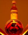
| 08/05/2004 09:48:16 PM |
50ml of a 12 Year Favoriteby Kha0SComment: Interesting choice of lighting, though I'm not sure if it works for you. It's difficult to know what I'm supposed to be looking at and what the demonstration of "miniature" is in this challenge. |
| Photographer found comment helpful. |
| 08/05/2004 09:46:52 PM |
Handsby Faye PekasComment: Your top three fingers come out of focus at the tips. This doesn't kill the image, but it is distracting. I think there are other perspectives you could have used to make the photo more interesting. I hate it to say it, but the photo kind of bores me. :( |
| Photographer found comment helpful. |
| 08/05/2004 09:45:05 PM |
Unifinishedby WobblyLegsComment: Centered well. Lighting is pretty good. Good focus. Too bad it's not finished! |
| Photographer found comment helpful. |
Home -
Challenges -
Community -
League -
Photos -
Cameras -
Lenses -
Learn -
Help -
Terms of Use -
Privacy -
Top ^
DPChallenge, and website content and design, Copyright © 2001-2025 Challenging Technologies, LLC.
All digital photo copyrights belong to the photographers and may not be used without permission.
Current Server Time: 07/17/2025 08:37:38 PM EDT.