| Image |
Comment |
| 04/06/2003 08:58:11 PM |
|
| 04/06/2003 08:54:56 PM |
|
 Photographer found comment helpful. Photographer found comment helpful. |
| 04/06/2003 08:51:53 PM |
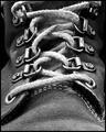
Interlacedby KarenBComment: Very creative and unique. A good black&white, the lighting and contrast is great. Only a little bit overexposured on the lace in the middle. I like the texture contrast of the blank metal vs. the rough lace. 9 |
| Photographer found comment helpful. |
| 04/06/2003 08:47:46 PM |
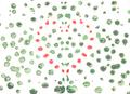
Aerial Followingby boyte1Comment: I like this abstract. I think it fits into the challenge very well, although the photo itself is not symmetrical. Unfortunately the photo is a bit small. Anyway, good composition and a nice lighting. 8 |
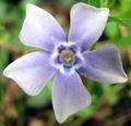
| 04/06/2003 08:43:01 PM |
Natural Symmetryby scrooslooseComment: I like the fuzzy focus on the flower. The background should be even more blurred, it's a bit distracting because of the brown/green contrast. |
| Photographer found comment helpful. |
| 04/06/2003 08:41:17 PM |
In Politicsby blind_as_a_batComment: I think the photo suffers from being a bit too small. Otherwise (as far as I can see) a good photo. Perfect composition. |
| Photographer found comment helpful. |
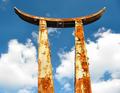
| 04/06/2003 08:36:51 PM |
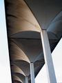
Rust and Skyby BudweezerComment: I think a plain blue sky without the clouds would look better and enhance the abstract look of the photo. Also it seems that it's not perfectly symmetric, a step to the right could have helped. Otherwise a good photo. |
| Photographer found comment helpful. |
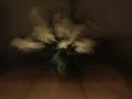
| 03/31/2003 06:44:03 PM |
Time afte timeby mrbarquetComment: I admit that I don't understand how it relates to the challenge theme, too. But I think it's better than the score you got. It looks like an oil painting to me and I like that effect. |
| 03/31/2003 06:40:10 PM |
|
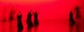
| 03/24/2003 08:14:28 AM |
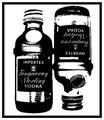
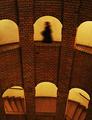
Silent Striderby stephanComment: Thank you for your comments. Yes, the "painted" look and the dark/eerie theme was what I was aiming for. Like a poster for a horror movie. I'm glad that many of you liked that. I increased the contrast quite a bit and sharpened it in post processing.
ChrisW123: Originally it was titled to the left and I rotated it. I had a version where the lines on top of the frame were perfectly straight, but somehow it appeared to me that the image was still "toppling" to the left. I think it's because of the balance of the image and the way the stairs go up. So I rotated it one degree more to the right and it looked much better to me.
StevePax and Rgold: The person was intended. I can't see why it would be distracting? From what? I mean the person really is the point of interest.
KAOS: Thanks :)
|
Home -
Challenges -
Community -
League -
Photos -
Cameras -
Lenses -
Learn -
Help -
Terms of Use -
Privacy -
Top ^
DPChallenge, and website content and design, Copyright © 2001-2025 Challenging Technologies, LLC.
All digital photo copyrights belong to the photographers and may not be used without permission.
Current Server Time: 08/12/2025 06:46:20 AM EDT.