| Image |
Comment |
| 06/27/2002 09:24:00 PM |
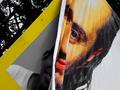
Transitionby sanandanComment: interesting angle but i'm not sure if it makes the photo better in this case. when i rotate my head to the right then it looks even more interesting ;-) then the dark and a bit distracting background could be cropped out, too. porttrait format would be better then of course. photo 8, creativity 9, city life 7 = 8 |
| 06/27/2002 10:11:00 PM |
Home Sweet Homeby rll07Comment: nice shot! maybe a little less DOF could have helped to put the "home" even more into focus and take away focus from the pedestrians. |
| 06/27/2002 09:08:00 PM |
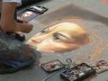
A picture of a drawing of a portraitby adak69Comment: well done! good DOF, the chalk in the foreground and the smaller picture in the background are both sharp. the painting is in the middle that's also good. only thing distracting are the orange lines in the upper right corner. but i see that when they would be cropped out the top corner of the painting would also be cropped which actually would be worse. maybe a different angle could have helped. photo 9, creativity 8, city life 9 = 9 |
| 07/01/2002 07:21:00 AM |
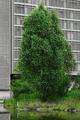
Urban Oasisby stephanComment: I photographed something else when suddenly the heron appeared. I hadn't much time taking pictures because he walked away after some time. I did some closeups but my camera doesn't have such a good zoom and this one already was zoomed in quite a bit. jmsetzler: Actually the building in the background was brightly orange. I decided to desaturate it and only leave the green to stress the contrast between the "oasis" and the city more. myqyl: Yes it was taken handheld. I don't own a tripod. I also had to sharpen it quite a lot using the "unsharp mask" in Gimp. The original looked very "washed out". I struggled a lot with the moiree effect of the building in the background. That's also why I chose "unsharp mask" instead of "sharpen". It had better results. Many thanks for your comments. I didn't expect such a high score but now I'm very happy with it :-) |
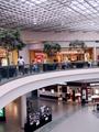
| 06/30/2002 09:08:00 PM |
Mall Shoppingby pnichollsComment: Malls are boring.. ;-) Also maybe you should have used a faster shutter speed because some people are blurred. I know, slower shutter speeds give this nice effect of creating activitiy in a photo but this only works when there are more people... I also think it would have been better when you photographed just one of the levels. Currently it's hard for the viewer to decide where to look at on this photo. There are two photos in one ;-) The center shows boring concrete which devides the photo. Photo 5, Creativity 2, City Life 6 = 4 |
| 06/27/2002 09:41:00 PM |
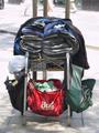
Basket Caseby GotchaComment: good shot! i like the statement and it's definitively something you'll see only in cities. somehow i think the photo would be better without the hydrant but i guess you couldn't push him a little down the street ;-) photo 9, creativity 7, city life 10 = 9 |
 Photographer found comment helpful. Photographer found comment helpful. |
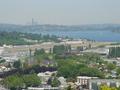
| 06/27/2002 08:39:00 PM |
Renton, Seattle, Airport, etc.by SwashbucklerComment: To me the photo is a bit too busy. There are just too many small things to look at, which the title ("... etc.") is also an indicator. The misty (?) weather is ok, because it creates a nice distance of the city in the background. But I don't see much "Life" (or an intended abscence of it as in other photos) or anything interesting going on. Photo 4, Creativity 4, City Life 4 = 4 |
| Photographer found comment helpful. |
| 06/27/2002 09:35:00 PM |
In the bullpenby TSaylorsComment: very good shot! good motion blur and composition. interesting selection for "city life" but it works for me. photo 9, creativity 9, city life 8 = 9 |
| 06/30/2002 08:44:00 PM |
office spaceby willsy66Comment: Good photo! I love how the left building vanishes in the mist. I'm curious why you chose such an angle. I think it doesn't fit here and harms the photo very much. To me it's a very quiet and calm scene but the strange angle tries to create excitement. But a good "city life" shot anyway. It's like you can feel how these are the last calm moments in metropolis just before rush hour starts and the buildings fill with busy workers. Photo 8, Creativity 9, City Life 9 = 9 |
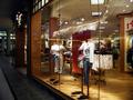
| 06/30/2002 09:21:00 PM |
Window Shoppingby shortredneckComment: Nice photo! I like the how the light in the window is captured. But there are two kinds of light in this shot. The one from the window and the one outside. I would have tried to crop out the left side of the photo to concentrate more on the window. Maybe an angle more frontal to the window could have helped, too. Photo 7, Creativity 7, City Life 8 = 7 |
Home -
Challenges -
Community -
League -
Photos -
Cameras -
Lenses -
Learn -
Help -
Terms of Use -
Privacy -
Top ^
DPChallenge, and website content and design, Copyright © 2001-2025 Challenging Technologies, LLC.
All digital photo copyrights belong to the photographers and may not be used without permission.
Current Server Time: 08/12/2025 07:13:32 AM EDT.