| Image |
Comment |
| 09/14/2002 10:29:00 PM |
|
| 09/07/2002 08:36:00 AM |
|
| 09/07/2002 09:40:00 AM |
Just One More Mileby jbolingComment: The plant in the foreground is distracting. Nevertheless a nice shot! I like the motion blur on the feet of the woman. -stephan |
| 09/07/2002 10:39:00 PM |
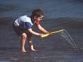
Washby mciComment: Very good photo! I like the overexposure. It makes colour of the red hair so strong. -stephan |
| 09/07/2002 10:20:00 PM |
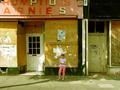
girl waitingby grahamgormanComment: Great composition. By showing so much of the surroundings and not zooming in the photo transports the loneliness very nice. -stephan |
| 09/07/2002 09:37:00 PM |
|
| 09/07/2002 10:22:00 PM |
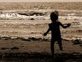
Spriteby FrooberComment: Beautiful back light photo. I like that the focus is on the waves and not on the girl. -stephan |
 Photographer found comment helpful. Photographer found comment helpful. |
| 09/07/2002 10:31:00 PM |
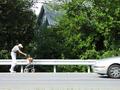
Progressby GolferDDSComment: Quite satirical ;-) I like it very much. I think the car element is good. It is a good contrast of speed vs. slowness and it only intensifies the slowness of the old man. The motion blur is good (makes the car look speedy). -stephan |
| 09/07/2002 10:27:00 PM |
Carefree Summer Daysby BigSmilesComment: Very nice photo. But I think it wouldn't hurt if you increase saturation a bit more via postprocessing. Especially the blue of the sea is more like grey. Also the photo seems to have a haze on it. -stephan |
| 09/09/2002 10:11:00 AM |
Disagreementby stephanComment: It was primarily being at the right place at the right time :-) For an explanation what was going on please see the "details". I intentionally tweaked the colours. I desaturated the red a little because it was too colourful overall and I wanted to direct the eyes focus to the green hair of the guy in the foregound and the police. Special thanks to grahamgorman whose comment was especially insightful. When I looked at the pictures at home I noticed that, too. The fingers almost vanish in the skin tones of the "masses". A contrast to a blue sky or such would be better. But I was lucky to get this elevated place and having a good overview of the crowd. I think shooting from a lower angle wouldn't get the desired result because the place was surrounded by buidlings of the same tone (as seen in the background) and I would have lost the tension between the police and the crowd. Regarding the blue. I tried! ;-) But somehow I couldn't desaturate them without also desaturating the green. So I left it and thought that maybe the guy in the backround (disinterested looking to the right) is a nice additonal subject for people exploring the photo a bit longer. Thanks to all for your comments. |
Home -
Challenges -
Community -
League -
Photos -
Cameras -
Lenses -
Learn -
Help -
Terms of Use -
Privacy -
Top ^
DPChallenge, and website content and design, Copyright © 2001-2025 Challenging Technologies, LLC.
All digital photo copyrights belong to the photographers and may not be used without permission.
Current Server Time: 08/14/2025 04:23:53 PM EDT.