| Image |
Comment |
| 08/06/2003 07:09:45 PM |
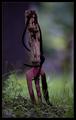
My Garden Dwarf went on vacationby arnitComment: Hey, jetzt hab ich dich! Bring my garden dwarf back!!!
Just kidding ;-) But when I saw this photo during the challenge I immedeatly remembered a story I read in the newspaper about how somebodys garden dwarf went on vacation and sent a postcard back with a picture of himself at a caribbean beach. Your dwarf seem to have been catched by the same kind of wanderlust. :-) I like the humour in the photo and I think it's also technically a great photo. So I gave you a 10, but I didn't finish voting on the 20% so that probably didn't help you much.
Anyway, I would also love to see the complete album at the end or maybe the dwarf will now have an appearance on DPC more often?
|
| 08/06/2003 06:45:34 PM |
Garden workby heidaComment: From all the photos in the challenge, your photo conveys the "in the garden" theme at best. I like the colours and the shallow depth of field. Well done! |
 Photographer found comment helpful. Photographer found comment helpful. |
| 08/06/2003 07:38:10 AM |
Under Constructionby stephanComment: I'm happy that the photo did relatively well and people liked joke.
I didn't recognise the reflection in the windows as a distratcing element before. But I agree that it would have been better without it. Time to by a polariser filter :) |
| 08/06/2003 07:33:46 AM |
Mystic Underwater Gardenby ndsComment: Ein bahnbrechendes Photo! Fast niemand hat es wohl als Unterwasserbild erkannt ;-)
Trotzdem, Gratulation zum 6+ Score, Brüderchen :) |
| Photographer found comment helpful. |
| 08/06/2003 07:33:21 AM |
I want to grow...by KAOSComment: Also ich mag das Gegenlicht! Daher finde ich auch, dass kein Aufhellblitz nötig wäre, wie einige sagen. Es ist sicher ein Schnappschuss, wo man nicht alles so perfekt machen kann, aber schön wäre noch gewesen, wenn bei kürzerer Belichtungszeit die Wassertropfen glitzernd "eingefroren" wären. Mir gefällts aber trotzdem, wegen der Idee dahinter. |
| 08/04/2003 03:52:18 PM |
All Saints' Churchby e301Comment: Greetings from the Critique Club, Ed.
Composition: Of course the angle is the most outstanding feature of the photo. I like it because it makes the photo different and interesting. I like that but it seems a bit unmotivated. It's not apparent why you chose the angle. I rotated it in my image editor and it looked rather boring in a normal angle. Also the subject doesn't seem to fit to that chaotic and strange angle. A bar a night with neon signs or something like that would have been better. However, the composition is good. The diagonals do their work and the clock in the corner is great.
Lighting: The photo looks a bit bland. I would like to see more contrast, especially in the pillars.
Focus: Some parts look a bit soft. I'm not sure of it comes from the aperture or from Neatimage, but the overall focus is ok.
Challenge: The photo sure fulfills the challenge theme. Now I have an idea why you possibly have used that angle. That diagonal composition makes it possible to "cram" much more of the church into the frame and thus visually filling the frame to a greater extent. If that really was your intention then I think it worked. But unfortunately your comments don't tell us your reason. When stirring up so much controversy, I think we deserve a denouement (is that the correct word?) ;-)
Creativity: Having the courage and trying such an unusual angle is creative in my opinion. I hope you aren't deterred by the score and stop doing such more "experimental" shots.
Good luck for your future challenges,
Stephan
|
| Photographer found comment helpful. |
| 08/02/2003 10:03:58 PM |
shortcutby spidermanComment: Greetings from the Critique Club, John.
Composition: The composition is very strong. I like the simplicity. For example clouds in the sky would have been very distracting in my opinion. The diagonal lines draw your attention to the bottom of the photo. I think it's good as it is now but I wonder how it would look like if the people would sit in the chair on the right lane near the bottom.
Lighting: Exposure is good. The selective desaturation is subtle but fits very well. This is the "icing on the cake".
Focus: The narrow aperture was a good choice. I think a shallow DOF where maybe some of the seats have a softer focus wouldn't look as good as it's now.
Challenge: I think this is the weak part of the photo. Don't get me wrong. It is technically a great photo and in my opinion it also fits to the challenge. But when you look at some of the other top-photos (e.g. the winner) then you see that there is a great contrast regarding the subjects. I see contrasts in your photo, too. E.g. the empty seats vs. the two people and also colour-wise, but it's a bit too subtle to be recognised immedeatly and also not very strong (as compared to for example the hands of the winning photo).
Creativity: Well, the photo certainly does not look like just a snapshot. The composition and the selective desaturation sure shows creativity.
Ok, I probably couldn't help you very much. But this is also because your photo would have been a 10 in my book. It's hard to write a CC critique for good photos :) |
| 07/30/2003 08:41:46 PM |
Flip Flop Sandalsby stephanComment: Thank you for the many comments! Never got such controversial comments about my border. One said that it's too pale, and the next comment says it's too prominent. ;-)
Actually I made a mistake. I finished the photo on my laptop which has a problem with the TFT. The colours look much less saturated there and have a blue tint. So the photo actually shouldn't be so oversaturated and also the border should be less yellow.
@miller: I tried to remove the sticker from the sandals, but it was not possible without leaving ugly remains on it.
@mediamst: Actually I like the chaotic look of the grass. It's only the background, the sandals were the subject where I wanted to lead the concentration to.
And I almost forgot: Special thanks to my cousin darksusi! She lent me her beautiful sandals to make this photo possible :)
|
| 07/20/2003 09:39:34 AM |
|
| Photographer found comment helpful. |
| 06/27/2003 09:11:33 AM |
Timeless Youthby dodobirdComment: If people couldn't see something they really should fix their monitor settings. I can see your son very good. And I like your technique! It makes the photo interesting. The face of your son expresses a somewhat darker mood and the very dark lighting goes with that. |
| Photographer found comment helpful. |
Home -
Challenges -
Community -
League -
Photos -
Cameras -
Lenses -
Learn -
Help -
Terms of Use -
Privacy -
Top ^
DPChallenge, and website content and design, Copyright © 2001-2025 Challenging Technologies, LLC.
All digital photo copyrights belong to the photographers and may not be used without permission.
Current Server Time: 08/12/2025 09:00:11 AM EDT.