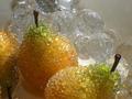
DPChallenge: A Digital Photography Contest You are not logged in. (log in or register
 
Browse Settings
Currently viewing:
Registered Userstephan

Show comments:

Per page:

Order:

Comments:


Comments Made by stephan
Pages:   ... ... [53]
Showing 171 - 180 of ~528
Image Comment
my dinner with ackbar
11/17/2002 07:27:00 PM
my dinner with ackbar
by johnny_justjohnny

Comment:
Funny photo! I know Admiral Ackbar, I'm a big fan of Star Wars and although I didn't had these action toys when I was a child this photo reminds me when I was younger when I was playing with my dinner instead of eating it ;-) Good lighting. The DOF is in my opinion a little too narrow, because the green object to the left (belonging to the dinner) could be sharper. -stephan
Photographer found comment helpful.
Too Close For Comfort
11/18/2002 07:04:00 AM
Too Close For Comfort
by ambaker

Comment:
Alex, it's a really nice photo. I like the colour and the focus although I think the DOF is too narrow. But I guess you couldn't take your time to setup your tripod over the fire and use a longer exposure ;-)
Photographer found comment helpful.
Annular Rings
11/17/2002 07:53:00 PM
Annular Rings
by MaYz

Comment:
Good lighting it shows the interesting texture very good. -stephan
Pussy Galore
11/17/2002 07:40:00 PM
Pussy Galore
by howza

Comment:
Very well done cat photo! I like the coloured tint and the sharpness is great. I also like your composition. -stephan
Golden Pears
11/25/2002 07:43:00 PM
Golden Pears
by kathleenm

Comment:
Hello kathleenm! This is a critique I do by assignment of the "Critique Club" currently forming here on DPC. Just in case you wonder why you get a comment so late ;-)

Composition: One of the things I learned is that photos almost always look better when you keep them simple and concentrate on a detail instead of showing too much of a scene. But this is the case here. The photo looks very crowded and cluttered with different objects.

Because the front pear is out of focus and the left pear is only seen halfway the viewers eye is guided to the pear in the middle. So that seems to be the primary object and the subject of the photo. But as soon as the viewer accepts the one pear as "the" subject the other objects distract from it. Especially the crystal grapes in the background.

So at first I would have tried to concentrate on either the crystal grapes or the pears, or even just one of the objects. This especially makes sense in a macro challenge where everybody expects a very closeup photo (not meaning you have to go "mainstream" and do what people expect ;-)).

Another thing which I count in to "composition" are the following two observations: The photo looks a bit unbalanced. This is due to the angle you used, but I think the area in the upper left corner looks very empty.
The second observation is a merger of the middle and the left pear. Because of the lighting and because they are so close together they look as if "grown" togther. I think that's not so good although it's only a minor issue.

Lighting: In your photo details you said, that you used natural sunlight as your lighting. Personally I think that sunlight can be one of the best light sources in photography, but in your photo it's not visible that it really is sunlight. Actually it looks a bit unnatural, although I can't really say why. What I would love to see is some kind of sparkling because the objects are made of glass. This would add some "wow" to the photo and would show that you actually used the sunlight. E.g. try to let the sunlight come from behind the subject. I like the colouring of the pears. I would have worked a bit more in that direction to stress that, e.g. by using a more complementary colour like blue, red or purple in the background or otherwhere to accentuate your subject.

Focus: I looked up the specs for the Powershot G1 and it says the smallest aperture is f/8. So I think the "19" you entered was a typo of some kind. That said I think your aperture is too wide, because the DOF is a bit too narrow. At least it doesn't cover the pear in the front. I don't see why the one pear in the middle should be in focus while the other one not. They both look the same and there is no other characteristic which would make them different. That's why I don't see much point in your DOF. But I see that in macro mode it's really difficult to get a wide DOF.

Art: I think you showed some creativity by taking a different approach instead of the flower or bug photos you usually see in macro shots. I also think you fulfilled the challenge topic.


Overall I don't really like the photo that much and I think you did better ones already. But please keep in mind that this is my personal opinion only. Anyway, I hope my feedback helps you understanding why I think the photo could be done better.

Cheers,
Stephan
Photographer found comment helpful.
Changes
11/17/2002 07:17:00 PM
Changes
by PM76227

Comment:
Nice autumn shot. I like the colours. Try saving in hight JPEG quality next time, because your photo looks quite pixelized and unsharp. You can use up to 150 kB when submitting a photo to this site. -stephan
Illusion
11/13/2002 10:13:00 PM
Illusion
by Ilona57

Comment:
Nice idea, but I think I would have zoomed more in to the waterdrop. -stephan
corn, filmed in Technicolor(tm)
11/17/2002 07:01:00 PM
corn, filmed in Technicolor(tm)
by LauraK

Comment:
Is this really corn? It looks more like onions. Very interesting. I don't know about the leaf in the foreground. On theone hand it seems to distract from the subject but on the other it gives a nice sense of depth. But I think it distracts more that it helps. At least in this position. A little higher would be better. -stephan
Mollusc
11/17/2002 07:19:00 PM
Mollusc
by Perico

Comment:
Cool abstract! I like the lighting. -stephan
Nuclear Death
11/18/2002 06:04:00 AM
Nuclear Death
by stephan

Comment:
The light source was a glowstick like the ones divers use underwater. It's really a nice toy and an interesting light source for photography. While playing with that glowstick I found a dead midge (wasn't a spider) on my ledge. I didn't kill the midge for the photo (never would do that) but despite it lived well from my blood (*grrr*) it seems that was not enough.
Anyway, somehow the idea formed in my mind to take a stance against nuklear energy by showing that radioactive material kills us. Shocking! :-)

@ambaker: I really enjoyed your explanations. Special thanks to you! But I think people will believe the fake radioactivity like I presented it in the photo more than as if I would taken a photo of a real radioactivity effect like you described. Stange thing, isn't it?

Thank you all again for your comments. Not a single critical one! Please be more negative ;-)
Pages:   ... ... [53]
Showing 171 - 180 of ~528


Home - Challenges - Community - League - Photos - Cameras - Lenses - Learn - Help - Terms of Use - Privacy - Top ^
DPChallenge, and website content and design, Copyright © 2001-2025 Challenging Technologies, LLC.
All digital photo copyrights belong to the photographers and may not be used without permission.
Current Server Time: 08/14/2025 04:46:51 AM EDT.