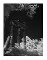
DPChallenge: A Digital Photography Contest You are not logged in. (log in or register
 
Browse Settings
Currently viewing:
Registered Userstephan

Show comments:

Per page:

Order:

Comments:


Comments Made by stephan
Pages:   ... [53]
Showing 1 - 10 of ~528
Image Comment
Setting A Heart On Fire
02/05/2004 03:38:44 PM
Setting A Heart On Fire1st Place
by nds

Comment:
I congratulate you to this great photograph my brother! I like special lighting tricks very much and this is clever idea. I think this photo really is one of your best!
Photographer found comment helpful.
Illinois Fields
09/29/2003 09:16:26 AM
Illinois Fields
by pitsaman

Comment:
This photo somehow reminds me of "The Shire" from Lord of the Rings. Nice romantic rural landscape.
Photographer found comment helpful.
Survival Of The Fittest
09/24/2003 06:25:17 AM
Survival Of The Fittest
by stephan

Comment:
Unfortunately I hadn't much time fixing the lighting. But I also liked the snapshot-like look, because it made the photo more candid, as if shot in a hurry. This conceals a bit the fact that the photo was staged.

Anyway, was much fun shooting the photo and it's nice to see that some people had as much fun viewing it.

Many thanks to Thomas for posing for this shot!

Message edited by author 2003-09-29 07:42:24.
Gaia
09/21/2003 08:28:04 AM
Gaia
by anireno

Comment:
I think it's a wonderful idea to portray "mother earth" for a "life" challenge.
Photographer found comment helpful.
Ruins
09/15/2003 11:25:23 PM
Ruins
by stephan

Comment:
Oops, I just saw that I didn't leave my obligatory post-challenge comment to this photo... Well, to be honest I was a bit disappointed by the score. I thought it would do better in this challenge.

I put some effort into it. I did the shooting on two days test different lighting conditions by different positions of the sun. Postprocessing was difficult, because heavy changes to the contrast/levels etc. would increase the grain from the long exposure time.

Some people complained about the big border. That was inspired by Remie who sometimes uses big borders, too. First I didn't like bigger borders (or borders for that matter) but then I somehow thought it would fit. When you go to a exhibition, photos are often displayed in white mats/passepartout which give the photo a proper and clean surrounding. That's what I wanted to imitate here.


On to some direct responses:

@tyrkinn+vjoz: You're right, the contrast between the ruins and the sky is low but I wanted an overall dark theme. The challenge was "desolation" and the subject are ruins, I think it's clear why I didn't want a stark black&white contrast.

@amsmyth+tomc: That way the most helpful hint. The infrared light made the bushes and trees so white. I didn't see it when submitting but now I agree that this does not fit. I think it's distracting and lightens the image too much.

@'Pong+Fayech: It's not processed very much. The effect comes from the infrared filter and is not some digital effect.

@tarique: I admit that I used the infrared filter just for fun. I thought it would give the lighting a more ghostly/out-of-this-world feel. But it seems that didn't work out.

@ceovishy: No I can't share the non-negativised version of the photo because it isn't negativised (I think you mean "inverted").

Anyway. Thanks to everybody for your feedback. As always it was very helpful.
The Brandeburg Gate
08/25/2003 08:36:59 AM
The Brandeburg Gate
by kiwiness

Comment:
Hey, I know that monument, too! :) Greetings from Potsdam. --Stephan
Photographer found comment helpful.
Victory Column - Berlin
08/25/2003 08:36:46 AM
Victory Column - Berlin
by Anastasia

Comment:
Hey, I know that monument! :) Greetings from Potsdam. --Stephan
Photographer found comment helpful.
Imagine...
08/17/2003 07:58:05 PM
Imagine...2nd Place
by e301

Comment:
Greetings from the Critique Club, Ed! :)

Composition: I think the composition is great. I also like the fence. It gives the photo it's rural "setting" which makes your trick more plausible, because it really looks as if it's an abandoned nuclear power plant in the country. It also adds a perspective and depth to the image to see the fence in the foreground in relation to the towers in the background.

Lighting: Well, sunny weather is always nice. I see a good use of shadows. The lighting from the side creates shadows on the towers which make them look more plastic. This added depth again prevents the image from looking flat.
You also did a great job of adding the proper shadows of the flowers to the image. I think the lighting is the most difficult part of such fake photos. That's what decides whether the illusion is successfull or not. If the lighting looks out of place then people won't accept it. And to me it looks very real!
The only nitpicking thing I can find is the darker area in the lower right corner. It's not distrating or aother wise a big deal, but still I would like to see it being the same lighting as the other part of the fence.

Focus: I don't know what aperture you used for your "base" image of the fence+towers photo but it probably was a small one. The depth of field is very wide which is good because you really need everything in focus here. Normally photos tend to look a bit flat then but there are other things to prevent this (see above). The only noticeable focus issue I don't like is that some areas on the flowers on the two leftmost towers look a bit too soft. It seems they don't match the focus of the tower they're sitting on.

Challenge: You met the challenge very well. It's a great idea to convey this theme. It's something many people immediately understand. Personally I hope that this future will come true :) I'm sure this photo would work good as an advertising. It also would be a great poster for the election campaign of the greens!

Creativity: No question. This is really creative! First your matrix entry, now this. You really have great ideas! I knew why I added you to my favourite photographer list (already in april) ;-)

I look forward to your future photos. Good luck!
Stephan
Photographer found comment helpful.
Statue in the Garden
08/12/2003 12:08:10 PM
Statue in the Garden
by jxpfeer

Comment:
Greetings from the Critique Club, Jason :)

Composition: In my opinion there is much room for improvement. I have the following suggestions: The background is very "busy" meaning it distracts from your subject. Blurring the background by chosing a more shallow depth of field (see below) could have helped. Because of the wide depth of field the photo lacks visual depth meaning it's very 2D. One effect of this is for example that the palm leaf in the background looks as if it's "growing" out of the head of your statue. Then I think the statue was cropped too much at the bottom, the foot is missing. And as Konador already said, the statue seems to fall over to the right side. It should be rotated.

Lighting: The lighting is very flat. I know you probably couldn't change it at that moment, but this way it looks a bit boring. Some light from the side would create some shadows highlighting the structure of the statue and thus add more drama to the photo.

Focus: Everything is in focus. While sometimes this is a good thing sometimes it's better to direct the viewers concentration on your subject by blurring the backgound. Chosing a wider aperture to create a more shallow depth of field would be the solution. This also would have given your photo additional visual depth.

Challenge: The challenge was clearly met.

Creativity: Well, overall I would say this is more a snapshot than a photo you put much thought into. It certainly fits the challenge but at least to me it's not very interesting. People have different tastes though ;-)

I just saw that this was your first photo on DPC. I don't know how much experience in photography you have in general, but I suggest reading through the tutorials on this site and on the internet. Try recreating the techinques described there. This helped me a lot when I started with photography and I'm still learning ;-)

Good look in future challenges!

Stephan
Church
08/10/2003 01:29:02 PM
Church
by russi

Comment:
Greetings from the Critique Club, RĂșnar :)

Composition: I like the composition. The angle below makes the church look more mighty which somehow fits to the historic context. On the other hand the church being made of wood does not look like a very monumental one ;-) Seeing the sky is nice. To me it conveys the heavenly part of the building.

Lighting: In my opinion this is the weakest part of the photo. The lighting looks very normal and flat and generally a bit overexposed. I also would like to see more contrast. I loaded you photo into my image editor and did contrast +110 and lighting -80. I know that my taste is not shared by many people but I would like this much more than the current lighting.

Focus: Everything is in focus. I think that's appropriate.

Challenge: Well, I agree with the people that it doesn't fulfill the "fill the frame" challenge. But you'd lose only one point for that on my scale. But when I look at your final score I guess other people vote more strictly...

Creativity: The subject itself is not that interesting but your angle made it.

Good luck in the future challenges,
Stephan
Pages:   ... [53]
Showing 1 - 10 of ~528


Home - Challenges - Community - League - Photos - Cameras - Lenses - Learn - Prints! - Help - Terms of Use - Privacy - Top ^
DPChallenge, and website content and design, Copyright © 2001-2024 Challenging Technologies, LLC.
All digital photo copyrights belong to the photographers and may not be used without permission.
Current Server Time: 04/25/2024 04:20:56 AM EDT.