| Image |
Comment |
| 07/16/2004 01:50:06 AM |
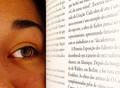
Words of Wisdomby portComment: This shot suffers a little from jpeg artifacts around the text. If you had got closer to the 150k limit it would have been much better. it's only 53k.. Nice image though, although I don't read german? Italian? :-). |
 Photographer found comment helpful. Photographer found comment helpful. |
| 07/16/2004 01:35:31 AM |
Light Tricksby dagills22191Comment: Neat idea.. Did you manage to write this that well backwards, or is the image flipped? Either way, neat.. I would have probably cropped it abouce the top of the words, but appart from that, did I mention neat? |
| Photographer found comment helpful. |
| 07/16/2004 01:31:25 AM |
Tongue Twisterby vtruanComment: Asside from the lack of words, this shot is a bit dark around the eye's for a full frontal portait, and you've broken one of the unwritten ruls of photography, especially a woman (Albeit a young one)... Don't take up nostril photos... :-). |
| Photographer found comment helpful. |
| 07/16/2004 01:25:45 AM |
canonby letheComment: The black stripe on this is quite distracting.. Almost looks like the shots you get when you have the shutter sync wrong on an old SLR... the over exposed highlights on the fingers are also very distracting from the lenscap, a diffuser on the flash, or bounced flash would have worked much better for this I think. |
| 07/16/2004 01:22:39 AM |
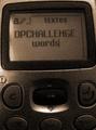
SMSby victor01Comment: What's up with the grain/noise in this shot? it appears to be a little underexposed, but that can't be it.. I'm a fan of grain/noise in shots where it works, but this looks odd somehow. A PS effect? |
| Photographer found comment helpful. |
| 07/16/2004 01:17:51 AM |
|
| 07/15/2004 04:53:21 PM |
The Mimesby ellamayComment: This is really well composed, but I would have been tempted to rotate it a wee bit clockwise, the lean to the left is a little distracting. |
| Photographer found comment helpful. |
| 07/15/2004 04:51:36 PM |
Splashby BearSilberComment: Is this plastisene? (sp). You've obviously gone to a great deal of effort to set this up, but it looks like at the last step you got some motion blur in the shot... |
| 07/15/2004 04:46:49 PM |
Stark/Starckby lindaqComment: This looks like a good clear image, but at 216x162px and only 17k, it is really not hitting the mark.. |
| 07/15/2004 04:38:18 PM |
Theby boomerComment: Not sure if the bird really belongs in this shot, it detracts from the simplicity a bit.. Really neat idea, and crisply executed. Well done. |
| Photographer found comment helpful. |
Home -
Challenges -
Community -
League -
Photos -
Cameras -
Lenses -
Learn -
Help -
Terms of Use -
Privacy -
Top ^
DPChallenge, and website content and design, Copyright © 2001-2025 Challenging Technologies, LLC.
All digital photo copyrights belong to the photographers and may not be used without permission.
Current Server Time: 08/05/2025 06:27:04 AM EDT.