| Image |
Comment |
| 06/11/2006 09:59:08 PM |
|
| 06/11/2006 09:58:41 PM |
Jasmineby PhotoTessComment: A nice basic compilation but it looks a little blown on the highlights on her forehead! |
 Photographer found comment helpful. Photographer found comment helpful. |
| 06/11/2006 09:58:11 PM |
|
| Photographer found comment helpful. |
| 06/11/2006 09:57:43 PM |
|
| Photographer found comment helpful. |
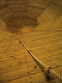
| 06/11/2006 09:57:17 PM |
Moving Dayby TommyMoe21Comment: I really like this photo. Very well done. Only thing that lets it down is the blown light and the light switch on the right! |
| Photographer found comment helpful. |
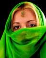
| 06/10/2006 12:57:05 PM |
In the darkness of liesby TUBORGComment: * Greetings from the Critique Club *
Hi Arnthor. This was one of my favourites from this challenge. It's amazing to have a photo score as well as this but not have it make your front page of best photos, which says a lot about your work!
You've got a great exposure on this shot, with just enough light spilt onto the background to help define her profile in the darkness. Your models skintones look well balanced and offers up a soft feel but with a nice crispness in the focus. Your use of lighting has added drama to the photo and you've worked in a fantastic crop.
If I was to pick a complaint on this the only thing that would spring to mind is I wish I could see a little more of her eye by having the light slightly lower but I'm really clutching at straws by saying that as this photo has worked really well. The only reason I say this is because her eyes are a beautiful shade of blue and is a real focal point in the image.
You have some amazing work in your portfolio and I'm sure it's only a matter of time until you pick up a ribbon or 10. Well done and best of luck with your future challenges.
Neil |
| Photographer found comment helpful. |
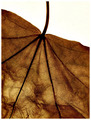
| 06/09/2006 01:09:26 PM |
Senescenceby rubienneComment: * Greetings from the Critique Club *
First up, well done on your 2nd entry in DPC challenges. This is a simple photo showing great detail in the leaf. Looking at your comments you also made the most of a simple lighting setup.
I agree with some of the comments you received about filling the frame with your subject rather than having the white background in the top corner, but by doing that you may run the risk of people looking at it as too much of an abstract of some sort.
The lovely warm tones of the sepia filter are apparent here and works really well with the leaf. Your focus seems to be pretty close to spot on except slightly around the edge of the leaf at the top.
Well done on this entry and it scored very well. Best of luck with your future challenges.
Neil |
| Photographer found comment helpful. |
| 06/09/2006 09:39:29 AM |
|
| Photographer found comment helpful. |
| 06/09/2006 09:33:49 AM |
Viridianby bryantbusComment: Would of been a great photo if you had of nailed the focus on the eyes. They are not sharp enough. A slight bit of blowing out on the top right too. Great effort otherwise! |
| Photographer found comment helpful. |
| 06/09/2006 09:31:18 AM |
|
| Photographer found comment helpful. |
Home -
Challenges -
Community -
League -
Photos -
Cameras -
Lenses -
Learn -
Help -
Terms of Use -
Privacy -
Top ^
DPChallenge, and website content and design, Copyright © 2001-2025 Challenging Technologies, LLC.
All digital photo copyrights belong to the photographers and may not be used without permission.
Current Server Time: 08/14/2025 06:14:34 AM EDT.