| Image |
Comment |
| 05/14/2004 05:14:40 PM |
|
 Photographer found comment helpful. Photographer found comment helpful. |
| 05/14/2004 05:13:21 PM |
|
| Photographer found comment helpful. |
| 05/14/2004 05:10:58 PM |
Sweet & Sourby Brooklyn513Comment: Good - sweet vs. sour does convey an "opposite." The wood-grained background is a bit noisy - but the dark tone certainly allows the light-colored lemon and sugar (figure) to stand out. |
| Photographer found comment helpful. |
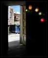
| 05/14/2004 05:07:39 PM |
inside outsideby ursulaComment: Nice work. Inside vs. outside. Lightness vs. darkness. Left vs. right. All cues are working together and convey some form of "opposite." |
| Photographer found comment helpful. |
| 05/14/2004 05:00:33 PM |
Simple Choiceby FirstyComment: a) On vs. off. b) Figure in focus vs. ground that's not. So, two opposites are apparent - yet neither cue is working to support/contrast the other. |
| Photographer found comment helpful. |
| 05/14/2004 04:53:33 PM |
Fattened Desert Lifeby mithandorComment: Red and green hues are contrasting hues - so that's an opposite. But, other than a difference in color, I'm not sure the differences between objects (rocks and cactus) also capture "opposite" - they seem, to me, related. |
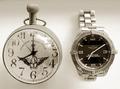
| 05/14/2004 04:50:01 PM |
tempus fugitby whiteroomComment: Nice. White vs. black. Old vs. new. Analog vs. digital. So yeah, I think the "opposite" concept has been captured by several simultaneous cues. Overall, a very nice photo with only one glaring exception - the reflected images on the "old" watch. |
| Photographer found comment helpful. |
| 05/14/2004 04:45:05 PM |
Sitting,standing or crawlingby pitsamanComment: Good detail - I like how the third animal is staring right at me. Not sure your title captures "opposite" however. Sitting and standing are different kinds of "stationary", while crawling is a kind of "motion." So yeah, there's a couple of individual opposites working here, but the picture as a whole doesn't convey a single message. |
| Photographer found comment helpful. |
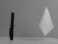
| 05/14/2004 04:39:42 PM |
Deadly Oppositesby rigelComment: Black vs. white and war vs. peace - contrasting tones and symbols working together - that's good. Image appears very grainy - I think the contrast apparent in your background detracts from the contrast you've established between your two objects. |
| 05/14/2004 04:36:14 PM |
Charged Oppositesby drgsoellComment: The "opposites" concept is obvious - that's good. I don't understand why the set in the background is included given that the set in the foreground is in better focus and conveys the same message. Perhaps you might have extend the series (include more battery pairs) or reduced it to a single set. |
| Photographer found comment helpful. |
Home -
Challenges -
Community -
League -
Photos -
Cameras -
Lenses -
Learn -
Help -
Terms of Use -
Privacy -
Top ^
DPChallenge, and website content and design, Copyright © 2001-2025 Challenging Technologies, LLC.
All digital photo copyrights belong to the photographers and may not be used without permission.
Current Server Time: 08/03/2025 07:35:03 PM EDT.