| Image |
Comment |
| 05/15/2004 01:43:09 PM |
"Black & White," On The Rocksby whagerbaumerComment: Interesting - it seems like the birds have been "punched-out" of the image to reveal a black background. Black vs. white. Organic vs. inorganic. Smooth/flat texture (birds) vs. grainy texture (texture). Overall, I think all of your visual cues are working together to support the "opposite" concept. |
 Photographer found comment helpful. Photographer found comment helpful. |
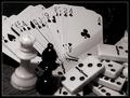
| 05/15/2004 01:36:35 PM |
Black & White Gamesby HotchieComment: Indeed, black and white are opposites, but your objects are not. As your title indicates, all are different kinds of the same thing: a game. So, I think there's a mismatch between visual cues - the differences in tone (black vs. white) and the variations of game don't support each other. |
| Photographer found comment helpful. |
| 05/15/2004 01:32:31 PM |
Chalk & Cheeseby dhareComment: Wow - great photo. Your colors and tones really help differentiate your two objects (cool colored chalk and warm colored cheese). Neutral background texture is nice too. Perhaps I'm missing the point, but how are chalk and cheese opposites of one another? Perhaps edible vs. inedible? |
| Photographer found comment helpful. |
| 05/15/2004 01:27:00 PM |
Architecture: New and oldby eirasiComment: Nicely done - your title helps. The new international-style glass structure and the old (gothic? romanesque?) building do provide an intersting contrast. Silly architect. The image seems a bit dark - the brightest objects are the clouds, which, in my opinion, don't stay in the background where they belong. |
| Photographer found comment helpful. |
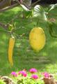
| 05/15/2004 01:21:44 PM |
Laurel and Hardyby vaguiloComment: I think your title helped me - otherwise I would have thought "different" and not "opposite." I like how your figure has focus and your ground does not, but I think the flowers (at bottom) provide too much contrast -- they don't seem to stay in the background despite the lack of focus. Perhaps others will disagree, but I think the flowers (at bottom) are competing with your lemons for attention. |
| Photographer found comment helpful. |
| 05/15/2004 01:16:57 PM |
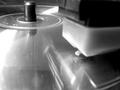
CD Turntableby utopian mangComment: Nice idea, but I don't think you've captured "opposite." Two different kinds of media perhaps, but not two opposite kinds of media. Incidentally, why did you choose to focus on the eye of the CD rather than the needle of the turntable? |
| 05/14/2004 05:51:35 PM |
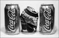
Fierce Competition!by doctornickComment: So which do you drink? Background is, perhaps, too light - which doesn't allow your objects to consume the entire grey scale. The words "Coca Cola" are white on a can, but appear neutral grey in your image. You definitely captured "opposite" though. |
| Photographer found comment helpful. |
| 05/14/2004 05:48:37 PM |
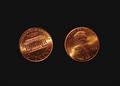
heads or tailsby kevintuftsComment: Nice concept, but inefficient use of negative space. Also, the pennies (as a set) appear slightly left-of-center. |
| Photographer found comment helpful. |
| 05/14/2004 05:47:05 PM |
|
| 05/14/2004 05:46:29 PM |
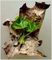
A New Life Has Sprungby HRoxasComment: Beautiful detail and frame. Young small green leaves vs. old large brown leaf. You captured "opposite" and all of your visual cues support each other. I like your figure vs. ground, too. |
| Photographer found comment helpful. |
Home -
Challenges -
Community -
League -
Photos -
Cameras -
Lenses -
Learn -
Help -
Terms of Use -
Privacy -
Top ^
DPChallenge, and website content and design, Copyright © 2001-2025 Challenging Technologies, LLC.
All digital photo copyrights belong to the photographers and may not be used without permission.
Current Server Time: 08/04/2025 11:35:15 AM EDT.