| Image |
Comment |
| 11/12/2004 04:44:55 PM |
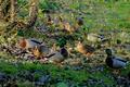
November: -Ducks of the Northwest-by ssodellComment: I don't find the image very interesting, not because of the subject matter. In fact I believe that anything in this world can be photographed beautifully.
The photograph looks like a mess. Birds are every where and your eyes are moving arr around. There's nothing that really grabs your attention. I think if you had waited or were able to capture maybe just one bird sharp in focus (in an interesting way) and forget about the rest, it would have made the image much stronger. The way it is now, I actually don't know what I should be looking at or what the image is about.
Hope take more shots and experiment with different settings. Best of luck. |
 Photographer found comment helpful. Photographer found comment helpful. |
| 11/12/2004 04:41:11 PM |
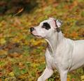
Falling in November by Rando D300Comment: That's a great capture. I really like it. But I do feel that there's too much or less of the dog. It's a bit 'not right'. I have a feeling that something like a 6x4 crop starting from the top would work better. I don't the bottom half of the image, but the toip half is brilliant. I think just the dog's head and the leaves would have made a better image. I feel that everything else in not really needed here. I have to bow to you for this capture. Well done. |
| Photographer found comment helpful. |
| 11/12/2004 04:36:15 PM |
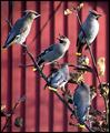
Novemberby MonaComment: I like the 2 birds on the top left and the one on top right. But combined with the rest of the stuff going in the image, it does look a bit cluttered. Also, I think the processing has made them look a bit unreal, like rubber. There's no detail on the birds. It's way too smudged. I don't know what you used to do it, but it doesn't look good. |
| 11/12/2004 04:02:08 PM |
Januaryby cabaComment: EH! what the f*** is that!!!
Looks like someone has been busy hunting humans. I really don't think I want to see that on a Calendar. Whatever is in there, it's not something I want to see for a whole month. |
| 11/12/2004 03:59:56 PM |
Novemberby JohannesFrankComment: Looks like you have treated it like a gallery challenge. :)
I like the image, but the framing is taking away the detail because the image itself is small. I would like to see a bigger version of it. |
| 11/12/2004 03:54:54 PM |
Novemberby bpickardComment: I really like this image, but I would have preffered it without the bright patch at bottom right. Also, I don't think that a website is the place this one should be on. It needs to printed large and displayed on a wall. |
| Photographer found comment helpful. |
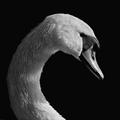
| 11/12/2004 03:52:31 PM |
October (Audubon Calander)by ellamayComment: IT IS BEAUTIFUL!!!!
Just sitting here and starring at it. Great Great capture. I love how the neck forms the curve and how you have cropped to balance it all. The detail is brilliant and the B&W conversion is excellent. I love this image. It's a beauty! |
| Photographer found comment helpful. |
| 11/12/2004 03:47:09 PM |
Miss Decemberby wkoffelComment: Is she? :)
I think the light balance in this is a bit off for a pleasent image. Her shadow in the background and the bright patch at bottom left takes away a lot. I think moving her a bit away from the backdrop would have made it better (I have a feeling you would have done it if you had the space).
I like her expression, how you have captured it. I am sure you will be a bit unhappy with a few things in the image as well, and would surely be trying to get it right.
Best of luck. |
| Photographer found comment helpful. |
| 11/12/2004 03:42:30 PM |
Februaryby jmsetzlerComment: :)
Now you're talkin'
Kudos to you for coming up with it and submitting.
Like the softness and treatment of the image, conveying the gentle touch. |
| 11/12/2004 03:36:49 PM |
Septemberby davidbedardComment: The image is interesting but the treatment given to it is not. It looks all smudged. Doesn't look like a photograph (this could be bit of a stretch). But, my point is, this looks like the result of a badly exposed photograph forced to look nice with processing, or a really good photograph with too much messing about.
I like the compostion and the subject matter. |
| Photographer found comment helpful. |
Home -
Challenges -
Community -
League -
Photos -
Cameras -
Lenses -
Learn -
Help -
Terms of Use -
Privacy -
Top ^
DPChallenge, and website content and design, Copyright © 2001-2025 Challenging Technologies, LLC.
All digital photo copyrights belong to the photographers and may not be used without permission.
Current Server Time: 08/08/2025 01:33:22 AM EDT.