| Image |
Comment |
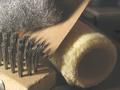
| 07/22/2005 02:23:14 PM |
Soft, rough and sharpby VanGoghComment: This certainly would have been a great shot if you managed to give it proper processing. Right now, even the dark shadows are so creamy that you feel like screaming. You have adjusted the tones in to to the point where I am having a hard time trying to understand how you can possibly achieve this. Black is present in a few dots, but the rest is just hazy.
I don't know if it's your monitor that's showing you something different or you have actually chosen to present it this way, but to me it looks really odd. A lot can be done to this image and it can be made so much better. Although I don't know, I feel that calibrating your monitor is the first step. |
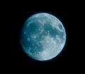
| 07/22/2005 02:18:25 PM |
the moonby JinboComment: This would have been a nice shot, but it looks like I am looking at through a coating of honey. Whatever the settings in your camera or the processing you did after has taken the detail otherwise present in shots of the moon. This moon looks more like a marble. |
 Photographer found comment helpful. Photographer found comment helpful. |
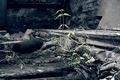
| 07/22/2005 02:15:18 PM |
Rough survivalby nico_blueComment: Interesting image. This ones requires time to analyze. It's beautiful. I would like to see a print of this. |
| Photographer found comment helpful. |
| 07/22/2005 02:09:39 PM |
nutby supermaxComment: Looks like the shot didn't receive proper focus. It certainly looks a bit blurry. If you could contro the camera shake and got the focus spot on, it would be a lot more interesting. |
| 07/22/2005 02:07:00 PM |
braidsby cheleComment: This is good. I like what you have chosen to shoot and how you have composed it. A bit more clarity would have helped the shot even further. Nice job. |
| Photographer found comment helpful. |
| 07/22/2005 02:05:11 PM |
|
| Photographer found comment helpful. |
| 07/22/2005 01:57:44 PM |
The seatby harrisxanComment: It's a beautiful B&W. It's a face on straigh forward shot, but it's the angle of light that works for me here. it creates the depth and brings it to life. Well done. |
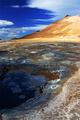
| 07/22/2005 01:55:25 PM |
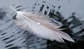
3 Textures for Texture III: Just a drop in the sea of timeby sallyplantComment: I like images like this. I did something similar for obsolete, not with much texture though.
I like how you see things (maybe because I look at similar things :))
I don't know how well this image works for this challenge, but, I don't think it's very strong either. I think it's the angle of light, combined with the overall sharpness of the image that doesn't make the bots of the feather pop out. The water is fine and I like it a lot. |
| Photographer found comment helpful. |
| 07/22/2005 01:51:55 PM |
Hungry yet?by nomad469Comment: I am a bit hungry but I will stick to the strawberries only.
I think you have elements in the image that you could have experinmted with closely on an idividual basis rather than throwing all of them together. The flower and the strawberries and whatever is under the plate could have been used as the main subject and explored.
What's been created now, to me, looks like a mess of objects fighting for attention and the colours make it worse. There's red popping out of everywhere, which is guaranteed to make you eyes follow and the rest is not very clear as to why it's there.
I don't know what you were trying to show, but, I think it would be better for a challenge like this if you could isolate something and explore it. |
| Photographer found comment helpful. |
| 07/21/2005 09:21:26 PM |
|
| Photographer found comment helpful. |
Home -
Challenges -
Community -
League -
Photos -
Cameras -
Lenses -
Learn -
Help -
Terms of Use -
Privacy -
Top ^
DPChallenge, and website content and design, Copyright © 2001-2025 Challenging Technologies, LLC.
All digital photo copyrights belong to the photographers and may not be used without permission.
Current Server Time: 08/18/2025 09:22:13 AM EDT.