| Image |
Comment |
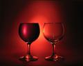
| 05/13/2004 04:47:04 PM |
full / emptyby redmoonComment: I do not think there's much to criticize here. It's just magnificent. I really like the lighting. The blackness that surrounds this scene gives it a real 3D look |
 Photographer found comment helpful. Photographer found comment helpful. |
| 05/13/2004 03:12:16 PM |
Indecisionby nathankComment: That object on the left-hand side is a bit distracting. The picture would look better without it. |
| 05/13/2004 03:07:32 PM |
|
| 05/13/2004 03:03:51 PM |
Light and Darknessby lojinhavirtualComment: Maybe it's just me, but I cannot see where the opposites are. Especially that what the main subject of this picture appears to be, is that animal |
| Photographer found comment helpful. |
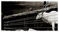
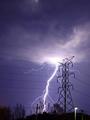
| 05/13/2004 02:42:31 PM |
Unbridled versus Restrained by BikeRacerComment: A good shot. You must have been really lucky to get that. Just one little comment: I feel that this picture would be more attractive had you positioned yourself in such a way that your camera pointed along the wires, so that they don't cross the field of vision. (I know that it's impossible to know where the lightning will strike and prepare for it accordingly, so the previous sentence is not meant to be a criticism)
It's a 9 from me |
| Photographer found comment helpful. |
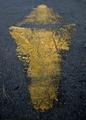
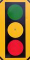
| 05/13/2004 02:23:41 PM |
Go and Stopby willtataComment: It is not a photo that can hold a viewer's interest. It would have been much better if you had included the surroundings of that sign, or the sky, or just anything, because right now it looks pretty much like a picture one can draw using Microsoft Paint. Anyway, I wish you more luck in the challenges to come. |
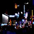
| 05/13/2004 02:15:13 PM |
Bright Night in the Big Appleby janoComment: I like the idea, but here it just doesn't seem to be working very well. IMHO there're way too many objects/lights in this picture. As a result your eyes just keep darting from one place to another. There's nothing to grab your attention for a longer time |
| Photographer found comment helpful. |
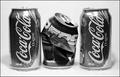
| 05/13/2004 02:11:49 PM |
Fierce Competition!by doctornickComment: Overall, it's a nice shot. I like that you chose to do it in black&white. On the negative side, I do not think that this picture shows opposites. They're competing products, but it does not make them opposites of each other. |
| 05/13/2004 01:12:43 PM |
Beauty and the Beastby jrs915Comment: I like the colors you used, but IMHO the focus (or, rather, lack thereof) really ruins this shot. Having read the title, I assume that the spider is the "beast" here. Unfortunately, it is not possible to tell what the "beauty" is, or what it is supposed to be. |
| Photographer found comment helpful. |
| 05/08/2004 02:20:18 PM |
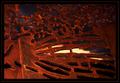
Through and Throughby LENWOODBLUZComment: I love the colors in this picture. They create a really warm atmosphere. The contrast between the foreground and the background is great, too. |
| Photographer found comment helpful. |
Home -
Challenges -
Community -
League -
Photos -
Cameras -
Lenses -
Learn -
Help -
Terms of Use -
Privacy -
Top ^
DPChallenge, and website content and design, Copyright © 2001-2025 Challenging Technologies, LLC.
All digital photo copyrights belong to the photographers and may not be used without permission.
Current Server Time: 08/03/2025 03:53:27 PM EDT.