|
|
|
Showing 241 - 250 of ~520 |
| Image |
Comment |
| 06/06/2006 07:38:27 PM | Sea Otterby anmldocComment: Very nice shot, just a couple mods I make would be to heal/clone out the small spot near the top leftish of the shot. It is a tab bit distracting.
You might try adjusting the constrast up a bit to bring up the blue a tad.
Very nice shot... |  Photographer found comment helpful. Photographer found comment helpful. |
| 05/29/2006 03:18:13 PM | Trilliumby gardenerComment: Nice crisp, clean shot. I tend to agree with Diamond that the stick in the upper right is a bit distracting. You could get rid of most of it with a tight crop.
Also there is yellowish stick below the flower, that jumps out once the stick in the upper right is cropped out.
The only other thing I might have done would be to darken (contrast) the background a bit more using levels to make the flower really snap.
| | Photographer found comment helpful. |
| 05/29/2006 12:51:19 PM | Still Salt, Still Pepperby genxm5Comment: Greetings From the Critque Club.
Hello Rich, nice within the challenge shot here.
keep in mind these are my opinions only
The shot has a real nice feel about it. I like the fact that this shot is somewhat outside the box, where Still Lifes generally take in a whole setting but you came in close on this one. Not the most interesting subjects (salt and pepper), but you presented them in a way that we have to stop and take in the shot.
Personally I'm thinking that I would have liked to see only a couple things here.
The composition is great, but I believe it might have benifited from an even closer crop. Something along the lines of a 7x5 crop taking a litte off the left, right and top (more off the top and right).
There is a lot of detailed space on the right (not really needed) and some table showing through between the salt and pepper shakers (and upper left) that I don't think important to the shot and sorta distract.
To further hide the table showing through (upper left) and adding a bit of pop to the scene I might have adjusted the Levels even darker (more contrast) to bring the upper left coner to a darkness level almost equivalent to the bottom left pushing the viewer back to the middle frame.
Just my take, overall really nice shot. I like it.
Andy |
| 05/29/2006 12:03:59 PM | Blured Crowdby dan06Comment: Greetings from the Critique Club Dan, and welcome to DPC.
Keep in mind this is my opinion only
Challenge Results: The score you received for this shot, your first entry, reflects a beating by the DNMC (Does not meet the Challenge) Crowd. Over time you will pick up some of the voters habits and trends.
Many around here will give a 1-4 vote If they have some preconceived notion as to the Challenge Description and we do not meet what they expect. Many voters do not read the Descriptions entirely or read too far into them. This particular challenge, "Still Life" I believe the voters were looking for that defacto standard that we all studied in Highschool Art. The ole table place setting with fruit, flowers, bowls etc.
My take on the challenge was a setting (used loosely) with signs of life (human) but no human presense.
I believe the biggest factor in your score was that the voters felt that it did not meet the challenge.
The Photo: Not bad for a first entry, however there is some room to grow. As you get beyond the DNMC, there are other areas the voters will scrutinize our shots for:
Interest Level: Many on DPC call this the WOW factor, I refer to it as interest level. Does my subject keep me focused on it, or are there other distractions in the shot. Also lessor exciting subjects need to be tack sharp and add some interest to keep the viewer focused.
Focusing on the Dandelion in the front right foreground, my periphial vision also picks up the white tips of the other not quite open and/or already free of the seed pods. These distractions are enough to get my eye wandering about the shot away from the intended subject. There is a nice bokeh in the shot but some things just stand out too much.
Always watch for distractions (especially with basic challenges) reframe the shot as necessary and/or crop the more prominent distractions out of the shot.
This particular shot perhaps I would have used levels and curves (or auto exposure/auto levels) to add a some contrast (to darken and make less interesting) the background to make the foreground dandelion stand out. I also might have applied a final sharpen to crispen up the subject.
Bottom Line: A good first challenge attempt, a first lesson in, wether right or wrong, we have to find that happy medium between what we like to shoot and how the voters (majority) perceive the Challenge Description and submit accordingly.
Andy
| | Photographer found comment helpful. |
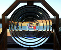
| 04/05/2006 12:49:57 AM | Lighthouse Lens Inversionby JeffryZComment: Ah yes... Cabrillo Monument... and you got them to clean it for you. :) Wonderfully executed, nice angle and good crop. Not much we can do about the reflections from inside the center. Great Shot. |
| 03/10/2006 12:21:23 AM | So happy togetherby AnnaPComment: **Greetings from the Critique Club**
I see here creative and cheerful composition that definately meet the spirit of the challenge as this would be considered an odd couple.
Off the bat, remember this is in my opinion, the shallow Depth of Field is probably the number one factor in the score that you received. There are several areas that are out of focus due to the DOF. They tend to compete with the areas of very sharp focus primarily the faces of our subject.
Our eyes are funny things and want to see everything in focus. The faces of your models are tack sharp and the eye does not need to work to see those clearly but then they catch the large dark area in the foreground that is out of focus. The viewer is immediately drawn away from the subject to that area and trys to make it clear. Once evident that I can't bring that to focus the hand pops out as being unclear.
Shallow DOF creates a Conflict to the viewer in this case. The viewers eyes dart around the composition never staying in one area long enough to put it all together.
It seems there is plenty of light on the subject; so to create a deeper DOF I might have used a smaller Aperture somewhere around f/8 or so. A deeper DOF would bring the foreground into focus making it less a distraction. If the background becomes In focus (because you have it nicely blurred here) I would move the models further away from it.
Other things that we could do to make it more DPC appealing would be a crop that eliminates as much of the OOF are as possible. Or better yet as this was an advanced challenge add a Romantic (soft) effect to the entire shot, by duplicating the entire shot, applying some gaussian blur to the top layer and then making that top layer transparent just to the point where there entire shot is soft but detail of the faces come through.
Final thought would be, beings that this setup appears to be a portrait (I'm assuming because of the background) I think I would use the pose you have but turned the female head to look at the camera.
Just my thoughts...
Andy
| | Photographer found comment helpful. |
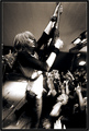
| 03/03/2006 10:10:29 PM | Johnny Truantby BobsterLobsterComment: Greetings from the Critique Club...
Sheesh I couldn't have drawn a better photo from the bunch... One of those guys that I look up to.
Having played in a band and attended a plethera of concents, I can say that you are offering the viewer more than what is seen and/or remembered when one attends a concert such as this.
You have captured a frenzied moment in time, froze the action, concentration of the players, emotion the fans and presented it to us in a highly detailed fashion.
Tonal qualities are excellent, putting the viewer into the dark environmet that usually found in a club environment yet perserving all the needed detail to keep us involved.
Composition is spot on, one couldn't have asked for a better pose from the guitarist. The corrigated ceiling adds to drama. The lines of the ceiling are strong and try to lead me away (upward) but the detail of the the guitarist face and hair draw me back to the center of the shot.
This truly is a fun shot to study, as the more one looks the more one sees. The expression of the guy in the front row and the up raised hands shows the devotion these guys have to their idol on stage, who seems to be controlling them with his guitar held high.
All the mechanics play well together to make this a better than live performance shot.
The key points that make this shot what it is for me are the Detail of the guitarist hair (stringy over the face) and face (dark shadows create the detail), the leading lines of the ceiling, and the expression of the gentleman in the front row.
I realize it was a basic challenge as you did, but if there is any thing that I would like to see differently in this shot; it might be toning down a bit the hot spots on the guitarist belly and on the stage.
Also there is some fireflys flying around behind the guitarist legs that tend to distract a tiny bit.
Understanding this is a live performance and we can't say to the bass player "hey could you back up a bit" I might have cropped it to remove his nose and mouth or given us just a little more of his face.
Just my thoughts...
Over all this is a most excellent performance shot and I really enjoyed studying it in depth. Great job Bob.
Andy
ED: Typo Message edited by author 2006-03-03 22:27:44. | | Photographer found comment helpful. |
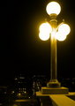
| 03/01/2006 12:58:00 AM | The Approachby rebs138Comment: Over all it is a very nice composition... very calculated. Probably the biggest thing that hurt you in the challenge is that that lights (globes) are too hot (over exposed)... on a calibrated monitor the four bottom globes tend to flow together with not distiction overpowering the shot.
Andy | | Photographer found comment helpful. |
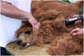
| 02/25/2006 11:29:40 AM | Shearing Dante The Alpacaby trainComment: Greeting from the Critique Club...
Nice approach to providing the viewer with one of the necessities in life that we don't always see. I believe you are using Dante as the subject and not the shearers due to the crop that you have presented us.
Given the situation that you mentioned in your description the lighting and detail is quite nice. The story you are telling doesn't appear to bad a sad one as Dante does not appear to be fussing about.
In general I would have liked to see just a little (just a tad) more of the hands on right and a lot less of the gentlemen on the left. The amount of white from the gentlemans tee-shirt adds an uneven balance to the natural colors that otherwise fill the frame.
As always, when doing a critique, I will download the shot and while perserving what the shooter originally intended, try different things that I might have done and/or to back my observations.
To ease out some of the white on the left of the frame, I tried a 6x4 crop starting just below the stain on the gentleman's sleeve. For me this accomplished several things, the most obvious being a lot less of the white tee shirt, the stain on the sleeve a small but evidant distraction, the dark area (gentleman's black pants) all but removed from the frame and finally places the subjects eye on the bottom left third of the frame.
The only other thing that I might have done, would be to do a tad bit of Dodging of the eye and just below the nose to bring out Dante's expression a bit.
As to sharpness I will always say a bit more sharpness but realize that softness comes a lot of the time from resizing the image. When submit to challenges my last step after the resize is to sharpen one final time.
A very nice shot, highly fitting of the challenge. Great job.
Andy
ED: to note a strange coincidence... Today (after critiquing this in the morning) I went down to Old Town San Diego to shoot the Mormon Infantry celebration... Long story short they had an Alpaca there that was trimmed up nicely as the one you have in this shot. Not to common a a sight in San Diego... Message edited by author 2006-02-25 20:35:50. | | Photographer found comment helpful. |
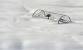
| 02/25/2006 12:44:56 AM | Waiting for Springby brens29Comment: Greetings from the Critique Club.
You have presented us with a wonderful minimalist shot here. At first glance one perceives a cold lonely, abandoned feeling of the piece of farm equipment. Very fitting of the Challenge.
Studying the shot in depth, the time of day that this was shot casts a nice shadow that adds to the effect nicely. The angle and placement of the subject are such that it leads us through the frame which makes this simple shot appealing.
If there is a distraction in this shot, for me it would be the footprints in the snow in the upper right corner. Personally, I would rather see no sign of (recent) life in a shot of this nature. As I'm drawn to the subject, my eye picks up those footprints in the corner and wants to bring them to focus taking us past the subject. The snow covered trails add texture/flow but do not draw attention and are integral to the shot.
Finally I would like to see a little more sharpness on this shot. Not only would it add a little pop to the cold steel equipment but I think it would add a little more life to the snow.
Very nice shot and a tough one (snow) to shot... Congrats on a wonderful shoot.
Andy
Ed: Typo Message edited by author 2006-02-25 00:53:36. | | Photographer found comment helpful. |
|
Showing 241 - 250 of ~520 |
Home -
Challenges -
Community -
League -
Photos -
Cameras -
Lenses -
Learn -
Help -
Terms of Use -
Privacy -
Top ^
DPChallenge, and website content and design, Copyright © 2001-2025 Challenging Technologies, LLC.
All digital photo copyrights belong to the photographers and may not be used without permission.
Current Server Time: 08/07/2025 03:07:17 PM EDT.
|