| Image |
Comment |
| 12/13/2005 10:22:30 PM |
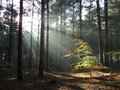
Mystical Creekby tsheetsComment: I suspect this may be one of those images hurt by compression with all that fine detail in it. Did you have trouble getting it down to the 150K limit? I'd love to see a nice large print of it, I bet it would look lovely.
The warm colors are great, I love the leading lines of that creek pulling you deep into the photo, and the reflections in the water are great too. I think ideally I would prefer a bit tighter crop on the bottom (feels a little foreground heavy) and a bit more of that framing tree included on top.
Totally underrated in both score and percentile imo. Those free study competitions are tough ones though! |
 Photographer found comment helpful. Photographer found comment helpful. |
| 12/13/2005 01:10:25 PM |
Christmas Candleby Jbchess1Comment: The crop feels too tight, like the top part was inadvertently chopped off. I think a "portrait" orientation with the entire hurrricane lamp would've felt better. The bokeh in back is lovely -- Christmas tree? |
| Photographer found comment helpful. |
| 12/10/2005 06:03:33 PM |
Kelley Point (Industrial Outtake)by ElemmennopeComment: It was f/22 (details are listed above) but maybe it needed a longer exposure time to really make the starburst happen? I had it on aperture priority, and it exposed it for 0.6 seconds and yes, with tripod. And actually the starburst are there, though hard to see in the 640 pixel version. Definitely not as dramatic as some photos I've seen. The fog may have been a factor in that too - the air wasn't nice and clear between me and those boats.
Horizon is parallel but no matter what I do this picture looks like it's tipping to the right to me. It was one of the reasons I didn't care for it too much. |
| 12/10/2005 04:48:12 PM |
Acadia Before Sunriseby NeilComment: Very pretty glowing clouds! It's almost an abstract in that it's just about broad areas of color with very little detail, other than some small areas of texture.
I wonder if this might look nice broken up into a triptych? It could emphasize the dominance of the central portion of the photo, with the two sides acting as more supportive players. All three would make nice photos on their own, the left side with the small penisula, the right with the water, the center with the bright clouds. But together they would make a better whole. (Or maybe I still have triptych on the brain since that recent challenge.) Message edited by author 2005-12-10 16:55:03. |
| Photographer found comment helpful. |
| 12/09/2005 05:00:44 PM |
Machine Girlby fadedbeautyComment: I'm with those that thought this was pretty good actually (and even as a female, you know, not really my kind of subject...)
It was a good play on the word industrial, I guess some didn't really follow that. The model is nice, the pose is good, I like the expression on her face, I like the setting a lot. Criticisms include it being a tiny smidge overexposed on her ass and thighs, and I would have removed the black thing hanging down (ribbon? whip? I can't really tell what it is.)
Good effort, don't let people on this site get you down. I hope you continue to enter challenges. |
| Photographer found comment helpful. |
| 12/09/2005 04:36:20 PM |
Rise of the Machinesby ajschelComment: This was probably my favorite in the challenge. Great use of silouette and that gradient in the sky is perfect. Those machines seem practically alive. |
| Photographer found comment helpful. |
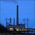
| 12/09/2005 04:19:18 PM |
1.21 Gigawattsby MQuinnComment: I loved the color to this one with the rich blue sky the row of yellow windows and the star effect on the yellow lights. What hurt it, imo, was the composition with that dominant tower smack in the center of the shot. I like the perspective of coming at the building from the POV of the power lines, maybe that could have been played up even more by moving off to one side a bit and shooting right through them, offsetting that tower at the same time. This is one challenge where the presence of power lines and stuff don't make you absolutely crazy. They actually add to the meaning of the photo. :)
I gave it a 6 which is a good score with just some room for improvement. I don't think I gave anything higher than an 8 in this challenge. :) |
| Photographer found comment helpful. |
| 12/08/2005 05:35:13 PM |
Going Upby ChezComment: I love this. Wonderful texture and color. |
| Photographer found comment helpful. |
| 12/07/2005 03:04:43 PM |
|
| Photographer found comment helpful. |
| 12/03/2005 12:53:44 PM |
Three by TerramarComment: That family is going to treasure this photo for years. I hope they have a nice large print for their wall. :) Well done! |
Home -
Challenges -
Community -
League -
Photos -
Cameras -
Lenses -
Learn -
Help -
Terms of Use -
Privacy -
Top ^
DPChallenge, and website content and design, Copyright © 2001-2025 Challenging Technologies, LLC.
All digital photo copyrights belong to the photographers and may not be used without permission.
Current Server Time: 08/04/2025 08:16:39 AM EDT.