| Image |
Comment |
| 05/10/2004 02:44:13 PM |
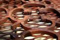
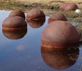
Rusted Geometryby bradbaneComment: The subject is mostly well lit and the the diffused background provides good contrast to expose the geometry. The shadow and what appears to be a burned out match in the lower left hand corner detract.
The point of view and composition are the larger distractions for me.
A 4. |
| 05/10/2004 02:38:20 PM |
"Use Me."by AmiYuyComment: Nice title. I like the perspective and composition. I am a lot less keen on the choice of subject and lighting.
A 5. |
 Photographer found comment helpful. Photographer found comment helpful. |
| 05/10/2004 02:35:13 PM |
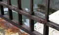
Venice Decadenceby mrBlueComment: I like the colors and components of this shot. I would have liked a deeper depth of field here as the background is not a distraction but part of the interest of this picture. The water also does not diffuse very well, nor do the steps. I also think I would like the picture adjusted to make the verticals vertical. I would also like to see the lower crop not cut off the bottom of the fence vertical.
A 7. |
| Photographer found comment helpful. |
| 05/10/2004 02:23:47 PM |
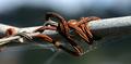
Rusty Wireby MazerComment: I like diffused background. There is immense realism and lack of pose in this shot. The colors are right on, the cobweb help, and I really like how the diffusion of the background works. This picture immediately made me aware that I do not know what the galvanization process for iron is or what causes the white spots I see on galvanized pipes. Any picture that makes me think deserves a good rating. I just am not too happy with the composition.
For me clipping each side heavily results in a much stronger picture. On the left just to the right of the open pipe end, and to the right just a little beyond the end of the wire.
An 8. |
| Photographer found comment helpful. |
| 05/09/2004 04:24:41 PM |
Rake by Elevated Train Tracksby spudartComment: I like this better when cropped on the left to exclude most of building. Great lighting and I like the foliage growing over rake.
A 6. |
| 05/09/2004 04:22:06 PM |
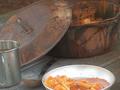
chowby hallswelComment: I like the lid of the pot and the table very much. The arrangement and cropping of the utensils is not my cup of tea although the meal itself is very appetizing.
A 5. |
| 05/09/2004 04:19:54 PM |
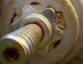
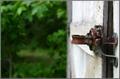
"Handle" With Careby ExoticChaosComment: Far too much unused space. I do like that the focus is exactly where it should be, I do not see though why we are looking at bolt almost head on.
A 4. |
| Photographer found comment helpful. |
| 05/09/2004 04:17:48 PM |
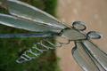
Weather-beaten Wingsby myfelixComment: I find that the support and the grass line at right angles and bisecting the picture in both directions completely steal the show.
A 3. |
| Photographer found comment helpful. |
| 05/09/2004 04:15:42 PM |
|
| Photographer found comment helpful. |
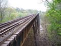
| 05/09/2004 04:07:45 PM |
Rustoleum needed!by DustyComment: I like this picture much more with everything to the right of the bridge cropped off. The tree, barn, and house are nice, but they reduce the impact of the perspective and the very lovely trees on the left. It is a very soft shot and I would like more sharpness in the foreground. Nevertheless, a beautiful setting and subject.
A 7. |
| Photographer found comment helpful. |
Home -
Challenges -
Community -
League -
Photos -
Cameras -
Lenses -
Learn -
Help -
Terms of Use -
Privacy -
Top ^
DPChallenge, and website content and design, Copyright © 2001-2025 Challenging Technologies, LLC.
All digital photo copyrights belong to the photographers and may not be used without permission.
Current Server Time: 08/12/2025 11:56:18 AM EDT.