|
|
| Image |
Comment |
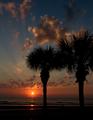
| 05/26/2004 03:23:05 PM | Florida Sunriseby GallatinComment: this photo is nice to look at, but not very original and the tree on the right is disturbing, because it seems cropped too tightly...meanwhile I don't see how this photo meets the challenge, since the only lightsource u used is the sun (or I must be overlooking something??) |  Photographer found comment helpful. Photographer found comment helpful. |
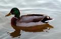
| 05/26/2004 03:19:35 PM | The Duckby 3rdigitalComment: you say you used multiple lightsources (I only see sunlight reflecting on the water and maybe some kind of red laserlight on the bollocks of the duck?? If that is your second light, it doesn't really show..), but you still managed to underexpose the duck's face!! |
| 05/26/2004 03:17:18 PM | Wings of Lightby spitz66Comment: exciting composition, nice idea..BUT the light is too sharp! Even here at home, it hurts my eyes, also the light lays a thin layer over the photo, so now the whole picture looks our of focus...also I don't really like to see the angle of the ceiling, because it brings me back into your livingroom and out of the abstract world you could have created here... | | Photographer found comment helpful. |
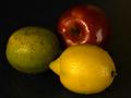
| 05/26/2004 03:14:22 PM | Still Lifeby nevillecComment: the two lightsources are visible in the reflections, nice idea! Too bad that the mango (??) and the lemon are out of focus..only the apple is sharp..colours and placing are nice too!! | | Photographer found comment helpful. |
| 05/26/2004 03:09:29 PM | Dancing Rainbowsby breezee70Comment: though there is a triangle in the photo, there are too many other things my attention get drawn to..this is a chaotic picture with too much in it and too much colours also... |
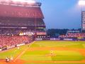
| 05/26/2004 03:07:59 PM | Piazzaby TranquilComment: ok, there are a lot of lightsources, but this is nothing more than a snapshot, and not a really nice one either...maybe next time you should think of another way to meet the challenge other than just taking a picture of multiple lightsources?? What is so interesting often on those playfields is that the multiple lights are visible in a lot of shadows around the persons or, in this case, no shadows at all! maybe focussing on that would have given the photo something extra..something to think about? |
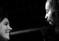
| 05/26/2004 03:05:21 PM | Singin' in Spotlightby unicumComment: The right face is very nice, good black and white contrast, nice expression! The left face misses this all and seems also a bit out of focus! But I guess you needed her for your second lightsource :) | | Photographer found comment helpful. |
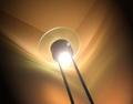
| 05/26/2004 03:02:38 PM | Stereoscopic Light Bulbby imolaavantComment: Though your lamp is slightly out of focus, I kinda like this picture! I like the two different colours of the shadows, and think that you shouldn't have showed the reflections of the lights in the lamp (but I guess you couldn't avoid that..it is an open challenge, so you couldn't use PS..pity..) | | Photographer found comment helpful. |
| 05/23/2004 12:59:56 PM | Start of Boating Season, Lake Michiganby flip89Comment: :: Critique Club Comment ::
The composition of your photo is in theory perfect; if you draw a line horizontally and a line vertically both at about 1/3 from the border, you'll see that all your subjects are on one of these two lines.
Your photo has three visible objects (2 boats and tower) all on the horizonline, so that my eyes are having trouble to chose which object is most important. The title says that the boat on the right must be the most important, but that's not really clear. The other boat (small boat) is slightly distracting. For the start of boating season there are too many boats, when you would have showed only the bigger boat, the start of boating season would have been expressed in a more symbolic way.
You choose to show a lot of pier and less of the lake, but to match your title more, it would have been nice to have the tower on the left and the boat sailing into the lake. The colours are just fine to look at, and really marine-like. The red and white of the lighthouse and the white of the boats are breaking the mass of blueness you have in your picture.
Fotowereld. | | Photographer found comment helpful. |
| 05/19/2004 03:45:48 PM | WTC-Amishby Herblacklist12Comment: :: Critique Club Comment ::
A lot has already been said in other comments, so I'll try to put things together shortly:
You have put the word 'Amish' in the center, so this is obviously meant to be the center of attention. You did it by photographing the sign from a different perspective, wich is appealing to the viewer, because it brings a good tension in the picture. What is a pity, is that the "A" of "Amish" is not wholy showing.
The sunlight is overexposing the sign, making te colours weak. The picture could have been making a stronger expression, when you wouldn't have been photographing into the sun. Maybe you could have waited until the sunlight was coming from another postition, when it would have shined ON the sign, the colours would have lit up and be bright!
You made this picture for the challenge "something new", a lot of viewers commented that it isn't clear what is new in your picture. I don't see it either, maybe it's something local or only know to you? Keep in mind that your public is very broad and living in all parts of the world, so a subject must speak to a lot of people.
Fotowereld. | | Photographer found comment helpful. |
Home -
Challenges -
Community -
League -
Photos -
Cameras -
Lenses -
Learn -
Help -
Terms of Use -
Privacy -
Top ^
DPChallenge, and website content and design, Copyright © 2001-2025 Challenging Technologies, LLC.
All digital photo copyrights belong to the photographers and may not be used without permission.
Current Server Time: 06/19/2025 01:40:54 PM EDT.
|