| Image |
Comment |
| 12/01/2004 02:15:04 AM |
My kids point of view for "Lucky 7"by ofirkComment: like the shot, hate the border. sorry to be terse. it's just too much. with so many colors in the shot, plain white might have drawn them all together more than putting all the colors in the shot into the border. |
 Photographer found comment helpful. Photographer found comment helpful. |
| 12/01/2004 02:13:27 AM |
Plucky Duckieby debitiptonComment: very cute. and very clean and smooth. i think the DoF is perfect and i like the light blue bg, its a perfect contrast with the duckies. |
| Photographer found comment helpful. |
| 12/01/2004 02:12:04 AM |
|
| Photographer found comment helpful. |
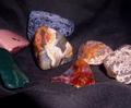
| 12/01/2004 02:11:23 AM |
Nuggetsby pechkaComment: cool rocks. i wish the cloth was darker, the fuzz takes away from the rocks, also the focus seems a little soft. |
| 12/01/2004 02:09:13 AM |
7 Doublesby MAKComment: i really like this shot, but you have stumbled upon a pet peeve of mine. except under certain circumstances, fingernails should be really really really clean when hands are in pictures. |
| Photographer found comment helpful. |
| 12/01/2004 02:07:29 AM |
Rainbowby JinjitComment: nice. like the subtle reflections. the top seems a little dark for the subject though. |
| Photographer found comment helpful. |
| 12/01/2004 02:06:26 AM |
Seven Hands, Studby JiaBobComment: i guess i'm a square - i don't get it. but the red seems waaaay too RED. kinda makes the red fingernail disappear - unless that was the idea. |
| Photographer found comment helpful. |
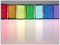
| 12/01/2004 02:04:40 AM |
Xmas-Tree Lightsby DianaBComment: colors seem a bit muted, would like to see more saturation. maybe a wider contrast too. |
| Photographer found comment helpful. |
| 12/01/2004 02:03:32 AM |
|
| Photographer found comment helpful. |
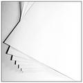
| 12/01/2004 02:02:53 AM |
Seven Pieces of Paperby yeouaComment: nice texture and grain. like the shadows. i think i actually like the border too (i usually hate them) |
| Photographer found comment helpful. |
Home -
Challenges -
Community -
League -
Photos -
Cameras -
Lenses -
Learn -
Help -
Terms of Use -
Privacy -
Top ^
DPChallenge, and website content and design, Copyright © 2001-2025 Challenging Technologies, LLC.
All digital photo copyrights belong to the photographers and may not be used without permission.
Current Server Time: 08/06/2025 12:55:17 PM EDT.