| Image |
Comment |
| 04/26/2006 01:30:00 PM |
|
 Photographer found comment helpful. Photographer found comment helpful. |
| 04/26/2006 01:06:03 PM |
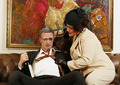
Spicing things upby tyrkinnComment: *Howdy from the Critique Club*
First of all, when I looked at it gave me a smile and as my eyes start to move around. The relationship between the picture and the couch are out and a little distracting.
Also if you would have moved your subjects over to your left about 6 inches this would have put his head in the red area and hers in the white. Because the green in the painting is around his head making it look strange. I know you did allot of set up for this shot, but you could always change the background to something else. Just my opinion.
His glasses seem smudged a bit I don't know if this was intentional or not. But I do know the voters see everything here.
Your lighting seems to be dead on, nothing to bright or dark.
You might also keep up your file size close to the 150K limit, so you don't loose any more detail than possible.
Over your photo has a nice funny story to it, I think you have fine image and keep up the good work. If you have any question feel free to ask.
Have a Great Day, Mark Thomas Kelsay |
| Photographer found comment helpful. |
| 04/26/2006 12:13:31 PM |
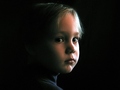
Look into my eyesby JudiComment: *Howdy from the Critique Club*
I really like the composition of your shot, a few thing about the shot, lots of negative space that draws my eyes out of the shot. You might have used a complementary color to keep drawn into the face and eyes. I think also there is either not enough of the other face showing, maybe to the eyes?
Also flattening out the cloth some and showing more of the shoulders would have created more repeating lines, since you are shooting into the mirror.
Light is good, except the light seems to be reflecting into the face and hands causing it to be a white powdery or pale look to it.
Shooting into reflective objects is always a challenge in itself.
Over all I really like your shot and I gave it a nine when scoring, I loved looking at it. You have done a wonderful job and hope to see more like this.
If you have any question about my critique, just ask me.
Have a Great Day, Mark Thomas Kelsay |
| Photographer found comment helpful. |
| 04/25/2006 02:38:32 PM |
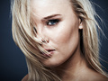
Curvesby PatrolComment: *Howdy from the Critique Club*
First of all I like the light and shadow in this picture and the way the lines along back and the buttocks area create a matching curve along your back ground.
A few things you might want to look at, since it was a chrome challenge.
I pulled up your picture and played around with it, by removing the color I got more of a chrome or silver feel. Also I cropped most of the shoulder area out, along the right side where the bright highlights are at and up from the bottom. Which gave it a abstract look, at first glance you didn't really know what you were looking at.
As far a sharpness, reflective images for me don't always look to sharp and blurring it was out of the question. So I over sharpened it and it gave the reflective side the look of orange peel (kind of smooth but textured) and it made the background rougher since there were imperfection already there.
These are only my thoughts.
I hope, I help you out and if you have any questions just give me a shout.
Have a great Day, Mark Thomas Kelsay |
| Photographer found comment helpful. |
| 04/24/2006 01:30:09 PM |
Spring at lastby jonconleyComment: Howdy from the Critique Club
Over all you have a really nice shot, very nice color and the a isolated subject from blurred back ground and sharpness is good.
Natural light is good, but a few things you might consider is time of day when you shoot, is either early or late part of the day. If those times of day is not good for you. You might try shielding your subject from the bright sun. It shows on the top of her head and in the hair area and parts of the back ground.
I looked at your histogram and there were no black pixels to work with so I did some simple level adjustments, to take out some one the flatness off the shot. This brought out the colors allot more and in turn took out some over powering brightness.
I think this photo is worth re-shoot and trying a few different things. This person looks like she is loved really good by someone and it is worth the effort to improve it. Maybe more light on the face to bring out those great eyes.
If you have any questions please feel free to PM me.
Have a Great Day, Mark Thomas Kelsay. |
| Photographer found comment helpful. |
| 04/23/2006 10:43:22 PM |
|
| Photographer found comment helpful. |
| 04/23/2006 10:38:00 PM |
Easter Portraitby karmatComment: I think a different color back ground may have been better here, the black on the baby seems to blend in with your black back ground. |
| Photographer found comment helpful. |
| 04/23/2006 10:13:07 PM |
Contemplativeby kashiComment: I really like the shot and the set up, just seems like the light is a touch on bright side. |
| Photographer found comment helpful. |
| 04/23/2006 10:00:28 PM |
|
| Photographer found comment helpful. |
| 04/23/2006 09:58:29 PM |
|
| Photographer found comment helpful. |
Home -
Challenges -
Community -
League -
Photos -
Cameras -
Lenses -
Learn -
Help -
Terms of Use -
Privacy -
Top ^
DPChallenge, and website content and design, Copyright © 2001-2025 Challenging Technologies, LLC.
All digital photo copyrights belong to the photographers and may not be used without permission.
Current Server Time: 08/04/2025 12:24:03 PM EDT.