| Image |
Comment |
| 04/29/2006 07:28:04 AM |
|
 Photographer found comment helpful. Photographer found comment helpful. |
| 04/29/2006 07:23:34 AM |
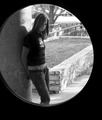
Ashby stare_at_the_sunComment: I would have done some more adjustments to this and would have made it better. |
| Photographer found comment helpful. |
| 04/29/2006 07:05:56 AM |
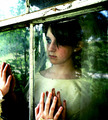
Clock tower through windowby cresusComment: The only thing I don't like is the window handle. It is a little distracting. To bad you didn't have a window without it. |
| Photographer found comment helpful. |
| 04/29/2006 07:02:55 AM |
daydream by CalliopeKelComment: Over all I like this image. I would have got rid of the top left corner, a little on the bright side. |
| Photographer found comment helpful. |
| 04/29/2006 07:00:23 AM |
Trinity Reflectedby DigiClikMAComment: This could have been a lot bet image, level, curves or anything to improve it. Its a flat side. Also need to keep your file size up to around 150k. |
| Photographer found comment helpful. |
| 04/29/2006 06:30:19 AM |
|
| Photographer found comment helpful. |
| 04/28/2006 12:04:34 AM |
Traneby prenticeComment: *Howdy for the Critique Club*
First of all, you have a wonderful shot.
Like how he is looking away. I also like complimentary lines. The pockets on his jacket and the collar of his shirt, jacket and tie. Also horizontal line on the jacket and the blocks in the building, in shapes of the mustache and the brim of the hat.
Things that might improve this shot would be removing the blue and maybe the brown edge. The blue really has no point of interest to me. His hands are out of the shot, maybe just cropped out. The brown edge is so far over, might as well not even be there or moved Him, to lets say a third of it.
I seen in your comments box that his hat blended in with the bricks, burn and dodge are ok, but you can just use a curves adjustment to change also. Simple S curve and when your done, in your mask paint with black over everything but the wall and man this is so much easier. Thus giving more contrast. And reducing the halo look around the hat.
Well that's about it, you keep up the great work!
Have a great day, Mark Thomas Kelsay. |
| Photographer found comment helpful. |
| 04/27/2006 01:02:28 PM |
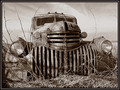
Past it's gloryby BMacDComment: * Howdy for the Critique Club *
For me this photo brought up memories for me. For when I was a kid and my dad use to take me place where old trucks and cars were. I can't believe how good of shape this baby is in. If that was in Kansas it would be full of bullet holes lol.
Ok when I first open this I thought wow nice. I think your camera angle is good. Really showing those great lines in the grill. Something I think could be changed, as you said you walk by it when walking your dogs, is asking the owner about it. Maybe seeing if you could remove the small trees growing threw the bumper area, but I do like the grass growing over the area. The trees for me is a eye sore I keep wondering back to them.
Do like your processing on this really give old feel to it not to warm and not to cool.I think you could have tweaked it bit more with some curves adjustments to darken the sky a bit and also the rusty areas on the truck. This would have given a bit more contrast.
Over all you have a wonderful photo and keep up the great work, if you have any question feel free to PM me.
Have a great day, Mark Thomas Kelsay |
| Photographer found comment helpful. |
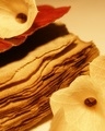
| 04/27/2006 12:10:25 PM |
Untitledby TejComment: * Howdy from the Critique Club *
First of all if you want a good critique, you really need to fill out your photgrapher's comment box. For me the main suject is hidden by other ojects in your photo and I can't really make out what it is.
It's either old paper or a book.
This is more abstact to me not really know what it is. I am not trying to sound harsh, but there not much here to keep the viewers attention.
The quality of light is ok, I think you were going for a low light to make it feel old, which I think it worked well. It does have a warm feel to it.
You need to keep your file size close to 150k as possible so you don't loose any image quality.
If you have any question feel free to PM me and I will try to answer.
Have a great day, Mark Thomas Kelsay
|
| Photographer found comment helpful. |
| 04/26/2006 06:44:19 PM |
Swept Away by Fallby NeilComment: I have played around with this kind of stuff a few times, this one is very eye catching. |
| Photographer found comment helpful. |
Home -
Challenges -
Community -
League -
Photos -
Cameras -
Lenses -
Learn -
Help -
Terms of Use -
Privacy -
Top ^
DPChallenge, and website content and design, Copyright © 2001-2025 Challenging Technologies, LLC.
All digital photo copyrights belong to the photographers and may not be used without permission.
Current Server Time: 08/04/2025 07:48:11 PM EDT.