DPChallenge: A Digital Photography Contest You are not logged in. (log in or register
 
Browse Settings
Currently viewing:
Registered UserPrime_Time

Show comments:

Per page:

Order:

Comments:


Comments Made by Prime_Time
Pages:   ... ... [65]
Showing 171 - 180 of ~647
Image Comment
Somewhere Over the Rainbow
04/30/2006 01:05:50 PM
Somewhere Over the Rainbow
by Keith Maniac

Comment:
Excuse me mister, but could I use your head for a tri pod :-p
Photographer found comment helpful.
dust and scratches
04/30/2006 01:03:03 PM
dust and scratches
by mocabela

Comment:
I like dark images, but there are many who don't.
Photographer found comment helpful.
Elements of Reality
04/30/2006 01:01:42 PM
Elements of Reality
by karmat

Comment:
to bad the car reflection is in there and it fairly flat also
Photographer found comment helpful.
1/2 a Man
04/30/2006 12:55:34 PM
1/2 a Man
by movieman

Comment:
I read a man and half :-), its a wee bit to bright.
Photographer found comment helpful.
A window on terrorism
04/30/2006 12:53:59 PM
A window on terrorism
by TrollMan

Comment:
I think you have a powerful image, but the image itself needs some work.
Maybe b&w and some more contrast.
Photographer found comment helpful.
Five Loaves Bakery
04/30/2006 12:34:59 PM
Five Loaves Bakery
by holdingtime

Comment:
A few things you could do to improve your image, one cropping in from the sides removing the silver frames, two adding more contrast, three blurring background object. I used the elliptical marquee tool, by pulling out a nice big circle then inversing it. Then I filled with black paint and blurred it to remove the sharp circle edge. Then you drop the opacity down to about 10%. Give you a better image. Also this helps the viewer focus on the subject.
Photographer found comment helpful.
Faith through the window
04/30/2006 11:53:57 AM
Faith through the window
by Grahve

Comment:
Your photo is quite flat, since most of the shot is in the shadows, a small bit of curves made it pop out a bit more. Thus improving the colors.
Photographer found comment helpful.
Set Me Free
04/29/2006 01:37:27 PM
Set Me Free
by Philos

Comment:
* Howdy from the Critique Club *

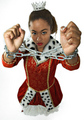
First of all if this would have been in the right challenge it probably would have done really well. It does have story to it, one a fantasy look to it. So I will try to critique, as if it was in this challenge.

Your lighting looks ok, maybe a touch softer. Colors are good. Your model expression could have been more sad. Than a look of you want to fight, because if you put boxing gloves on instead of chains, looks like she's ready to rumble. I still think you could have used a shot like this, like the one in your portfolio. With the chain coming right out from under the dress and leading out of the picture and still keeping the story book feel to it.

I do see some imperfection in your shot, this is her right hand area around the knuckles. It looks a little strange and her relationship to the background, it looks more like clip artish. ( is that a word, is now ) I think some more depth would have help here, or even blurring in Photoshop in the bottom half.

If you have any question about my comment please ask me

You a wonderful day, Mark Thomas Kelsay.
Photographer found comment helpful.
450 year old window view
04/29/2006 07:55:36 AM
450 year old window view
by Tallbloke

Comment:
Nice black and white.
Photographer found comment helpful.
Haleluja!
04/29/2006 07:35:17 AM
Haleluja!
by Bolti

Comment:
This would make a killer black and white even without the window frame in it.

Message edited by author 2006-05-01 15:24:10.
Photographer found comment helpful.
Pages:   ... ... [65]
Showing 171 - 180 of ~647


Home - Challenges - Community - League - Photos - Cameras - Lenses - Learn - Help - Terms of Use - Privacy - Top ^
DPChallenge, and website content and design, Copyright © 2001-2025 Challenging Technologies, LLC.
All digital photo copyrights belong to the photographers and may not be used without permission.
Current Server Time: 08/04/2025 08:07:38 AM EDT.