|
|
|
Showing 141 - 150 of ~647 |
| Image |
Comment |
| 06/09/2006 04:56:51 PM | |  Photographer found comment helpful. Photographer found comment helpful. |
| 05/18/2006 11:53:24 AM | | | Photographer found comment helpful. |
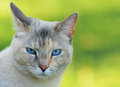
| 05/07/2006 04:04:17 PM | Quiet Momentby lindsayComment: *Howdy from the Critique Club*
First of all I would like to tell you how much I like this image. There is so much line here as I look it over. Most people would not see it, so I am going to point it out to you and to others. One thing I wish the eye was open or even turn a bit towards the camera. This image brought a creative thought to me. If the high lighted area below the eye, was tear this would have showed great emotion and made a lot more powerful image. The emotion of being sad would have played more on the voters hearts and minds. Even if was stage or not.
I think you could have changed the lighting a bit though. Maybe the one beside you, moved it further back from you. I do like the way it is illuminating against the wall and use another to the front, to try to get rid off the shadow you talk about, in the elbow of the arm.
I did a few in things Photoshop to show what talking about. I did something that is not allowed in basic challenge. I did crop this image some to remove some of the bright hair area and move you off center a little bit. Cloned out the shadow and dodge the so called tear area.
The red lines show this downward look. To showed you if you would have had your eye open this would have been in the same direction as arm and chin. With the blue lines it shows all triangles and diagonals and all of these lines are repeating and complimentary to each other.
You can see these change here. Please let me know if you don't want my version of your image online, and I'll take it down. If you have question or comments, please feel free to PM anytime.
I really have enjoyed looking over your image. Stay creative and have a wonderful day.
Mark Thomas Kelsay
| | Photographer found comment helpful. |
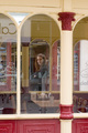
| 05/06/2006 11:37:16 PM | On the Other Sideby MartinKempComment: *Howdy from the Critique Club*
First of all, this photo is very busy there is all kinds of things going on and to much completion with the main subject. I think you could have cropped from the left of the photo and removed some of the clutter and also this would taken her off center. The colors are ok, but maybe black and white here. I tried this and the green channel seem to make it pop a bit.
Also I would have cloned out the reflection on her face. You might have tried a vignette this would have put more on your subject. These are just ideals, I tried several ways but it was to much Photoshop for me. I did like the repeating lines in the archways. I really have to agree with most of the commenters on this one. I try not to sound harsh that is not the way I am. Also you need to keep your file size close to the 150kb limit, so you don't loose any more image quality. Let me just show a quick redo on your shot and see if you like it any better. Please let me know if you don't want my version of your image online, and I'll take it down.
You have yourself a wonderful day and good luck in furture challenges.
Mark Thomas Kelsay
| | Photographer found comment helpful. |
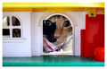
| 05/06/2006 04:41:05 PM | Look who's come to visit?!by KitaComment: *Howdy from the Critique Club*
I would like to say first, what a cute image you have here. Since I have a few of these. I really like the perspective view here, looking into something. As I start looking around your shot the red to the right, to me is over powering the cat. My eyes keep wondering over there. So I pulled it up in Photoshop and split it up by drawing lines on it. To see how it played with rules of the third and your cat is close to a power point. If you do not know what a power point is. It is where two line intersect each other. Well I thought, I will crop the red away and by doing so, to me it accomplished two things one it got rid of the red and two putting the cat on a power point. Now I look directly to the cat. You can see the changes here. Please let me know if you don't want my version of your image online, and I'll take it down.
I see where you use levels a lot. A quick tip in levels if you hold down the ( option on a Mac or alt on a PC ) and left click the triangles below the histogram and slide them it will show you black pixels which are on the left and white pixels to the right triangle. I do not mess with the center I use curves for this. Most of the time I just slide them until I barely get white or black pixels. I do see in your notes that you use curves and then levels. There is an easier way, so you don't have to go to levels. In the box next to curves is called a mask (if you don't know) and in this mask you paint back portions of your image you don't want to change. By selecting the brush type you want in the tool pallet and in the paint box, the color black. Now go to the image and paint back what you do not want to change. Also you can change the brush size with these bracket keys. (Smaller brush this key sign [ ). ( Bigger brush this key sign ] ). I hope this helps you out and if you have any questions please feel free to PM and if I can't answer. I will find the answer.
You have a wonderful day and keep up the awesome work, you have lots of potential, to be great.
Mark Thomas Kelsay
| | Photographer found comment helpful. |
| 05/05/2006 01:24:03 PM | Lumberjackby Little KingComment: *Howdy from the Critique Club*
From reading some of your comments, it seem a little dark and from your histogram it really did show many white pixels except up in the sky area. A quick tip in levels if you hold down the ( option on a Mac or alt on a pc ) and left click the triangles below the histogram and slide them it will show you black pixels which are on the left and white pixels to the right triangle. I do not mess with the center I use curves for this. Most of the time I just slide them until I barely get white or black pixels. I have some examples for you later, whether you need them or not its totally up to you. I also darken behind the block wall it seemed to push it forward adding a little depth.
Now that your subject stands out more, as I looked over your shot, I notice that the tree branches might have outlined this house or building at one time. So now there are more diagonal features to it. Those of the trees and on the block wall and the man carrying the axe and the subject is close to a third, but I don't even think with a good crop you could get him there without loosing a lot of the picture. This just my opinion and you can see my changes here and please let me know if you don't want my version of your image online, and I'll take it down.
You have yourself a wonderful day and good luck in future challenges.
Mark Thomas Kelsay Message edited by author 2006-05-06 15:11:32. | | Photographer found comment helpful. |
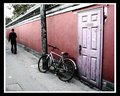
| 05/03/2006 03:56:27 AM | Bikeby MadMan2kComment: I don't know what did it look like before? | | Photographer found comment helpful. |
| 05/03/2006 01:40:23 AM | Old memories...by ZILAComment: *Howdy from the Critique Club*
First of all I would like to tell you, I myself really like this image and I will try to give you what I (think) might have made it look a little better, which you may or may not like. Also try to keep your image close to the 150k, so you don't loose any image detail.
I really do believe you have something to work with, though the voters may not like, but for me I don't care what they think sometimes if you enjoy your image. You can not please everyone. To me this has a lot a story, what the camera in its day did and the pictures show its life.
For me I think some more contrast could have been added. The camera is on a power point, but with a small crop, you could have had 2 on power point and the second being the lower right picture. Also black and white works good with this, because there are really no great colors. Also since you could use advanced editing in basic this time.
So what I did was crop, channel mixer-red, curves for contrast simple-s curve painted in the mask with a soft paint brush, color black to bring back camera body
another curves adjustment to dark the paper edge some more, then in its mask I paint the first 3 picture above the camera. Then duplicated background and blurred the whole image radius 2 pixels, then applied a mask and paint with a soft brush the color black, the first picture and the front of the camera around the lens area this brought back the sharpness of these two places. Then I thought what about a vignette, since all the pictures in your photo has them. So in my duplicated background layer I selected marquee tool pulled out a oval leaving just the corners, inversed, filled with the color black, blurred this to remove sharp oval edges radius 27.5 pixels and in the layers pallet dropped the opacity down to 36% and you can see these changes here. Please let me know if you don't want my version of your image or images online, and I'll take it down.
Now I think the photo tells the same story of the older camera.
You have a wonderful day and if you have any question please feel free to PM anytime.
Mark Thomas Kelsay Message edited by author 2006-05-03 01:44:32. |
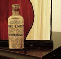
| 05/02/2006 02:12:10 PM | Old medicineby mmusicanteComment: *Howdy from the Critique Club*
First of all there is not a lot going on with this picture.
It met the challenge, but here's how I see it. Your medicine bottle is left of third and your back ground runs short. So by cropping past the brown edge this put your medicine bottle on two power points, Now it is better use of the thirds.
Now you have something old, In my opinion black and white would do good here and maybe a vignette.
Here is what I done. I made background copy, then channel mixer, curves for some contrast, then I went back to background copy used the marquee tool and pulled out a oval around the bottle, then gaussian blur 40 radius and opacity 80 percent. You could use a sepia look also.
Thus giving it a look of maybe and old time advertisement, back in the day. These changes can be seen here . Please let me know if you don't want my version of your image or images online and I will take them down.
You have yourself a wonderful day, Mark Thomas Kelsay. | | Photographer found comment helpful. |
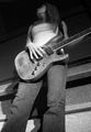
| 05/01/2006 12:25:14 PM | New Guitarby roO_dawgComment: * Howdy from the Critique Club *
First of all, you need to save file close to 150K. So you don't loose any more detail.
I do believe this image works well in black and white.
Not sure if your camera angle is doing your image justice, (not straight on) I think if you have put yourself to left of your subject and use those great lines in the background along with neck of the guitar. More of a perspective look. To me it looks as if she is standing in a square type area. If you can't be up high enough, take something to stand on or zoom in. Since the subject was about the guitar and not the girl.
You cropped or didn't have the whole neck in the photo. ( wish it was there)
I seen where you said that your camera doesn't work well in low light. Take flashlight with you and tripod.
You really have some nice shapes to work with here. The curve of the chin and top of her head match those curves of the guitar. The neck of the guitar and the lines of the back wall.
This can be seen here Please let me know if you don't want my version of your image online, and I'll take it down.
Also you should go out and reshoot. You do have something to work with. I do think you can and will improve.
If you have any question or comments please feel free to PM me anytime.
You have yourself a wonderful day, Mark Thomas Kelsay
Message edited by author 2006-05-02 12:44:40. |
|
Showing 141 - 150 of ~647 |
Home -
Challenges -
Community -
League -
Photos -
Cameras -
Lenses -
Learn -
Help -
Terms of Use -
Privacy -
Top ^
DPChallenge, and website content and design, Copyright © 2001-2025 Challenging Technologies, LLC.
All digital photo copyrights belong to the photographers and may not be used without permission.
Current Server Time: 08/02/2025 01:28:46 AM EDT.
|