| Image |
Comment |
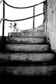
| 02/21/2006 09:00:05 PM |
Up Rightby PrincessLolaComment: love the gritty feel of this and how the tree is trying to poke into the picture, but the stairs turn away from it |
| 02/15/2006 10:38:19 AM |
Blood Moneyby mferg265Comment: Your title might make more sense as part of a series, but taken out of context like this, it's just meaningless with a dollop of meanness. As for the photo itself, the lighting seems a bit harsh, but I like the light and use of the background. |
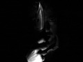
| 02/15/2006 10:30:22 AM |
The Beast Withinby balmikiComment: Nice job making the darkness work for you here. I also like the negative space on either side. |
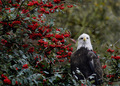
| 02/02/2006 07:30:37 PM |
Bald Eagle with Berriesby RissaComment: The focus on the eagle is a bit soft, and the RED berries steal all the glory here. I like the framing, but I think the eagle needs some more space around it to pop. |
 Photographer found comment helpful. Photographer found comment helpful. |
| 02/02/2006 07:28:23 PM |
Innocenceby fadedbeautyComment: This is all about those gorgeous eyes. And the hair and the way it frames her eyes. I honestly don't even notice the rest of the picture. 9 |
| Photographer found comment helpful. |
| 02/01/2006 05:24:51 PM |
Trooperby dpattersonComment: I kind of like the busy background, but Trooper would be cuter in focus. Or at least sitting still. |
| Photographer found comment helpful. |
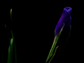
| 02/01/2006 05:22:56 PM |
Irisby james_soComment: The iris itself is a bit dark (the stem draws the eye more), but I really like the extra stalk on the left. |
| Photographer found comment helpful. |
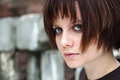
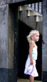
| 02/01/2006 05:20:59 PM |
Waitingby manic35Comment: You've put her head center (vertically) and cut off her feet! Everything else is great - love of contrasts between the girl (young, light, bright, soft) and the building (old, grey, darker, hard). I even like how she's looking around the corner to the short side of the frame. |
| Photographer found comment helpful. |
| 01/31/2006 04:46:30 PM |
Strandedby danw791Comment: I like the idea, but the lighting and the overall look of this is flat. There doesn't seem to be a lot of depth here; the one part of the shot out of focus is neatly cut off by the plate and so is shoved away, not really part of the picture. |
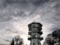
| 01/24/2006 06:31:15 PM |
pagodaby kevinfComment: I need to see more along the bottom of this - the trees and the pagoda seem cut off from the ground. It's a bit disorienting. Otherwise, it's a nice shot with a great, dynamic sky. |
Home -
Challenges -
Community -
League -
Photos -
Cameras -
Lenses -
Learn -
Help -
Terms of Use -
Privacy -
Top ^
DPChallenge, and website content and design, Copyright © 2001-2025 Challenging Technologies, LLC.
All digital photo copyrights belong to the photographers and may not be used without permission.
Current Server Time: 08/24/2025 03:05:08 PM EDT.