| Image |
Comment |
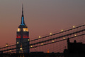
| 05/31/2006 03:17:15 PM |
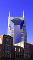
Shades of the Empire Stateby Nikolai1024Comment: love the lines here. The muted sky is nice, too -- helps set off the black lines of the bridge cables and building silhouettes. I hate to say it, but the Chrysler Building sort of takes away from the overall effect by sticking out like that. |
 Photographer found comment helpful. Photographer found comment helpful. |
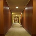
| 05/31/2006 02:51:05 PM |
Hotelby burtctComment: I kind of like how boring this is. You've perfectly captured typical hotel "design." Bland colors. Dirty carpet. Almost symmetrical. I'm waiting for little Danny Torrance to come around the corner riding his Big Wheel. |
| Photographer found comment helpful. |
| 05/31/2006 02:36:37 PM |
|
| Photographer found comment helpful. |
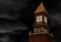
| 05/31/2006 02:35:49 PM |
Timeby PrismComment: I wish the clock tower were brighter, but it still stands out from that sky pretty well. |
| Photographer found comment helpful. |
| 05/31/2006 02:33:38 PM |
New rising from the Oldby drake217Comment: Way too much blue, Batman. Interesting idea to contrast the old red brick with the new blue glass, but all that blue reflected in the old buildings' windows ruin the effect. |
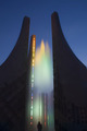
| 05/31/2006 02:16:13 PM |
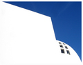
The Sculpture´s Domeby gsalComment: I'm guessing you blew it out on purpose, but I'd like some detail in the white, especially with so little in the sky. |
| Photographer found comment helpful. |
| 05/31/2006 02:14:27 PM |
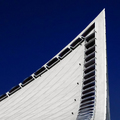
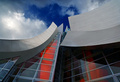
^by Prime_TimeComment: Cute title. I like the stark white against the deep blue. Interesting lines. Could be a little sharper, but the overall effect is great. |
| Photographer found comment helpful. |
| 05/31/2006 02:12:03 PM |
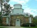
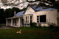
Observatoryby CEJComment: This shot doesn't really help flatter the building. It's just a straight-on shot, but the symmetrical profile is lost in the trees. It looks flat because of the lighting, and the background is sort of boring and washed out. You have a line leading from top-left to middle-right, but there's nothing to see there. Maybe try a different time of day or from another angle? |
| Photographer found comment helpful. |
| 05/31/2006 02:03:36 PM |
|
| Photographer found comment helpful. |
| 05/31/2006 02:02:57 PM |
|
| Photographer found comment helpful. |
Home -
Challenges -
Community -
League -
Photos -
Cameras -
Lenses -
Learn -
Help -
Terms of Use -
Privacy -
Top ^
DPChallenge, and website content and design, Copyright © 2001-2025 Challenging Technologies, LLC.
All digital photo copyrights belong to the photographers and may not be used without permission.
Current Server Time: 08/24/2025 11:44:40 AM EDT.