| Image |
Comment |
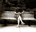
| 05/17/2004 07:26:12 PM |
Away from it Allby elsapoComment: Nice "human scene" and use of B & W. I think it could be improved with straightening and more of a central theme of interest. No real focus for me. |
 Photographer found comment helpful. Photographer found comment helpful. |
| 05/17/2004 07:24:00 PM |
Starting a New Cycleby HRoxasComment: Nice macro, but doesn't hold my interest as a subject or focal point. The cropping is a little tight, forcing the "centeredness" a bit for me. |
| Photographer found comment helpful. |
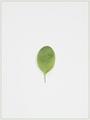
| 05/17/2004 07:22:07 PM |
Zen, Consider the Leafby rudacbComment: I almost submitted a very similar shot, so of course I like the concept and simplicity. For me, the leaf doesn't create enough interest and isn't bold/striking enough. Maybe a little sharper focus. The hint of a shadow on the left I would either like to see more of or not at all. |
| 05/17/2004 05:44:56 PM |
Circles of Colorby cabaComment: I really gravitated to the creamy yellow center. The colorful spiral might look a little more engaging with some additional thickness maybe -- looks a little like pened lines right now. |
| Photographer found comment helpful. |
| 05/17/2004 05:43:08 PM |
Blue Smartieby ErnstComment: Love the brilliant colors. Is the center one raised above on glass, so that it appears so separated? I think it would be a more engaging shot with less contrast between the foreground and background focus. I probably would have cleaned up the white dots on the center candy -- but that is a picky thing. |
| Photographer found comment helpful. |
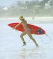
| 05/17/2004 05:40:35 PM |
Wahiniby kayceeComment: Her red board really "pops". If the focus were a little sharper and a little less "busy", it could a bit more effective, I thnk. |
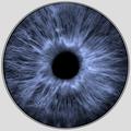
| 05/17/2004 05:38:49 PM |
Irisby labudsComment: Very interesting shot and nice pinstriped ring. I need a little more interest, focus or contrast to make me want to look. Focus too fuzzy for me for this purpose; reminds me of any x-ray. |
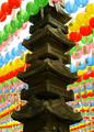
| 05/17/2004 05:37:05 PM |
Pagoda & Laternsby JoviComment: Very colorful and crisp. I feel that for me it is too tightly cropped in order to "make" it a centered composition. It doesn't draw me in. It could use a little straightening. IHere, the column goes thorugh our whole picture; I would like to have seen the original to see where it is in relation to its surroundings. |
| Photographer found comment helpful. |
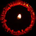
| 05/17/2004 05:34:27 PM |
Candleby DufusComment: Very interesting ring of fire effect. I think it would have been even more interesting with some detail still visible inside the candle/ring. The texture of the wax is well shot, but not necessarily appealing to me. |
| Photographer found comment helpful. |
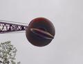
| 05/17/2004 05:32:38 PM |
Headache Ballby DrakeComment: It meets the challenge, but has no real interest for me. The tree distracts. If the tree were removed, and the colors brightened/contrasted up a bit more, I think it might have more interest. |
| Photographer found comment helpful. |
Home -
Challenges -
Community -
League -
Photos -
Cameras -
Lenses -
Learn -
Help -
Terms of Use -
Privacy -
Top ^
DPChallenge, and website content and design, Copyright © 2001-2025 Challenging Technologies, LLC.
All digital photo copyrights belong to the photographers and may not be used without permission.
Current Server Time: 08/04/2025 02:48:56 PM EDT.