| Image |
Comment |
| 07/30/2004 06:15:24 PM |
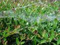
web in bushesby romeer1Comment: I am not sure what you wanted here, but for me there is no real interest or focus here. Has a "snapshot" look, also. |
| 07/30/2004 06:14:31 PM |
Dice In Handby reeveyComment: I think that this shot could be helped by a crisper focus . I am not sure B & W is a good choice here, but can't tell without comparing to color. It is an interesting take, but not compelling to look at IMHO. |
 Photographer found comment helpful. Photographer found comment helpful. |
| 07/30/2004 06:11:16 PM |
|
| Photographer found comment helpful. |
| 07/30/2004 06:09:44 PM |
Serena1by shannoyComment: Beautiful horse and capture. I think it would help to frame the composition less like a snapshot (IMHO) and more in line with a composition in mind, and the focus is too blurry overall. If the horse is blurry for motion, it would still be good to have the background crisp and vice-versa. |
| 07/30/2004 05:14:33 PM |
SSipperby greslizzzComment: I like the artsy feel, but it may be a bit too closely cropped and sized. The graininess is just a bit too much, and the blown highlights unfortunatley can't be fixed in basic editing. |
| Photographer found comment helpful. |
| 07/30/2004 05:11:54 PM |
water,water, everywhereby marlinComment: Water was well captured. The crop is too tight for me and you will probably see lower scores due to the size you took your image down to. Overall, this appears more like a "snapshot" to me, without a lot of interest, but that is just an opinion. |
| Photographer found comment helpful. |
| 07/30/2004 05:09:23 PM |
|
| Photographer found comment helpful. |
| 07/30/2004 05:08:27 PM |
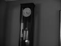
timeby macgeek007Comment: I don't know what you were wanting to achieve for your vision, but the problems I see are poor focus, tilt not corrected, lack of overall tonal range, and no real "interest" in the shot IMO. |
| 07/30/2004 05:06:31 PM |
In the eye of the beholderby DvanComment: The beak over-powers the focus on the eye, and the blown highlights of the upper left of the frame are too powerful to ignore IMO for this to score well. |
| Photographer found comment helpful. |
| 07/30/2004 04:07:29 PM |
|
| Photographer found comment helpful. |
Home -
Challenges -
Community -
League -
Photos -
Cameras -
Lenses -
Learn -
Help -
Terms of Use -
Privacy -
Top ^
DPChallenge, and website content and design, Copyright © 2001-2025 Challenging Technologies, LLC.
All digital photo copyrights belong to the photographers and may not be used without permission.
Current Server Time: 08/09/2025 02:31:41 AM EDT.