| Image |
Comment |
| 12/15/2006 12:09:58 AM |
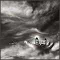
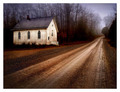
Fickle Finger of Fateby pointandshootComment: ummm. whoa. And I thought mine was pushing the limits of editing creativity. Yeah makes mine looks like nuthin'. I will be very interested on how people vote on this one. |
 Photographer found comment helpful. Photographer found comment helpful. |
| 12/14/2006 11:00:08 PM |
Peek-a-Blueby RompyComment: Honestly, I think this is one of those rare examples where talent and execution supercede camera quality. To me, that is the only perceivable reason for the average score. You can see some quality issues if you look closely at the eyes, not focus, but almost jpeg-ish issues. Could be editing or camera...My guess is latter. |
| Photographer found comment helpful. |
| 12/13/2006 01:16:25 AM |
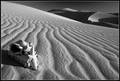
A Dark Past... by cutlassdude70Comment: sweetness - couldn't have done it better myself. Except maybe move the skull to the right about 6 inches..heh. You've got somethin' going and I want it. Maybe it is the driving to cool locales part I am too lazy about. |
| Photographer found comment helpful. |
| 12/13/2006 01:04:38 AM |
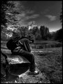
Contrast of lifeby GmicugaComment: I think this great...however, there is something just a bit too contrasty in the foreground, so that it kinda distracts my attention from the main subject. My eyes find solace in the castle instead...If that was your intention than you get mega-kudos, I just would have lessened the effect a bit. |
| Photographer found comment helpful. |
| 12/13/2006 12:42:54 AM |
Fertility by TechoComment: Techo, you have such a clean, fresh style. Is there a gel to get everything pink?? Great job.. |
| Photographer found comment helpful. |
| 12/08/2006 03:06:26 PM |
Unobservedby jfwolpertComment: This is inside the new and fantastic Denver Art Museum. A building that truly aspires to enhance its exhibitions. |
| Photographer found comment helpful. |
| 12/08/2006 01:28:30 PM |
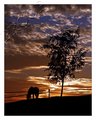
Whispersby BradComment: i am with she and alex here. you didn't get a wow from me, but definitely got a "oh yeah"..heh. The tree and sky add so much to the horse's environment.. |
| Photographer found comment helpful. |
| 12/08/2006 12:56:23 PM |
Simple Faithby StuckOnTheFarmComment: Originally posted by skiprow:
what a laugh! ...i guess we should ask shannon why he uses plotter prints all the time, or ask manny why he shoots portraits of beautiful girls all the time, or larus why he shoots landscapes and women all the time...thanks for providing some fodder for the b!+chbag ;-). |
That was a fairly rude remark. i happen to be one of the the dissenters on this one. This is nothing like Scalvert or Librodo or Larus. Those are unique works with similar techniques. This is the (basically) same shot. it is about the integrity of the site and the photographers. I don't believe it is about complaining, but more about the simple question: why? Raising concern is not the same thing as bitching. I would equally raise concern if it got a 4.5. |
| 12/08/2006 03:50:40 AM |
Simple Faithby StuckOnTheFarmComment: Originally posted by escapetooz:
I don't understand why you did the same shot again? |
completely agreed. Umm - Why? I have thought about it and it makes absolutely no sense. Unless you wanted to do a a color vs. b/w experiment...Hmmm.... |
| 12/08/2006 03:45:42 AM |
Then and Nowby FirstyComment: you are arguably (Nico as well) the master of sepia toned duotones. Your light/shadow play truly guides the viewer. I could honestly study your style. And that is saying something... |
| Photographer found comment helpful. |
Home -
Challenges -
Community -
League -
Photos -
Cameras -
Lenses -
Learn -
Help -
Terms of Use -
Privacy -
Top ^
DPChallenge, and website content and design, Copyright © 2001-2025 Challenging Technologies, LLC.
All digital photo copyrights belong to the photographers and may not be used without permission.
Current Server Time: 08/06/2025 06:36:09 PM EDT.