| Image |
Comment |
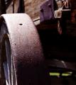
| 05/06/2004 07:31:14 PM |
Wheel of timeby silverleafComment: I'd like to see a bit more light behind the wheel - just enough to bring out some texture in the carriage's wood next to the wheel, and no more. Great depth of field - I enjoyed this image! |
 Photographer found comment helpful. Photographer found comment helpful. |
| 05/06/2004 07:29:06 PM |
A Door of the Pastby nikon_girlComment: Not only do I enjoy the photographic quality of this image, but I love that it makes me ask questions about what's behind the door. I like the lighting as well - excellent! |
| Photographer found comment helpful. |
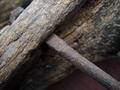
| 05/06/2004 07:27:11 PM |
old toolsby hodgeComment: his picture is a textbook example of "less is more." I love the subject, the DOF, and ven the cropping. Very well done! |
| 05/06/2004 08:49:02 AM |
|
| Photographer found comment helpful. |
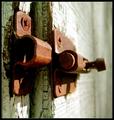
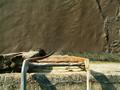
| 05/06/2004 08:48:33 AM |
Rusted but Trustedby geewhyComment: I like the mind-games this image plays... It's great when you see a picture that rewards second glances. I might suggest keeping more of those wooden posts in the frame as they add interest to me. |
| Photographer found comment helpful. |
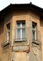
| 05/06/2004 08:46:25 AM |
Dentistby smr78Comment: Neat architecture. It looks like this was taken from slightly off center, which may have been your intent. I'd like to see it from a head-on symmetric POV as the symmetry of this shot could be interesting. Also not sure you needed to leave so much sky in the crop. It's almost too bright in contrast to the rest of the image. |
| Photographer found comment helpful. |
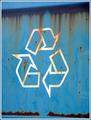
| 05/06/2004 08:44:24 AM |
Recycleby cbonsallComment: The cropping does a good job of keeping the focus on the subject, but I'm looking for something of interest to catch my eye. This just seems like a recycle sign. |
| Photographer found comment helpful. |
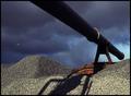
| 05/06/2004 08:42:52 AM |
Water Towerby darrengComment: Too much grass in the bottom half detracts from the tower. I think it would have been nice to see the frame which surrounds the container more centered. |
| 05/06/2004 08:41:26 AM |
Soon to be unchainedby indianzfanComment: I think the background washes out the image. The foreground hand is also out of focus, and the chains seem to be lackign in sharpness. The rings are a bit distracting as well; It seems like the focus of the image is the chaining of a body rather than the body's jewelry. |
| 05/06/2004 08:39:09 AM |
Decomposingby johnmComment: The glare in the upper left is distracting. I'm not sure the top half of the picture is adding anything to the image either. If the shot was taken from an angle that completely covered the grafiti in the chain link fence, it might have been interesting with a tight crop. |
| Photographer found comment helpful. |
Home -
Challenges -
Community -
League -
Photos -
Cameras -
Lenses -
Learn -
Help -
Terms of Use -
Privacy -
Top ^
DPChallenge, and website content and design, Copyright © 2001-2025 Challenging Technologies, LLC.
All digital photo copyrights belong to the photographers and may not be used without permission.
Current Server Time: 08/19/2025 01:45:56 PM EDT.