| Image |
Comment |
| 05/14/2004 10:17:38 AM |
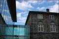
Architecture: New and oldby eirasiComment: Looks like the image is tilted clockwise by 1-2 degrees. It's also a bit dark for my liking, and would benefit from sharpening. |
 Photographer found comment helpful. Photographer found comment helpful. |
| 05/14/2004 10:16:30 AM |
Sweet & Sourby Brooklyn513Comment: The background has too much texture and distracts from the subjects. The shadow on the lemon's edge is also distracting. |
| Photographer found comment helpful. |
| 05/14/2004 10:15:21 AM |
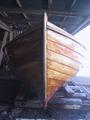
Ready for launchingby skalman69Comment: I wish it wasn't overesposed on the right as I like the dramatic sidelighting in this. Seems like ti would benefit from a little sharpening as well. |
| 05/14/2004 10:14:17 AM |
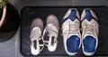
Formal or Casual.........??by bigjvoltageComment: The cropping is awkward in cutting off the boot tray. The shadow near the formal shoes, and the black thing on the left are both distracting. I'd suggest that you focus on what your subject is and find ways to highlight them rather than have competition for them. In other words, try shotting this sgain without distracting elements and maybe from a perspective that brings out the delicate features of the formal shoes vs. the clunky and dirty sneakers. It would make an interesting contrast. |
| Photographer found comment helpful. |
| 05/14/2004 10:11:54 AM |
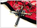
Opposite Agendas: Sinner or Saint?by mocabelaComment: Interesting composition, and it's nice that the background doesn't compete with the subject(s). the problem is that the subject is not in focus. the shadow from the cloth in upper left is also distracting. |
| Photographer found comment helpful. |
| 05/14/2004 10:10:40 AM |
45 vs. CDby JMSComment: Not sure how these are opposites, but its an interesting image. The image is lacking in sharpness, and there seems to be a shadow or light artifact in the lower left which is distracting. |
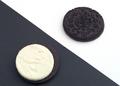
| 05/14/2004 10:09:20 AM |
Cookie Contrastby BillEComment: I think this image would be better without the opposing colors in the backdrop. Just a clean image of the two oreo halves. The cookie seems a bit grey vs. black. Not sure how to improve that, but something to think about. |
| Photographer found comment helpful. |
| 05/14/2004 10:08:06 AM |
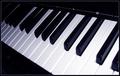
Opposing Colors Harmonizeby nikon_girlComment: Nice perspective. There's some distraction in the lower left corner which would have been nice to eliminate. Also a little extra shadow on the keys which a second light source might have helped with. Finally, I think it needs more sharpness. |
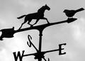
| 05/14/2004 10:06:25 AM |
DIRECTIONby rileyComment: Great use of silhouette! I didn't realize the bird was alive until I looked twice. I've said it many times, but my favorite quality in an image is one that rewards a second glance. It looks like the crop is a bit tight on the left, but otherwise, great job! |
| Photographer found comment helpful. |
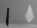
| 05/14/2004 10:04:42 AM |
Deadly Oppositesby rigelComment: The table edge on the right is distracting, and the image is very grainy. Might have also done better from a more interesting angle than head-on. Maybe contrasting the knife against the flag. |
Home -
Challenges -
Community -
League -
Photos -
Cameras -
Lenses -
Learn -
Help -
Terms of Use -
Privacy -
Top ^
DPChallenge, and website content and design, Copyright © 2001-2025 Challenging Technologies, LLC.
All digital photo copyrights belong to the photographers and may not be used without permission.
Current Server Time: 08/21/2025 02:17:10 AM EDT.