| Image |
Comment |
| 05/14/2004 12:38:46 PM |
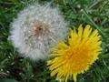
Chalk & Cheeseby dhareComment: Ok, yep, that's an opposite! I like the blue chalk on the yellow cheese - pleasing composition. Shadows are a bit distracting, but overall nicely composed. |
 Photographer found comment helpful. Photographer found comment helpful. |
| 05/14/2004 12:37:50 PM |
|
| Photographer found comment helpful. |
| 05/14/2004 12:33:37 PM |
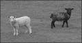
Lines And Curvesby rockhopperComment: Too much hair in the face... Hides the facial curves. The subject here is really the metal frame and the girl, yet my eyes are challenged by the background scenery as well. Needs to be composed more selectively. |
| Photographer found comment helpful. |
| 05/14/2004 12:32:14 PM |
Strong AND Weakby MotoCycleBoiComment: Great expression on the girl's face - very reflective. The backgroudn is a bit too blurred for my liking, but I think this is very creative and generally well composed. |
| Photographer found comment helpful. |
| 05/14/2004 12:31:22 PM |
Coming or Going?by hallswelComment: Has a "snapshot" feeling to it. Too much glare on the glass and distraction from the open garage door. |
| 05/14/2004 12:30:41 PM |
full / emptyby redmoonComment: Nice shot! I love the background and lighting - works very well. |
| Photographer found comment helpful. |
| 05/14/2004 12:30:16 PM |
Double Sixby MAKComment: The lighting works well with the softness in this image. |
| Photographer found comment helpful. |
| 05/14/2004 12:29:42 PM |
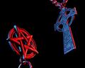
The Exorcistby labudsComment: Interesting. The reddish tint on the pentagram is a cool effect. |
| 05/14/2004 12:08:06 PM |
|
| Photographer found comment helpful. |
| 05/14/2004 12:07:24 PM |
|
Home -
Challenges -
Community -
League -
Photos -
Cameras -
Lenses -
Learn -
Help -
Terms of Use -
Privacy -
Top ^
DPChallenge, and website content and design, Copyright © 2001-2025 Challenging Technologies, LLC.
All digital photo copyrights belong to the photographers and may not be used without permission.
Current Server Time: 08/21/2025 11:00:26 PM EDT.