| Image |
Comment |
| 04/05/2007 01:49:28 PM |
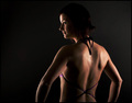
contouredby hkvamComment: I could say that I'm even more curious to see her front than back, but that
would sound sexist so I won't say that.
Dim lighting shows definition and strength, a wise choice there.
Colors and sharpness of focus are fine. Simple black background;
Nothing to distract our attention from her face and back.
Overall a good composition. An 8 |
 Photographer found comment helpful. Photographer found comment helpful. |
| 04/05/2007 01:42:00 PM |
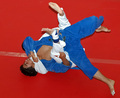
Advanced ground workoutby redpandaComment: Great action shot. Fits challenge well. And compositionally I like
how the action is centered on top of a plain red background, which is
contrasted well with the blue and white uniformed combatants.
You can also see the how challenging this physical tussle is, by the
expression and sweat on one of the two combatant's face.
A 9. |
| Photographer found comment helpful. |
| 04/05/2007 01:33:32 PM |
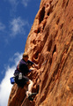
Extreme Workoutby WildShutterComment: I like this. Mostly because I have neither the fitness level nor the
bravery to even attempt. But does look kind of fun, in a death
defying sort of way.
Technically, the focus seems a bit softer on the climber than
the mountain. IMO it should be the other way around.
Normally the rule of closeups on people is good to follow, but
here, to show how high up he is, it might be better to pan out
a bit. To show more mountain below him. Seven |
| Photographer found comment helpful. |
| 04/05/2007 01:26:05 PM |
Eat fruitby marvinComment: Does not fit challenge at all
And lighting is way too bright. |
| 04/05/2007 01:24:16 PM |
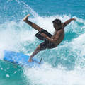
Fitness can be Funby scottwilsonComment: Great action shot. Definitely fits the challenge.
And does look fun, albeit a bit scary.
Technically, the natural lighting, the focus, and the contrast and
colors are all fine. Good job! A nine. |
| Photographer found comment helpful. |
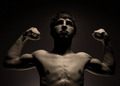
| 04/05/2007 01:21:01 PM |
Look.by Dan_CottleComment: A boxer's physique. Welterweight perhaps? That's 147 lbs. for you
non followers of the sweet science.
Lighting is a bit dark, but does fit the character of the composition,
as it shows off strength. Although, if we can see more of the eyes,
it might score better.
I like the symmetry of this. Totally centered.
This shows that there are exceptions
to applying the rule of thirds. Seven
A seven. |
| 04/05/2007 01:12:45 PM |
|
| Photographer found comment helpful. |
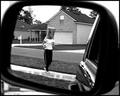
| 04/05/2007 01:10:36 PM |
The Witness Protection Fitness Programby idnicComment: A clever take on the challenge theme. And an interesting perspective
with the use of a mirror of a car. Title is great. And the lighting
is fine. Houses in the back are fine, not distractions, as it shows
the suburban neighborhood environment. Very original. A nine. |
| Photographer found comment helpful. |
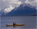
| 04/05/2007 01:00:03 PM |
Paddleby aberrationComment: Awesome shot. I'm sure you decided that the main POI are the mountains
as they are more clearly shot than the soft focus of the kayak and it's rider.
Tough decision, but IMO it was the right one.
Certainly fits the challenge theme as well. An eight. |
| Photographer found comment helpful. |
| 04/05/2007 12:54:31 PM |
|
| Photographer found comment helpful. |
Home -
Challenges -
Community -
League -
Photos -
Cameras -
Lenses -
Learn -
Help -
Terms of Use -
Privacy -
Top ^
DPChallenge, and website content and design, Copyright © 2001-2025 Challenging Technologies, LLC.
All digital photo copyrights belong to the photographers and may not be used without permission.
Current Server Time: 08/25/2025 05:34:05 AM EDT.