| Image |
Comment |
| 06/10/2002 01:10:00 AM |
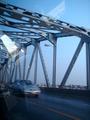
road homeby lunarmanicComment: I love the way the bridge structure and the reflections work with each other, but I don't like the cars in the shot. Oh, to control all of the elements of a shot... so impossible :( |
| 06/10/2002 01:12:00 AM |
Waitingby eesserComment: What are we waiting for? The road to open? If so, you should probably turn around... and maybe get in your car ;) I suppose you could be legitimately waiting to get in that beautiful machine. On the photography side -- great focus, and very nice use of depth of field. |
| 06/10/2002 01:03:00 AM |
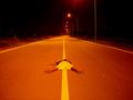
roadkillby eadwineComment: Absolutely awesome shot. The colors, the lines, the composition... and the so nicely positioned dead body. I love it. |
| 06/08/2002 02:58:00 PM |
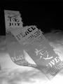
C'est La Vieby hokieComment: If this photo isn't altered, you're going to need to do a "how'd they do that?" to show us how you got this effect. |
| 06/03/2002 01:36:00 PM |
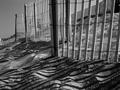
Duneby welcherComment: One of my early favorites -- your use of lines vs. curves and a range of textures and tones is outstanding. Wonderful shot. |
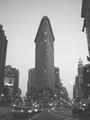
| 06/04/2002 10:02:00 AM |
Flatironby pauldComment: The photo seems washed out -- I'm not sure if it's a misty day, or if that's just your camera. Either way, I'd try to push the levels apart a little further, so the image has higher contrast. Great use of symmetry. |
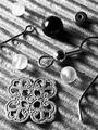
| 06/03/2002 01:41:00 PM |
Pieces for One Earringby AmphianComment: I think I'd have played with the levels of this shot, as the whole image seems to sit right around the mid-tone level. I think pushing the dark and light tones further towards their respective poles would have made the objects stand out even further from the great texture you have. |
| 06/04/2002 12:13:00 PM |
felinesqueby foot stepsComment: Awesome use of contrast and silhouette. I love the reflections on the table. My only suggestion is that you went a little further one way or the other on your angle ... that is, go for symmetry and shoot it straight on, or turn the camera a little more to show your intent slightly crooked composition. Great submission. |
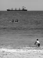
| 06/03/2002 01:38:00 PM |
Life at the Beachby langdonComment: I told you I liked "feel the heat" better, but I really do love how the kid almost seems to be diving into the picture. You're hot. |
 Photographer found comment helpful. Photographer found comment helpful. |
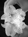
| 06/04/2002 10:09:00 AM |
Photoshoot Setupby FranziskaLangComment: The movement on that bottom flower is pretty distracting, and it makes the photo look blurred/out of focus at the bottom. I love the top of the image, though, so I know if that bottom part hadn't been blurred, I'd really have liked this image. I think you might have gone for a little more symmetry, though, with how much hand is showing at the top/bottom. |
| Photographer found comment helpful. |
Home -
Challenges -
Community -
League -
Photos -
Cameras -
Lenses -
Learn -
Help -
Terms of Use -
Privacy -
Top ^
DPChallenge, and website content and design, Copyright © 2001-2025 Challenging Technologies, LLC.
All digital photo copyrights belong to the photographers and may not be used without permission.
Current Server Time: 08/08/2025 07:23:20 AM EDT.