| Image |
Comment |
| 09/10/2005 04:47:40 PM |
Good Day Sunshine 2by NeilComment: Intense color contrast for sure, but I think it would be better with some more front lighting too. The detail on the right seems too dim. Maybe a slightly wider crop too. |
 Photographer found comment helpful. Photographer found comment helpful. |
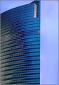
| 09/10/2005 03:27:44 PM |
chicago.jpgby puzzledComment: I like the image but something seems vaguely "wrong." Maybe it's how the building ends so abruptly at the right. I know that's an architectural design, but it looks off somehow. The crop at the top is unfortunate too. |
| Photographer found comment helpful. |
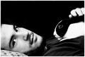
| 09/10/2005 09:26:59 AM |
Sir Francis Drake.jpgby mystical_princessComment: I like your crop on the hat and head, but I think the background is a little too overpowering. Your model is wonderful and I love the grainy BW texture. |
| Photographer found comment helpful. |
| 09/10/2005 09:22:15 AM |
18.jpgby rasdubComment: Fun with fisheye. I like this kind of experimentation. The perspective shift with the boardwalk is wild. I imagine you just missed your feet! |
| Photographer found comment helpful. |
| 09/09/2005 10:23:37 PM |
Horus' Throneby glodaComment: Absolutely spectacular. The kind of shot that makes me say "I wish I'd done that," and then immediately run out and try to do it! |
| Photographer found comment helpful. |
| 09/08/2005 01:19:05 PM |
IMG_5156.jpgby ourwebstopComment: Straighten the horizon a bit and you've got a winner. I'm a sucker for those sunbeams. |
| Photographer found comment helpful. |
| 09/06/2005 05:54:11 PM |
Friendsby CalliopeKelComment: There's a lot to like in this image. I like the close crop on the man's face (closer still might have been even better, just above the eyes) and the rabbit. I like the way you've allowed the white parts of the rabbit to overexpose a bit - bringing out the contrast required by the challenge subject. The flat black background is also nice. I score this one a 6 - technically a good image, a little above average in composition, meets the challenge. What it doesn't do is grab me and WOW me. It doesn't suggest a story or an emotional connection that's compelling and sucks me in. Overall nice image. Good luck! |
| Photographer found comment helpful. |
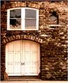
| 09/06/2005 05:49:01 PM |
Eden's Doorby rexComment: This is obviously a nice old building full of texture and personality, but I feel that your composition is lacking something. The placement of the door and windows doesn't feel naturally balanced to me, and the elements themselves aren't compelling - don't seem to suggest a story to me. I can see voters giving this one a few seconds, clicking a midrange vote, and then moving on. What could you have done to make it compelling? I'd suggest focusing on a single element instead of the combination of the three. Maybe just the door, or even part of the door (metal knobs, etc.). The brickwork visible is very dark and of relatively low contrast, which detracts more from the raw visual appeal. Was the day cloudy? I don't see evidence of direct sun, which could have also added to the dramatic feel (shadows on textured surfaces like that are great). The addition of the sidewalk at the bottom is further unnecessary (IMO) picture elements in a composition that already feels crowded and disharmonious.
OK, what of the contrast asked for by the challenge topic? I'm afraid I really don't see it. The white woodwork against the darker brick just doesn't do it for me. There is some contrast implied in the reflections in the windows, but I think these work against you too. |
| Photographer found comment helpful. |
| 09/04/2005 11:43:00 PM |
|
| Photographer found comment helpful. |
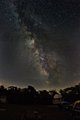
| 09/03/2005 09:49:54 PM |
Southern Milky Way_640.jpgby kirbicComment: Sensational Fritz. BTW, that's my van with the yellow sweatshirt at bottom right (bows). Second Astro GTG with StrangeKirb. Message edited by author 2005-09-03 22:04:01. |
| Photographer found comment helpful. |
Home -
Challenges -
Community -
League -
Photos -
Cameras -
Lenses -
Learn -
Help -
Terms of Use -
Privacy -
Top ^
DPChallenge, and website content and design, Copyright © 2001-2025 Challenging Technologies, LLC.
All digital photo copyrights belong to the photographers and may not be used without permission.
Current Server Time: 08/11/2025 09:54:00 AM EDT.