| Image |
Comment |
| 10/29/2005 02:27:54 PM |
Mars 80 MM ED Refractorby jmritzComment: Superb sketching job John. You should include the time/day you made the sketch for comparison! Message edited by author 2005-10-29 14:28:14. |
 Photographer found comment helpful. Photographer found comment helpful. |
| 10/24/2005 03:07:16 PM |
|
| Photographer found comment helpful. |
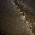
| 10/22/2005 07:31:19 PM |
October Milky Wayby kirbicComment: Too many stars, my dear Kirbic, and too beautiful for our eyes. Message edited by author 2005-10-22 19:33:01. |
| Photographer found comment helpful. |
| 10/15/2005 01:59:41 PM |
Primary colorsby pitsamanComment: This is so good it's scary. Keep it in reserve for a "best of 2005" challenge dude... |
| Photographer found comment helpful. |
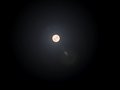
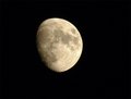
| 10/14/2005 10:05:39 AM |
moon.jpgby hyperfocalComment: Much better than your challenge entry (which didn't do that badly, BTW). Good glass makes a lot of difference. If you really want good results with the moon though, you need a telescope and an adapter to mount your camera to it. Now you're talking some bucks!! |
| Photographer found comment helpful. |
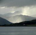
| 10/10/2005 02:33:15 PM |
IMG_4805_scotch-mist.jpgby barbaraanneComment: Nice composition! I wonder if you could have brought up the color saturation a little to bring out some of the greens of the lakeshore? The heavily moistured air is going to knock out a lot of color, but the result is pretty gray. Very sharp in spite of the fog! |
| Photographer found comment helpful. |
| 10/09/2005 09:54:55 AM |
Shadowby hannekeComment: This is a very cool effect. Could be interesting for lots of other objects too. Nice going! |
| Photographer found comment helpful. |
| 10/08/2005 04:03:45 PM |
|
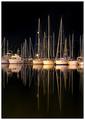
| 10/07/2005 10:32:01 PM |
Romanticby rsaulyteComment: Greetings from the Critique Club
by strangeghost
COMPOSITION
An absolutely breathtaking shot. Composition split evenly top to bottom with the water surface just short of glass-like. I love the portrait orientation which emphasizes the stature of the masts. Brilliant work!
TECHNIQUE
The thing that's so striking about this image is the absolute perfection of the lighting. I can't image what the source of light is that makes the boats' hulls glow in such a creamy soft hue. The center one is a little yellow but that is far from bad - it adds a little splash of color. I'm also struck by your perfect control of the tonal range, from inky black water and sky to softly glowing white boats. Focus is sharp and I almost get a feel of three dimensionality from the forest of masts. I looked hard but I can't find anything to criticize!
OVERALL IMPACT
I admit that I'm a bit blown away by this photo. It shows a great eye for composition and superb attention to detail, both in the shooting and the presentation. You give no details in your photographer's comment or photo information, so I can't tell what you were aiming for, or how you achieved it in-camera or post processing, but I say you scored a hit. Your commenters certainly liked it as well, but I'm a little surprised the final score wasn't higher. 6.14 is very respectable, but I liked it a lot and thought maybe it deserved a higher finish.
|
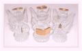
| 10/07/2005 08:37:18 PM |
Seasons Greetingsby trainComment: Greetings from the Critique Club
by strangeghost
COMPOSITION
I'm having a hard time deciding what I really think of this composition. The white background is lovely, though changing in brightness from bottom to top, which gives it a bit of a dirty feel. I think white backgrounds are very unforgiving. If they're not clean and clear, they tend to look muddy or messy. The angel figurines certainly do communicate a holiday feel, but it also feels somewhat empty and isolated. It's possible that a splash of color somewhere would have made it more balanced and given it a more "full" feeling. A sprig of holly, or a red ribbon, something. I think the centeredness of the composition is appropriate, though with a more varied and colorful use of subjects, that might have changed.
TECHNIQUE
Appears to be lit primarily from the front, which with glass subjects, is rarely the strongest lighting scheme. Did you mess around with side or back lighting? I think some very nice effects and atmospheric feels might have been possible with subjects like this. This raises another compositional tweak, red and green background, brightly lit and allowing the colors to shine and refract through the glass. Might have been interesting?
OVERALL IMPACT
A tough image to critique in depth because of the lack of any indication of what you were aiming for. Please consider including even brief photographer's comments in the future. Any hints about what you were trying to achieve helps the critic. As a greeting card, I could see it working, but as a photo, I can see many other possibilities that might have improved it and made it a stronger challenge image.
I imagine you were a bit disappointed at the performance of this image. A 5.1 isn't too bad but was below the 50th%ile for the challenge and far below what you've achieved in past challenges. I think its plain feel didn't wow the voters and got you many "5 and move on" votes. Again, a bit of color or a more interesting spin on the comp might have bumped it up a bit. |
Home -
Challenges -
Community -
League -
Photos -
Cameras -
Lenses -
Learn -
Help -
Terms of Use -
Privacy -
Top ^
DPChallenge, and website content and design, Copyright © 2001-2025 Challenging Technologies, LLC.
All digital photo copyrights belong to the photographers and may not be used without permission.
Current Server Time: 08/11/2025 05:10:05 AM EDT.