|
|
|
Showing 421 - 430 of ~1461 |
| Image |
Comment |
| 03/11/2006 10:03:59 AM | big brotherby mdfphotosComment: Greetings from the Critique Club
by strangeghost
The first three parts of this critique are written based purely on examination of your photo. "Final thoughts" is written after reviewing your score, photographer's comments, and voter comments.
TECHNIQUE
Technically adequate. Focus is good, exposure looks to be right on, lighting is soft and seems diffuse. Colors are OK but could maybe be a little more vibrant. Overall, no complaints at all technically.
COMPOSITION
Very cute kids, but I think the image loses punch because of the candid nature. Their hair is messy, her shirt is dirty, and most of all, their averted gaze steals the punch it might have had if they were both looking into the camera and smiling. As shot, it looks like a quick snapshot in the family room and little more. Does it convey the nature of the challenge? Yes, but the "comfort" idea is not topmost on my mind as I look at it. It looks like a shot that might be mailed to the grandparents - of family interest first and foremost.
EMOTIONAL IMPACT
For the parents and loved ones, this photo would clearly have a significant amount of emotional impact. Two adorable kids arm in arm is hard to resist. Unfortunately, your photo does not transcend the family effect, IMO. To accomplish that, I think it needed more specific planning and preparation in the composition stage. As it is, it's a fine snap for a family album or the refrigerator, but probably doesn't resonate well with the DPC voter species.
FINAL THOUGHTS
Your lack of a photographer's comment is frustrating since it leaves me with no context in which to interpret your motivation or intent. When you ask for a CC member to take the time to critique your photo, please take the time yourself to provide some of your thoughts to let us know what led up to this shot, and what your intent was. Even if it's just to say "last minute entry" or whatever, it helps! The fact that you received only three comments and a relatively low score indicates that the voters were not impressed and probably didn't spend long looking at your image before moving on. |
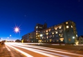
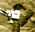
| 03/11/2006 08:25:48 AM | The Hospitalby DjabordjaborComment: Greetings from the Critique Club
by strangeghost
The first three parts of this critique are written based purely on examination of your photo. "Final thoughts" is written after reviewing your score, photographer's comments, and voter comments.
TECHNIQUE
There is so much to see in his photo it's hard to know where to start. Focus looks great, considering it's obviously a very long exposure. Everything is very sharp and contrasty and very pleasing to the eye. I love the very sharp starburst on the nearest streetlight. The deep blues of the sky and the very pleasing, gentle gradient to the horizon is just too well done. The minor lens flares are a bit of a distraction but when the theme is painting with light, those flares add a ghostly light echo to the mix as well. During your exposure, it appears as though someone walked through the composition, or maybe a bicyclist, creating some extraneous ghostly trailing at the bottom center and left. This is the only disappointing element I see. Very well done technically!
COMPOSITION
This composition shows some very significant thought and planning, IMO. The building is perspective distorted, which, along with the car headlight trails, creates a melange of lines flowing from right to left, converging on a vanishing point just at the left edge of the photo. The starburst streetlight is placed at a satisfyingly decentered position that strikes eye as a well planned element. Some might quibble and wish that you had followed a strict rule-of-thirds mandate and re-think this placement, but rules are nothing if not to be broken when the circumstances demand. I love the way this light is seemingly floating in a pool of brilliant blue sky. The perspective distortion then gives us a second vanishing point out of the top of the frame, created by the leaning of the streetlights to the right, and the lines of the building leaning inward. It's really quite amazing, how many lines there are to follow in this image.
EMOTIONAL IMPACT
Well, I certainly like it, though I wouldn't describe its impact as strictly emotional. It has a vague, otherworldly feel to it, like something out of a film noir or a science fiction movie. Something about the scene does ignite my imagination and make me speculate about other possibilities. It's a true visual treat that should reward anyone who takes the time to appreciate all the subtleties. In my view, this is a very creative shot with the right mix of the unusual and the ordinary.
FINAL THOUGHTS
I'm very surprised that you were accused of not meeting the challenge. It never even occurred to me as I was writing this that your photo didn't meet the challenge. It's a wonderfully unusual take on the challenge, and definitely deserved a higher score than the 5.4 it earned. Ah well, keep shooting. I look forward to seeing more of your stuff! |  Photographer found comment helpful. Photographer found comment helpful. |
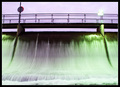
| 03/09/2006 08:33:45 PM | Damn itby marvinComment: Greetings from the Critique Club
by strangeghost
The first three parts of this critique are written based purely on examination of your photo. "Final thoughts" is written after reviewing your score, photographer's comments, and voter comments.
TECHNIQUE
I confess that I've struggled with this picture for quite awhile tonight. Frankly, I can't decide exactly what it is that bothers me about it. The motion blur in the moving water is nice, but the glaring, blown out green light is pretty harsh, as is the blown out sign (?) directly above it. The bridge looks a little too dark compared with the rest of the scene. The bright sky behind combines to create a whole pic where the lighting just somehow seems off.
COMPOSITION
The composition seems to be fairly plain and uninspiring. This is odd because flowing water generally has a pleasing feel to it, but this somehow feels a little abrasive or prickly. There's some nice symmetry with the posts, the signs, etc., but I don't feel any particular message coming from the comp. In relation to the challenge, I don't see an obvious connection to the odd couple. Dam and bridge? Water and walkway? Seems like you're stretching and not connecting.
EMOTIONAL IMPACT
None that really strikes me. There's nothing unusual or evocative that captures the imagination. No dynamic elements or tension implied. No real subject that grabs the eye and holds it, or lines that gently lead me to devour the elements. I think I don't really "get it."
FINAL THOUGHTS
I appreciate your humorous response to your commenters. It seems that most, by far, were perplexed by the relationship to the challenge, but many liked the photo, or at least were not as bothered by the technical elements as I was. In your photographer's comment, you say that you used USM to increase the saturation. I'm familiar with the oversharpening technique where you crank the amount down and the radius way up to boost contrast, is that what you mean (USM 35/100/2, for example?)? If so, you may have not had enough contrast and hue to begin with. Your final score of 4.34 reflects the voters' overall blase' attitude toward your image. You just didn't tickle their - or my - fancy with this interesting shot. | | Photographer found comment helpful. |
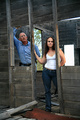
| 03/08/2006 08:53:10 PM | Don't Push It!by JudiComment: Greetings from the Critique Club
by strangeghost
The first three parts of this critique are written based purely on examination of your photo. "Final thoughts" is written after reviewing your score, photographer's comments, and voter comments.
TECHNIQUE
Technically excellent, I think. There's good detail across the full tonal range, except that bright white rectangle against the back wall, but I think that's supposed to be bright white. Good detail and textures in the wood, clothes, etc. It's all very sharp, exposure is great. Excellent technical control.
COMPOSITION
I'm not sure I understand the idea or purpose of your shot. The title, "don't push it" doesn't really rink a bell with me? An old building, hence "pushing" the walls could make them fall down?? Is the best I can think of. An "odd couple?" Hmmm. From a strictly compositional standpoint, the vertical joists are leaning to the left due to the perspective effect. That's disconcerting to the eye, but it also may add a little to the feel of this old structure on the verge of falling down. I particularly like the splash of sky and tree that's visible through the window. That bit of added color really sets off the starkness of the old, weathered interior. I think a closer crop on their faces might have made for a clearer statement in composition. There's plenty of wood at the top and foreground floor at the bottom that probably could have been sacrificed in the interest of tightening on the faces. There's plenty of building still available for context behind and directly in front of them. Just a suggestion. Whenever humans are present, faces are pretty crucial, unless pose and body language is speaking loudly (which doesn't appear to be the case here).
EMOTIONAL IMPACT
Hmmm, it's really just a shot of a man and woman posing rather pensively in an old building. It does make me wonder what they're doing, and any photo that raises questions in the mind of the viewer is making a connection, right? The problem is, for me it is much more of an intellectual question than it is an emotional one. Overall, I doubt that it has the initial visual appeal to hold voters' attention for more than a few seconds. Just a thought, maybe if he was trying to knock the wall down and she was on the other side trying to hold it up? (tension, emotion, and "odd" couple - at odds??).
FINAL THOUGHTS
Wow, only three comments, and no real obvious connection to the voters, eh? Your score of 5.17 surely reflects this blase' attitude, but I think you earned some points because you really nailed it technically. I wish you would have shared some of your thoughts and intentions in the photographer's comment. What were you aiming for? What "feel" were you hoping to evoke in voters' minds?? I find these comments invaluable after I spend time trying to grapple with a critique photo. | | Photographer found comment helpful. |
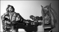
| 03/08/2006 06:23:03 PM | the classic GOOD vs. EVILby gocComment: Greetings from the Critique Club
by strangeghost
The first three parts of this critique are written based purely on examination of your photo. "Final thoughts" is written after reviewing your score, photographer's comments, and voter comments.
TECHNIQUE
Several issues to talk about here. First is the obvious focus issue on the left. The robot doesn't seem to have an compositional reason to be out of focus. If it was intentional, it doesn't seem to me to work. Second is the very bright background behind the robot, seeming almost blown out, with the light level decreasing sharply behind the barbie. Barbie is quite well lit, and the exposure seems to have been perfect for her but not the rest of the photo. Then there's the awful shadow of his arm holding the gun. Looks like possible on-board flash. This would have worked much better, imo, with two or more light sources, giving a more evenly lighted, diffuse feel. I don't feel that the black/white conversion adds much to the composition either. It's not a bad BW conversion, it just doesn't feel as though it has any real purpose in the photo.
COMPOSITION
Apropos of the subject of the challenge, it certainly is an odd couple. I appreciate the humorous aspect of the shot, but the technical issues really detract from the whole, as mentioned above. The composition is fairly centered. I think it might have been improved by having an interesting or more emotional take on the comp. For instance, Barbie with her hands up and back to the camera, with the point-of-view looking over her shoulder into the face of the robot. Or conversely, looking over the shoulder of the robot, into the joyously vacant stare of the Barbie. Either way, making the face the focus of the composition, and letting the other elements organize themselves around that focus. As shot, it looks a little too bland, as though it's an incidental setup on a toy shelf.
EMOTIONAL IMPACT
It's a somewhat unusual picture, but toys rarely make for impactful shots unless they're truly stunning or breathtaking in some way. If this had been sharply focused throughout, with bright vibrant colors, it might have been a more attractive shot, but still probably not a true eye popper. For me, it doesn't really evoke much in the way of a reaction at all, it's rather bland. A more creative approach to composition as mentioned before, might have helped also.
FINAL THOUGHTS
Your commenters were a mixed bag, but really offered some insight into how to improve the photo. I also can't help but appreciate the fact that you marked them all as helpful, even the ones that bordered on rudeness!. Your final score of 4.0 was probably a little disappointing to you, but I'm sure you can see the reason for it. Voters need to be hit over the head with impact and emotion. If that's not available, they need to have a steady dose of technical perfection. Failing those two things, low scores are almost certain. I also very much appreciate the fact that you wrote an excellent photographer's comment, letting me know exactly your frame of mind in shooting this. It makes perfect sense. Keep shooting. I looked at your profile and portfolio. You've got some great stuff, and a pretty good eye. I look forward to seeing more of your stuff in the future. | | Photographer found comment helpful. |
| 03/08/2006 08:46:43 AM | rod gold 2.jpgby Penny LaneComment: See if your camera has a setting specifically for sunsets or brightly lit landscapes. This may help to keep the sun from blowing up into a huge, burned out blob. If no scene setting, bump your apertue number way up (f13 or if not available, as high as it will go) and shoot until you are able to preserve color in the sky. For most landscape shots like this, don't use portrait mode (photo taller). And as others have said, fix that horizon! | | Photographer found comment helpful. |
| 03/07/2006 07:02:49 PM | Tulipby pellemannenComment: Greetings from the Critique Club
by strangeghost
The first three parts of this critique are written based purely on examination of your photo. "Final thoughts" is written after reviewing your score, photographer's comments, and voter comments.
TECHNIQUE
This image has such beautiful luminosity that it positively glows. It carries much more punch that the typical duotone. The focus is perfect on the near petal, and falls off gently toward the back of the flower, creating a nicely three dimensional feel. The lighting is wonderful, IMO, though a few small areas do appear to have blown out. I don't think this detracts, however. It leaves one with a sense of intense lighting that was well controlled. Your photo information indicates that it was a four second exposure at f5.6. Really? Must have been very dimly lit. The black background with the ray of light arching over the flower is exquisite. Much more effective than a flat black background. Whatever your technique, bravo on the result. I'm viewing (and critiquing) this image on a very bright iMac LCD. I just looked at your image on a traditional CRT and it's much darker and less vibrant on that monitor. I just can't express how beautiful it looks with the added brightness of the LCD screen. This gives me pause as I consider my own submissions, as well as my commenting on others' work. I bet you could have tweaked the brightness/exposure of this image up a bit and had it pop equally as well on CRTs.
COMPOSITION
Because it is an image that is so well done technically, the composition works. I don't know what is causing that arc of illumination over the flower, but I think it might have been even stronger had the flower been offset to the right, allowing the arc of light to frame it a bit. As shot, though, it's quite stunning.
EMOTIONAL IMPACT
Can you tell I like your shot?? It's beautifully simple and elegant, understated but strong. As a study, I can scarcely imagine how to make it stronger. It really works for me.
FINAL THOUGHTS
Your comments were generally very positive and people seemed to react to the beautiful lighting the same way I did. I'm a little disappointed that it only scored 5.77. Just based on the technical merit and over appeal, I would have guessed nearer to 6.0 and maybe even a smidge over. Still, it ranked at the 83rd%ile over all, not bad for a big challenge with lots of strong entries. Kudos to you. You made me pause and appreciate a wonderful work of art. | | Photographer found comment helpful. |
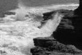
| 03/06/2006 09:21:44 PM | Beside the raging waterby Shutterbug0324Comment: Greetings from the Critique Club
by strangeghost
The first three parts of this critique are written based purely on examination of your photo. "Final thoughts" is written after reviewing your score, photographer's comments, and voter comments.
TECHNIQUE
Focus is very clear, lots of detail and texture in the rocks. Parts of the surf are a bit washed out, but this was a difficult exposure to control for given the dramatic difference in brightness between the water and the dark rock. Your sun angle was not idea given that a large portion of the rocks are in shade. Nice stop motion in the water. Good BW duotone.
COMPOSITION
Nice dramatic capture of a very aggressive surf over volcanic rock. One minor complaint that I have is the lack of any sense of scale. I can't tell how big the scene is because there is no reference object at all. A person sitting or standing on the rocks would have been useful, as would a plant or nearly anything that would provide a sense of scale.
EMOTIONAL IMPACT
There's not a great deal of impact here. It's a beautiful setting, but your photo fails to convey anything more than a hint. As suggested above, some central subject would have added a sense of drama or tension, and provided a focal point for the eye to return to. As shot, it's somewhat plain.
FINAL THOUGHTS
Your commenters were a bit underwhelmed too. Your final score of 5.09 indicates people thought it was just average and probably didn't spend that much time studying it. Keep shooting and be more thoughtful of what makes a composition stand out in a pack. This was a huge challenge (over 600 pics) and you really need to have something which catches the voters' eye. Keep shooting! |
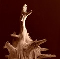
| 03/06/2006 09:01:30 PM | Dragonwoodby dhumann1Comment: Greetings from the Critique Club
by strangeghost
The first three parts of this critique are written based purely on examination of your photo. "Final thoughts" is written after reviewing your score, photographer's comments, and voter comments.
TECHNIQUE
On my monitor (a bright iMac LCD), the background looks extremely dirty with lots of spots and specks visible. Just to make sure my monitor is not at fault, I also used a traditional CRT to view your image. While the background was darker, the specks and spots were still clearly visible. I'm sure that this hurt you in the voting because any kind of distraction that takes the eye away from your subject is bound to irritate the voters. It looks like you had a piece of cloth as background. Moving the background as far back from your subject as possible helps to blur it during the shot. In your case, it looks so close (perhaps even touching that branch to the lower right?) that it's in pretty sharp focus. Any dirtiness will show up as though spotlighted, and that's apparently what happened to you. The lighting on your subject is pretty good, but I think you could have made more dramatic use of shadows, given all the cool textures and protuberances that this gnarled piece of wood provides. Focus looks pretty good, as does exposure, though it is a little washed out at points on the vertical branch extending toward the top. I like your choice of duotone (sepia) but wish the background was darker (or white, which would have been cool).
COMPOSITION
This largely centered composition could work if you had nailed the technicalities. As shot, it has a rather plain appearance. Not to harp on your background, but compositionally, I think it fails miserably. Due to the spots and obvious texture in the cloth, my eye is continually drawn there and away from your subject. The color doesn't really work either. Darker or much, much more diffuse would have added a lot of appeal to the photo.
EMOTIONAL IMPACT
Unfortunately, the technical flaws pretty much eliminate any real impact this photo might have had. I think your subject has considerable inherent visual interest, and wish you could have really isolated that facet and drawn it out. Perhaps a closer crop, or even a near-macro of certain nicely textured regions of the stump, with more peripheral regions softly blurred - again, all with a diffuse, nearly not-there background?? I wonder.
FINAL THOUGHTS
I see that I was a lot harder on your background than your commenters (only one mentioned it!). Your final score of 5.15 put you just under the halfway point of this HUGE challenge. Not bad but I bet you were disappointed. Had you nailed a technically perfect version of this shot, I bet you would have added at least .5 to your score, maybe more given how much commenters liked your tones. I hope I was not too negative with my comments above - I call'em like I see'em. I like your eye. Keep shooting! | | Photographer found comment helpful. |
| 03/05/2006 08:29:57 PM | Come On Downby lytaComment: Greetings from the Critique Club
by strangeghost
The first three parts of this critique are written based purely on examination of your photo. "Final thoughts" is written after reviewing your score, photographer's comments, and voter comments.
TECHNIQUE
There are a few technical issues that are fairly evident in this pic. First, the white of the cherry-picker bucket is awfully overexposed. There's also a spot on the bottom of the sawed section of the tree that appears blown. Second, both the tree and the bucket seem tipped over toward the right. This gives the image a very unbalanced feel, disconcerting to most viewers. Focus is not bad. Sharpness clearly suffers in the blown areas, even to the point of drowning out branches where they pass in front. I like your choice of duotone conversions. The browns mesh nicely with your subject.
COMPOSITION
The tilt is problematic, as noted above. Aside from that, the foreground branches may bother some, but given that your subject is a tree cutter, it's more context than clutter. The composition is very centered and not especially interesting. There's no clear point of focus implied. Too bad you couldn't isolate the guy's face and get an expression of intensity, or concentration, or some such. Or a focus on the textures of the tree, or the saw in action, etc. Without a clear focal point, the eye doesn't know where to go and lock, and there's no commanding theme to anchor in the viewer's mind.
EMOTIONAL IMPACT
Pretty bland, I'd say. It really amounts to a shot of a person working. There's no implied drama, no obvious tension, no questions raised in the mind of the viewer. There's nothing here to grab my mind and eye and keep me engaged. I hate to assign the epithet of "just a snapshot" but that's what comes to mind.
FINAL THOUGHTS
Your shortage of comments and disappointing final score indicate that voters felt the same lack of draw or appeal that I did. DPC challenge shots generally need some eye appeal and "wow" factor to score well. In a duotone challenge, where bright colors are pretty much ruled out, need to have technical perfection, and a focal point to give interest; perhaps the textures of the tree bark, or the facial expression of the worker. Some point of interest such as this would have given the image a clear focal point in which to engage the viewer. | | Photographer found comment helpful. |
|
Showing 421 - 430 of ~1461 |
Home -
Challenges -
Community -
League -
Photos -
Cameras -
Lenses -
Learn -
Help -
Terms of Use -
Privacy -
Top ^
DPChallenge, and website content and design, Copyright © 2001-2025 Challenging Technologies, LLC.
All digital photo copyrights belong to the photographers and may not be used without permission.
Current Server Time: 08/09/2025 07:41:22 PM EDT.
|